Exploring a GIS map
|
1. Create a folder called Explore_GIS_Map somewhere under your personal directory (e.g. C:\Users\jdoe\Documents\Tutorials\ Explore_GIS_Map\). 2. Download the data for this exercise then extract the contents of map.zip into your newly created Explore_GIS_Map directory. |
In this exercise, you will explore an ArcMap document. You will be introduced to the following tools and concepts:
· adding data,
· symbolizing features,
· navigation tools,
· data view vs. layout view,
· layer properties,
· identify tool,
· measurement tool.
Contents
Step 1: Opening an ArcMap document
Step 2: Creating a folder connection
Step 4: Changing a layer’s symbology
Step 5: Introduction to ArcCatalog
Step 6: More on symbolizing features
Step 7: Getting attribute information from map features
Step 8: Measuring surface areas and distances
Step 9: Data View vs. Layout View
Click on the Windows icon ![]() in the lower left-hand
corner of your desktop, expand the ArcGIS folder and open ArcMap 10.7
application.
in the lower left-hand
corner of your desktop, expand the ArcGIS folder and open ArcMap 10.7
application.
![]()
If you are presented with a Getting Started window, dismiss it.
From the File pull down menu, click Open.
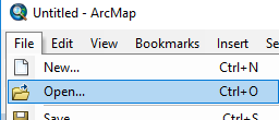
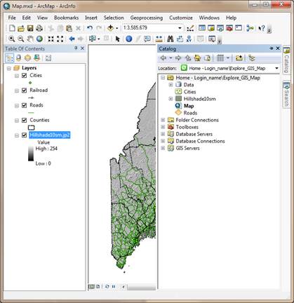
Navigate to your Explore_GIS_map folder and open Map.mxd.
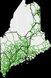
The file Map.mxd is a map document that contains information about the different data layers drawn as well as the different symbology schemes used to represent the data in the map.
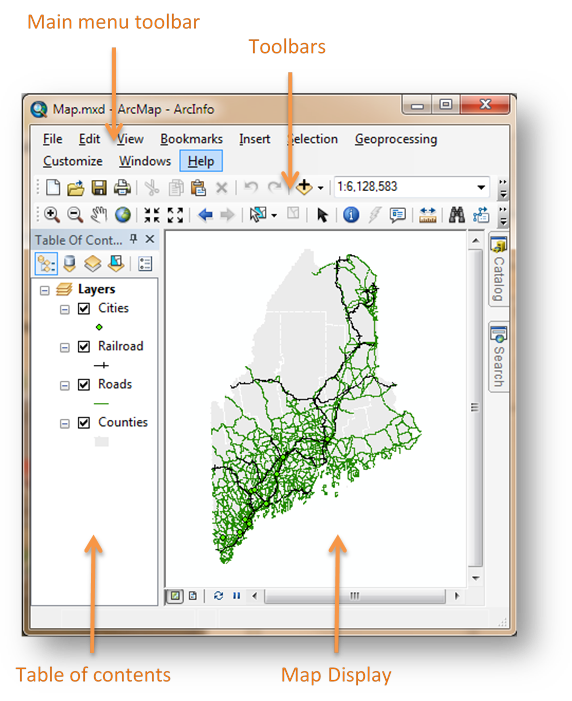 |
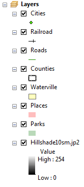
The different map elements (aka layers) used to build
the map are listed in the Table of contents (TOC). The TOC, like
many other ArcMap elements, can be undocked from the window by clicking on the bluish-gray
horizontal bar and dragging it away from the window. It can be re-docked by
dragging it back inside the ArcMap window; in doing so, you will notice four
blue arrows ![]() . These arrows point at locations
where the TOC element can be docked (just drag-and-drop the element on top of one
of the arrows).
. These arrows point at locations
where the TOC element can be docked (just drag-and-drop the element on top of one
of the arrows).
Toolbars can also be docked/undocked. To undock a toolbar, click on the toolbar’s vertical gray bar to the left of the toolbar and drag the toolbar to its desired location.

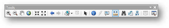
One toolbar that you should become intimately familiar with is the Tools toolbar. This has most of the functions you will be using when exploring a map in a Map Display environment.
GIS data come in many different file formats and data models (i.e. raster or vector), however they are all added to an ArcMap document in a similar way.
In the ArcMap document, click on the Add Data ![]() button.
button.
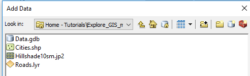
The Add Data file navigation window is not the typical Windows file browser you may be familiar with. The Add Data window will only display data files that ArcMap recognizes as a valid GIS data files or data table.
If this is the first time that ArcMap is opened under your login account, you will also note that drive letters (such as C: or D:) are not directly accessible from the Look in pull-down menu.
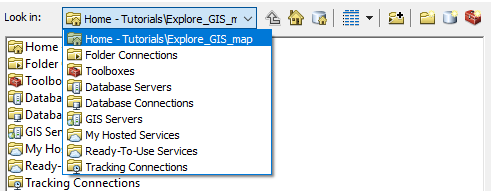
ArcMap requires that you make “connections” to folders, network, databases or internet map services before accessing their content. By default, ArcMap will connect to the folder that houses the current MXD document (~/Tutorials/Explore_GIS_map/ in our working example). But if you wanted to access data files under the ~/Tutorials/ folder you would need to create a folder connection as follows:
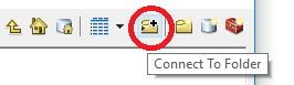
Click on the Connect To Folder button ![]() .
.
In the Connect to Folder window, navigate to your data folder, for example This PC >> c:\Users\jdoe\Documents\Tutorials (where you need to replace jdoe with your login name).
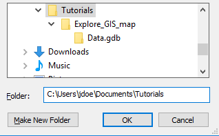
Click OK.
In the Add Data window, expand the Look In pull-down menu. You should now see your project directory listed as a connection (you may need to expand the Folder Connections to see your project folder).
Since all the data used in this tutorial reside in the Explore_GIS_map/ folder, the above folder connection step is not needed since ArcMap will always make the MXD’s home directory available as a folder connection for that session. However, going forward, this connection will prove useful when adding more tutorial exercises to the ./Tutorials folder since this folder connection will persist in future sessions (as long as you are logging into the same PC).
Next, we’ll add a hillshade raster of Maine’s topographic features to the map.
In the Add Data window, navigate to your project directory and select Hillshade10sm.jp2.
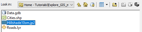
Click Add to add the data to ArcMap.
You’ll note that the hillshade layer is placed at the bottom of the TOC layers list.
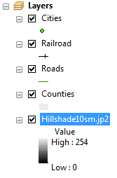
At this point, the Map Display window does not display anything new (except for a black background). ArcMap draws each layer following the order listed in the TOC. The bottom layer is drawn first (Hillshade10sm), then the second layer from the bottom of the TOC (Counties) is drawn, then the next layer above that is drawn, etc…
There are many different strategies that can be adopted to enable simultaneous display of overlapping layers. We will explore one such method next.
You will modify the way the County features are displayed in the map. Instead of having the county polygons filled in grey, you will make them invisible with just the outline boundaries showing. This will help us see the underlying hillshade.
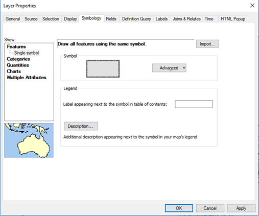
Right-click on the Counties layer in the TOC and select Properties (alternatively, you can double-click on the layer to access the Layer Properties window).
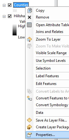
In the Layer Properties window, select the Symbology tab.
![]()
Click on the gray symbol.
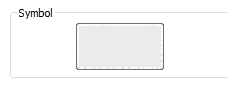
The above action should open the Symbol Selector window.
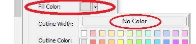
In the Symbol Selector window, click on the Fill Color symbol and select No Color.
Next, click the Edit Symbol button.
![]()
This will open the Symbol Property Editor window.
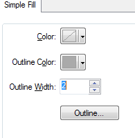
In the Symbol Property Editor window click on the Outline button.
![]()
This will open the Symbol Selector window.
In the Symbol Selector window look for and select the Boundary County symbol from the list of symbols (you may have to scroll down a line or two to find it).
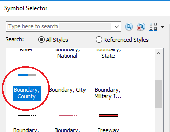
Click OK to close the Symbol Selector window.
In the Symbol Property Editor window, change the Outline Width to 2.
Click OK to close the Symbol Property Editor window.
Click OK again to close the Symbol Selector window.
This should bring you back to the Layer Properties window.
Click OK to close the Layer Properties window.
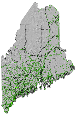
At this point the symbology for the Counties layer will have changed. You should now see the underlying hillshade map.
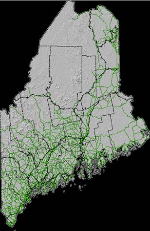
The black background is too distracting. We will modify the Hillshade symbology.
Right-click on the Hillshade10sm.jp2 layer in the TOC and select Properties. Remember that alternatively, you can double-click on the layer to access the Layer Properties window.
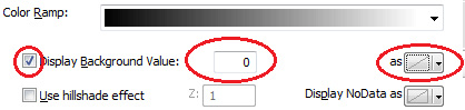
In the Layer Properties window, select the Symbology tab.
![]()
Check the box next to Display Background Value and make sure that the value is set to 0 and that the as symbol is set to No Color (this should be the default).
Click OK to close the Layer Properties window.
The above step instructs ArcMap not to display pixels in the hillshade layer that have a value of 0 (these are the pixels that generated a black background).
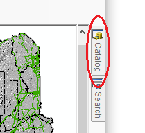
You can manage your project folder from within ArcMap using ArcCatalog. ArcCatalog is one of many applications that make up the ArcGIS software suite. ArcCatalog can also be accessed as a stand-alone application from the Windows’ Start menu.
Click on the Catalog tab that is docked to the right of the Map Display.
The catalog window will expand. This window can be
docked/undocked just like the TOC. But this can only be done if it is “pinned”.
You pin a window by clicking on the pin icon ![]() in the upper
right-hand side of the catalog window. If the window is pinned, the pin icon
will be vertical
in the upper
right-hand side of the catalog window. If the window is pinned, the pin icon
will be vertical ![]() . If the window is unpinned, it
will be horizontal
. If the window is unpinned, it
will be horizontal ![]() meaning that if you move the
cursor away from the window (or press the ESC key), that window will snap back
to a tab on the left-hand or right-hand side of the ArcMap display.
meaning that if you move the
cursor away from the window (or press the ESC key), that window will snap back
to a tab on the left-hand or right-hand side of the ArcMap display.
Note that the TOC is, by default, pinned, however, you can unpin the TOC to have it snap back to a tab to maximize the map display window (though this is not recommended in this course).
In the Catalog window, navigate to your map project
folder and expand the Data geodatabase ![]() .
.
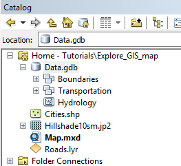
A geodatabase is a data storage system unique to ArcGIS that provides another way to store GIS data.
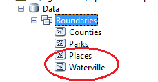
Expand the Boundaries feature data set, ![]() ,
and click and drag Parks into the TOC.
,
and click and drag Parks into the TOC.
Dragging and dropping is yet another way to add data to your
map document (recall that the other method of adding data is to click on the Add
Data ![]() button).
button).
Follow the same aforementioned step to add Places and Waterville features.
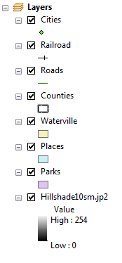
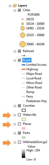
Rearrange the layers in the TOC such that they match the following order from bottom to top: Hillshade10sm, Parks, Places, Waterville, Counties, Roads, Railroad, Cities.
Next, you will change the symbology for the Parks layer.
Right-click the Parks layer in the TOC and select Properties.
Select the Symbology tab.
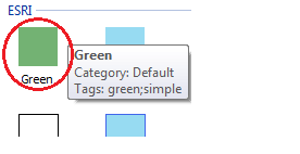
Click on the Symbol color (your default color may be different from the one shown in this tutorial).
Select the Green symbol in the Symbol Selector window.
Click on the Outline Color symbol ![]() and select No Color.
and select No Color.
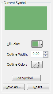
Click OK to close the Symbol Selector window.
Next, we’ll set the Parks layer to a 50% transparency. This will allow the background hillshade to show through the Parks polygons.
In the Layer Properties window, click on the Display tab.
![]()
In the Transparent value box, type 50.
![]()
Click OK to close the Layer Properties window.
Now it’s your turn to change the symbologies for the Places and Waterville layers using the techniques outlined in this step. You will set the Waterville symbol color to Yellow and the Places symbol color to Rose with the latter displaying no outline color.
So far, you have symbolized all features within a layer the same way (e.g. all Places features are symbolized using the same color). There may be instances when you might want certain layers to be symbolized differently based on an attribute value.
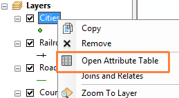
Right-click the Cities point layer and select Open Attribute Table.
The Attribute Table lists all of the layer’s attributes and associated values.
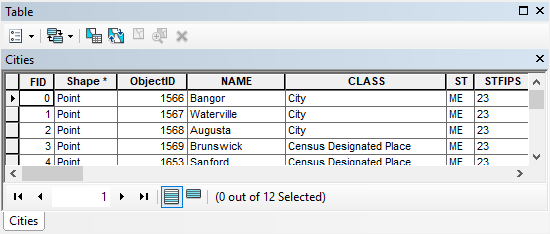
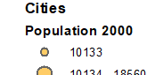
In the Table window, scroll to the right until you find the POP2000 field.
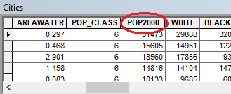
This column lists the population count for the year 2000 for each point feature in the Cities layer. Next, you will learn to symbolize the points based on the city’s population size.
Close the Table window.
Right-click the Cities layer and access its Properties window.
The 2000 population count field is a numeric (quantity) field. We will therefore use the Quantities scheme in the Symbology tab.
In the Layer Properties window, click the Symbology tab (if not already active) and select Quantities>> Graduated symbols from the list of schemes in the Show box.
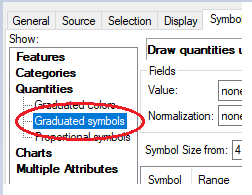
In the Value field, select the POP2000 attribute.
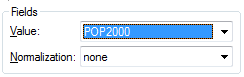
This will assign different sized point symbols based on the population value in the POP2000 field.
Click the Template symbol and select an orange color
(in this example, electron gold is chosen 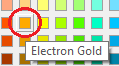
![]()
Click OK to Close the Symbol Selector window.
This color will be assigned to all points.
Click the Display tab and set the transparency to 40 %.
![]()
Click OK to close the Layer Properties window.
Symbolizing features can be time consuming, it can therefore be desirable at times to save the symbology information to a layer file (.lyr) for use in another map document. Note that the symbology you define in an ArcMap session is only stored in the Map document (the .mxd file) and not with the layer’s original data source.
You will use an existing layer file (Roads.lyr) to symbolize the Roads layer.
In the TOC, right-click on the Roads layer and open its Properties window.
In the Layer Properties’ Symbology tab, click on Import.
In the Import Symbology window, select the Open file
icon ![]() .
.
In the file manager window, select Roads.lyr located inside your map project folder.
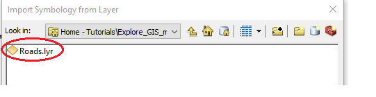
Click on the Add button.
Click OK to close the Import Symbology window.
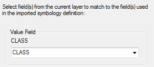
A window will pop up asking for the Roads’ attribute that will be used to identify which road classes will be symbolized with the pre-defined symbology scheme that is stored in the layer file (Roads.lyr).
Make sure that CLASS is selected from the pull-down menu.
Click OK to close the Import Symbology Matching Dialog.
Click OK to close the Layer Properties window.
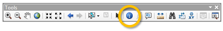
In the Tools toolbar, click on the Identify
tool ![]() .
.
The cursor changes to the ![]() icon.
icon.
Click on the Baxter State Park green polygon which is the northern most park feature on the map.
The above step should open an Identify window. By default, the Identify window will display feature information for the top most layer in the TOC. However, you can have ArcMap display feature information for one or all layers in the map document.
In the Identify window, select Visible layers from the Identify from pull down menu.
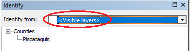
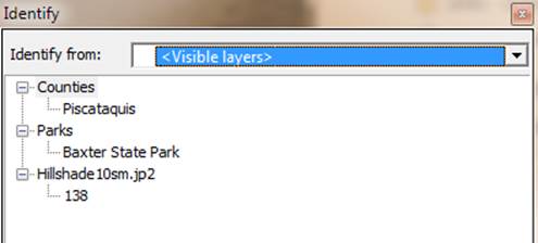
Click on the Baxter State Park polygon feature again.
The Identify window now returns information for the three visible layers that have features at the location just selected with the identify pointer. For each layer, information about the selected feature (or pixel) appears just below the layer name.
Click on Baxter State Park (under the Parks layer) in the Identify window.
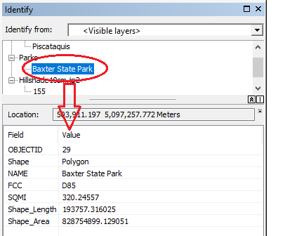
All attribute information associated with the Parks feature is displayed in the Identify window’s bottom pane. The information displayed is pulled from the layer’s attribute table.
Step 8: Selecting features
You can select one or multiple features in a data layer by using the Selection tool. You can also export selected features to a new GIS data file for future analysis.
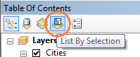
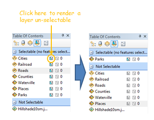
In the TOC, select the List By Selection icon located near the top of the TOC’s window.
Notice how the TOC’s content changes. This is where you tell ArcMap which features are to be selected in the map display. This is a very useful option when you have many layers overlapping one another but you only want to select features for a single layer.
For all but the Parks layer, make the layers (under the Selectable section) non-selectable by clicking on the left-most icon next to the layer’s name.
This will place the un-selectable layers under the Not Selectable section of the TOC. Make sure that the Parks layer is the only selectable layer.
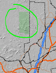
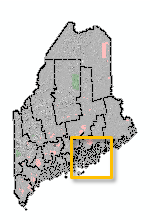
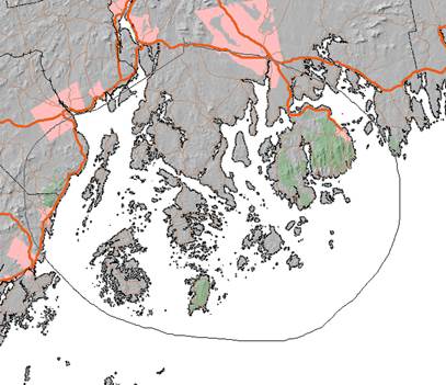
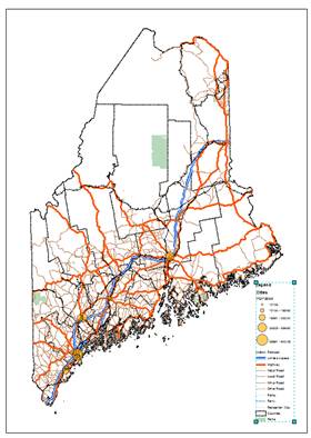
In the Map display window, zoom in (using
the zoom tool ![]() ) on the down-east section of
Maine (around the cluster of islands in Hancock County inside the orange box in
the following figure).
) on the down-east section of
Maine (around the cluster of islands in Hancock County inside the orange box in
the following figure).
Note that if you want to pan around the map, you can use the pan tool or click and hold the middle mouse button then move around your map.
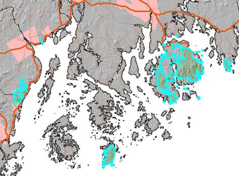
Expand the Select Features icon in the Tools toolbar and select Select by Lasso.
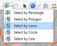
The lasso option allows you to select areas on the map using a freehand.
With the selection tool selected, delineate an area that encompasses the cluster of islands as shown in the following figure.
When you are done drawing the “lasso”, you’ll notice polygons highlighted in cyan. These are the selected park features (remember that you instructed ArcMap to only select features belonging to the Parks layer and no other layers in the map document).
Note that the number of features selected on your map may be different from the one shown in the graphic below if your selection lasso encompassed a slightly different area.
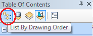
In your TOC, click on the List By Drawing Order button (this brings you back to the original TOC environment).
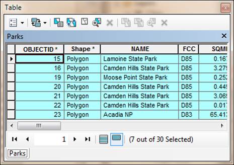
Right-click on the Parks layer in the TOC and select Open Attribute Table.
The records associated with the selected features should also be selected in the table (they are highlighted in cyan).
At the bottom of the table, click on the Show selected records button.
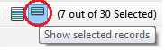
Now, only the selected features are displayed (note that your number of selected features may differ).
Close the attribute table.
Finally, unselect all features by clicking on the Clear Selected Features located on the Tools toolbar.
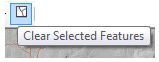
Note that if there are no features selected in your map then
the Clear Select Features icon will be ghosted out ![]() .
.
You can measure distances between features as well as surface areas of polygon features.
First, let’s declutter the map, so uncheck the Hillshade, Places and Waterville layers in the TOC.
Zoom out to the entire map extent by clicking on
the Full Extent button ![]() in
the Tools toolbar.
in
the Tools toolbar.
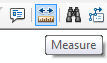
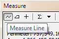
In the Tools toolbar, click on the Measure
tool ![]() .
.
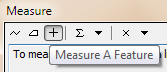
A Measure window will pop-up.
In the Measure window click on the Measure A
Feature icon, ![]() .
.
In the same Measure window, select the first pull down arrow to the right of the Measure A Feature button, then select Area >> Acres.
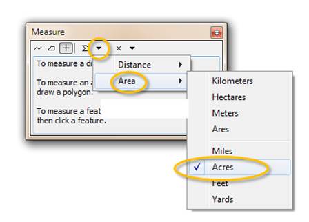
At this point, all areal measurements will be displayed in units of Acres.
Click anywhere within the top county (Aroostook) boundaries.
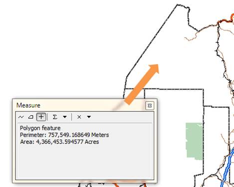
The measure tool should display the polygon’s area and perimeter measurements (4,366,453 acres and 757,549 meters respectively).
You will now use the distance measurement tool to measure distances between cities.
Uncheck the Roads and Railroad layers from the TOC to declutter the map.
In the Measure window, click on the Measure Line button.
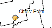
Click on one of the cities point features (e.g. Bangor). You will know when your cursor is hovering over a Cities point feature when the Cities: Point tip pops up.
Double-click on a second city point (e.g. Waterville).
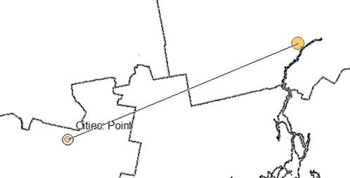
Double-clicking stops the measurement tool. If you click just once, the tool will expect you to click on a third location to add a second distance segment to the first.
At this point, the linear distance between both cities will display in the Measure window.
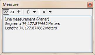
The software defaults to the coordinate system’s units for distance measurements. You can change the linear units in the Measure window like you previously did for the area units.
Click the ESC key to stop measurements.
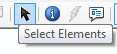
Click on the Select Elements button in the Tools toolbar to exit measurement mode and revert back to general mode.
Zoom back to the map’s full extent by clicking on the Full Extent button of the Tools toolbar.
Turn the Roads and Railroad layers back on.
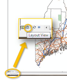
So far, you have been working in a Data View mode. When you want to prepare you map for publishing (e.g. print or PDF export), you need to switch your Map display from Data View to Layout View mode.
In the bottom left corner of the Map display window, click on the Layout View button.
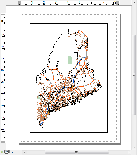
Your map is now enclosed in a new border. This border defines the page’s edge. You can modify the page size in the Page and Print Setup option under the File pull-down menu. For this exercise, we will stick with the default page dimensions of 8.5” by 11”.
You may also have noticed the addition of a new toolbar in
your working environment. This is the Layout toolbar. It should not be
confused with the Tools toolbar which you have been using so far since
the tools in the Layout toolbar have completely different functions. The Layout
toolbar tools only operate on the page layout and not the map’s content. For
example, the Zoom In icon ![]() in the Layout toolbar will zoom
in on the page, but the features within the map still maintain their original
scale/extent relative to the page layout.
in the Layout toolbar will zoom
in on the page, but the features within the map still maintain their original
scale/extent relative to the page layout.
![]()
In layout view, you can add elements such as scale bars and legend boxes to the map.
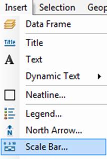
From the Main menu toolbar, click on Insert and select Legend.
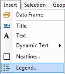
A Legend Wizard window will pop up.
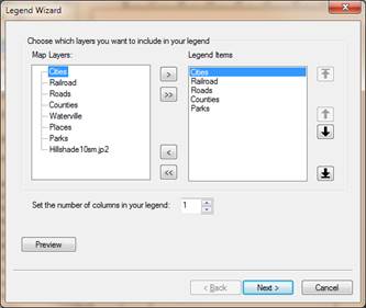
You will keep the default legend settings.
Click on the Next button four times until you reach the end of the Wizard window, then click Finish to exit the Legend Wizard and add the legend element to your map.
Once the legend element is added to your map, you can move it somewhere to the lower right-hand side of the map. If needed, you can resize the window so that it doesn’t overlap the map.
The legend box is dynamically linked to the layer names defined in the TOC. For example, if you change the POP2000 sub-title for the Cities layer in the TOC, that change will be reflected in the legend element
Click once on the POP2000 sub-title in the TOC, then click on it again after waiting a few seconds to place it in edit mode.
![]()
Change its name to Population 2000.
![]()
Note the change reflected in the legend element.
Next, you will add a scale bar.
From the Main menu toolbar, click on Insert and select Scale Bar.
In the Scale Bar Selector window, click OK to accept the defaults.
Position the scale bar somewhere near the bottom of the page layout.
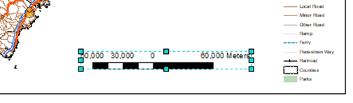
Feel free to rearrange the newly added scale bar in your map layout.
You might also want to change its units and intervals. An example of the scale bar’s properties modification follows.
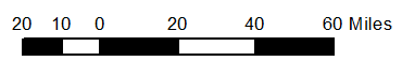
Double-click the scale bar to bring up its properties.
Select Adjust number of divisions, set the division units to Miles, then set the division value to 20 mi. Set the number of subdivisions to 2.
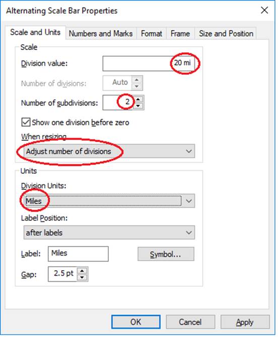
Click OK to close the scale bar properties.
From the Insert pull-down menu, you will add the North Arrow.
Choose any north arrow from the list of options (it’s best to pick the simplest arrow symbol) and click OK to close the North Arrow Selector window.
The north arrow may be placed in the middle of the map which may take some squinting to find. Move it somewhere to the bottom of the map.
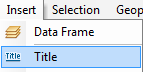
Finally, you will add a Title to your map.
From the Main menu toolbar, click on Insert and select Title.
In the Insert Title window, type The State of Maine.
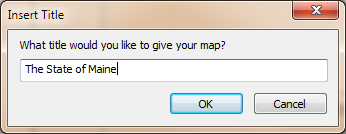
Click OK.
Position the title somewhere near the top of the map.
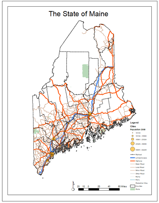
This ends this exercise.
© Manny Gimond, last modified on 8/12/2019