Symbolizing Features
|
1. Create a folder called Symbology somewhere under your personal directory (e.g. C:\Users\jdoe\Documents\Tutorials\Symbology). 2. Download the data for this exercise and extract the files from the Symbology.zip file to your newly created Symbology directory. |
In this exercise, you will learn how to symbolize features based on their geometric characteristics and their attribute type. You will also learn how to add data frames, modify their coordinate systems and generate a final map layout.
Step 2: Symbolize counties by farm acreage
Step 3: Add river features and labels
Step 5: Symbolize cities by population
Step 7: Adding additional elements to the map document
Navigate to your Symbology folder and open the map document Symbology.mxd in ArcMap.
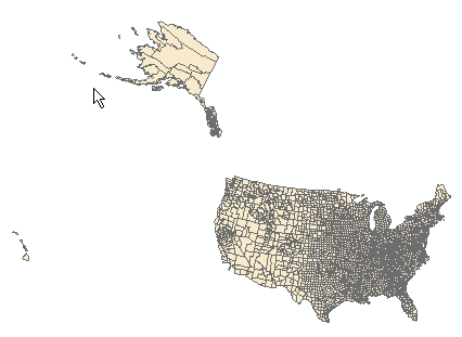
The map document is made up of a single data frame called “Layers”.
The data frame contains four layers: Cities, Rivers, States and Counties.
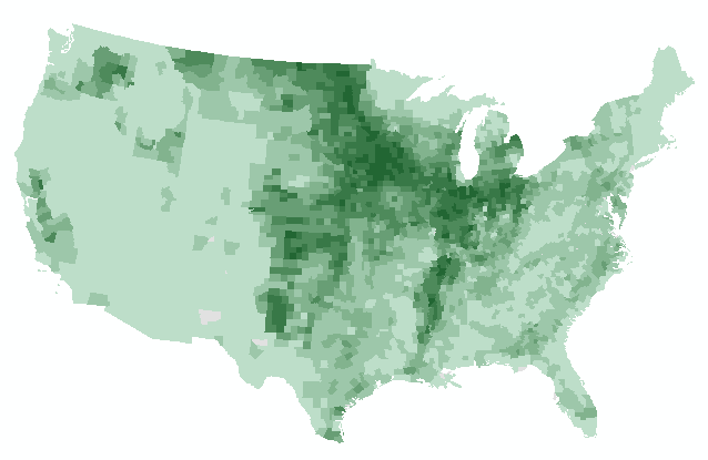
Next, you will create a choropleth map based on cropland distribution.
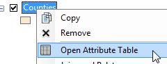
Right-click on Counties layer and select Open Attribute Table.
There is a field called CROP_MI07 that lists the total surface area of croplands within each county (units are in square miles). You will symbolize the counties using this field.
Close the attribute table.
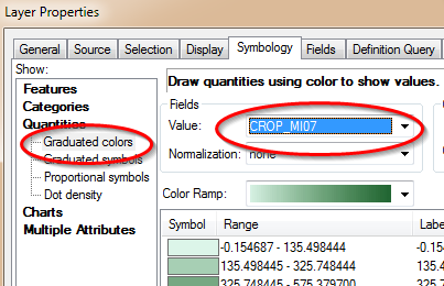
Right-click on Counties layer and select Properties.
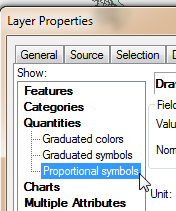
Select the Symbology tab ![]() .
.
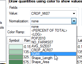
Select Quantities in the left window pane then select CROP_MI07 in the Value field. Choose a green color ramp.
Click OK to accept the symbology changes and close the Layer Properties window.
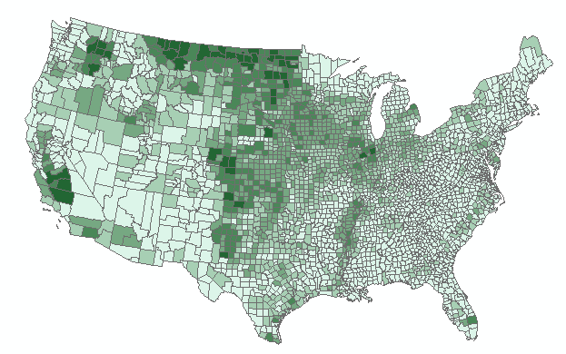
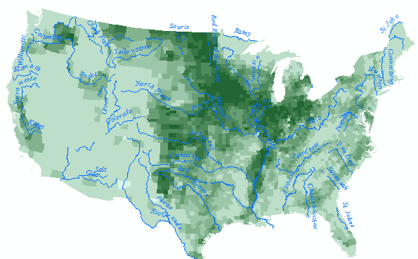
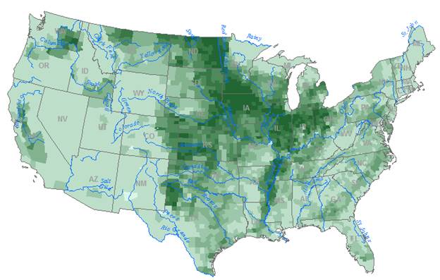
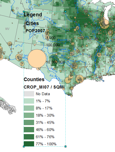
Note the distribution of “high” values around Montana and the Dakotas. Remember that we are looking at total acreage within each county. Also note that each county has a different total area and shape. Symbolizing heterogeneous polygons using ‘count’ or ‘enumerated’ data can mislead the intended audience. It is therefore best to normalize such data by polygon surface area. The field that lists total county area in square miles is SQMI.
Open the Counties Properties window again (right-click Counties and select Properties).
Make sure that the Symbology tab is selected.
Under Normalization, select SQMI.
This instructs ArcMap to divide all crop area values (CROP_MI07) by the total area of each county polygon (SQMI).
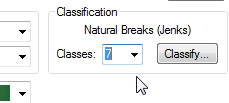
Before we accept the changes, we will make a few changes to the symbols. We will remove the dark outline from each polygon to emphasize the distribution of cropland across the US and we will increase the number of classes to 7.
Change the number of classes from 5 to 7.
NOTE: in the following step, you are asked to open the Properties for All Symbols menu. In version 10.4, the dialog box will not open. This is a known bug. The workaround is to select all color symbols then select the Properties for selected symbol(s) option instead. The original workflow is still shown in this tutorial for backward compatibility but should be replaced with the aforementioned workaround if using version 10.4 or later. Note that this bug has not been fixed as of version 10.6.
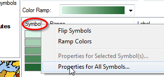
Click on the header Symbol (the column name just above the list of symbol swatches) and select Properties for All Symbols.
In the Symbol Selector window change the Outline Color to No Color. Be careful not to change the color settings for Fill Color!
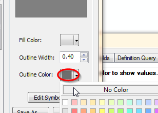
Click OK to close the Symbol Selector window.
Click OK to close the Properties window.
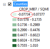
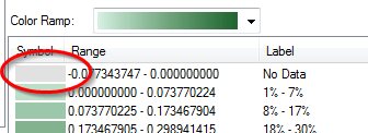
Looking at the legend, you’ll notice some oddities in the range of values. The range starts off with a negative value (-0.077) but it’s clear that we cannot have ‘negative’ area!
Let’s explore this discrepancy by opening the Counties attribute table.
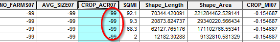
Looking a bit more closely at the data in the attribute table, we spot many ‘-99’ values under the CROP_ACR07 field (you might want to sort this field in ascending order to see these values). Why does this matter? Well it turns out that CROP_MI07 was calculated from the CROP_ACR07 field by multiplying the CROP_ACR07 by 0.0015625 (conversion coefficient from acres to square miles). This explains the -0.1547 values found in the CROP_MI07 attribute field. Of course, this is information you could not glean from the data. This is something you obviously were not expected to know unless documentation for the data was readily available. This is an example why data documentation (metadata) is critical!
So what does the -99 value represent? Fortunately, this bit of information is documented in the Counties layer’s metadata.
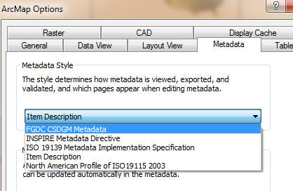
You may need to change the view settings for your metadata window by accessing ArcMap Options from the Customize pull-down menu, then selecting the Metadata tab, and choosing the FGDC CSDGM Metadata style.
Click OK to close the ArcMap Options window.
Right-click Counties and select Data >> View Item Description.
Under the ArcGIS Metadata tag, scroll down (about ¾’s of the way down) to the Fields section.

Then look for the attribute field CROP_ACR07.
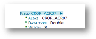
Looking at the list of values for the field CROP_ACR07, we discover that -99 is a placeholder for no data. Therefore we should change the map symbology such that counties with no data are indicated as such in the map.

Close the Metadata window.
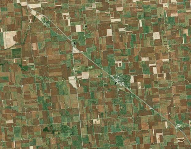
Also note that at the other end of the Counties layer range of values, we spot a value greater than 1.0 (which implies that there is more cropland area than county area). This is obviously an anomaly most likely due to error in measurements (i.e. crop area was probably computed at a different scale). Fortunately, only a single polygon (county) has a value greater than 1. Looking at an aerial view of the aforementioned county, it’s clear that the majority of that county is under cropland.
We will change the classification scheme to symbolize -99 as no data and round the value of 1.01 down to 1.
Open Counties’ properties window.
Make sure that the Symbology tab is selected.
Click on the Classify button.
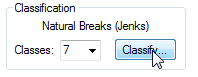
By default, ArcMap chooses a Natural Breaks classification scheme. We will change it to an equal interval scheme.
Select Equal Interval as the Classification Method type.
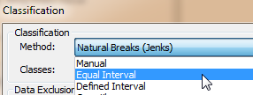
This ensures that intervals between each classification break are equal.
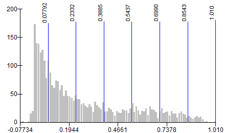
Next, you will add another classification break for all -99 crop land area features.
Right click somewhere on the far left side of the graph and select Insert Break.
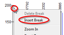
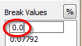
With the new break line still active (it should be colored red), type 0.0 in the Break Values window.
Click OK to close the Classification window.
In the Layer Properties window, click in the Label column header and select Format Labels from the pull-down option.
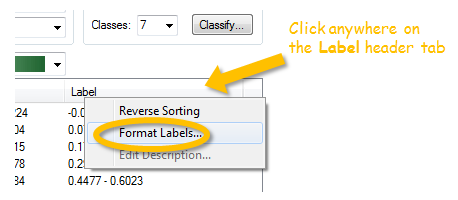
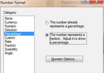
Change the category to Percentage and select the ‘…number represents a fraction…’ option.
Click on the Numeric Options ![]() button.
button.
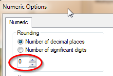
Set the Number of decimal places to 0.
Click OK to close the Numeric Options window.
Click OK to close the Number Format window.
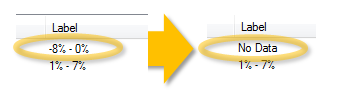
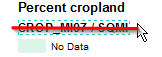
Change the first label name to No Data (just select the field to edit it).
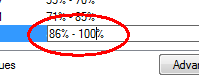
Likewise, change the last label to 86% - 100%.
To isolate the No Data symbol, you will change its color to a more neutral color.
Double-click on the No Data symbol and change its color to 10% gray.
Click OK to close the Layer Properties window.
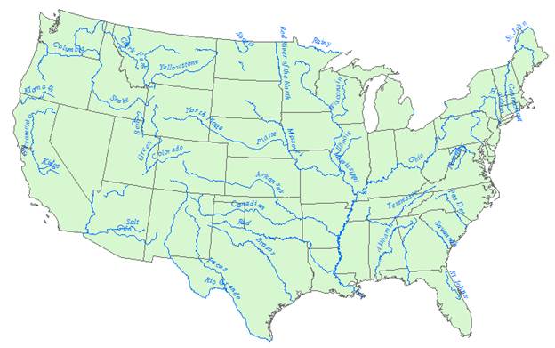
Turn on the Rivers layer in the TOC.
Open Rivers’ properties window.
Make sure that the Symbology tab is selected.
You will symbolize all river features with the same symbol type.
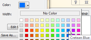
Click on the symbol.
Change the color to Cretan Blue.
Click OK to close the Symbol Selector window.
Click OK to close the Layer Properties window.
Next, you will have ArcMap automatically place the river labels.
Open the Rivers’ properties window.
Click on the Labels tab ![]() .
.
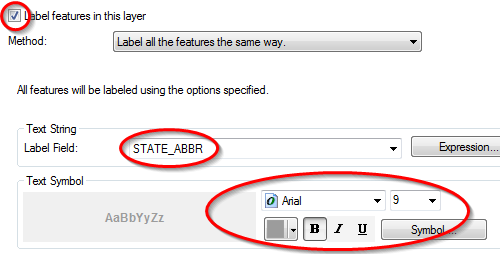
Check off the Label features box.
Select Name as the Label field.
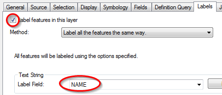
The label field allows you to select the attribute (from the attribute table) to use to label each feature in the map.
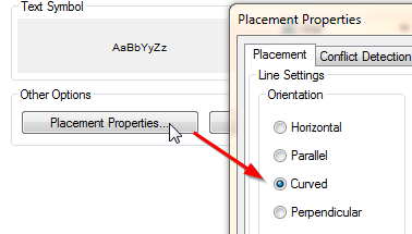
Click on the Placement Properties button.
![]()
Select Curved orientation.
Click OK to close the Placement Properties window.
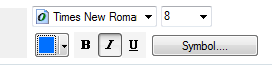
Change the label font to Times New Roman, Italic and Cretan Blue.
Click OK to close the Layer Properties window.
In the next step, you will add States outline.
Turn on the States layer.
The States layer is masking out the farm cropland layer. Since we only want to display the boundaries, we will remove the fill color.
Open the States’ Properties window.
Select the Symbology tab.
Click on the Symbol.
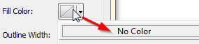
For Fill color, select No Color.
Click OK to close the Symbol Selector window.
We will also have ArcMap label the States.
In the Properties window, select the Labels tab.
Set the label properties as follows (use Gray 40%).
Click OK to close the Layer Properties window.
Next, you will symbolize cities by population count.
Turn on the Cities layer.
Open Cities’ properties.
Select the Symbology tab.
Select Quantities >> Proportional symbols.
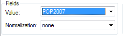
Use the POP2007 value to define the symbol sizes.
Click on the Min value button.

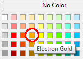
Set the color to Electron Gold.
Set the minimum value circle size to 1.00
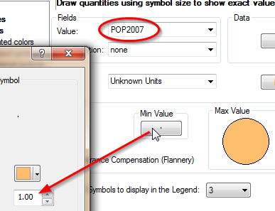
Click OK to close the Symbol Selector window.
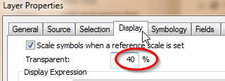
Click on the Display tab and set the transparency value to 40%.
Click OK to close the Layer properties window.
Next you will setup the map layout.
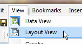
From the View pulldown menu, select Layout View.
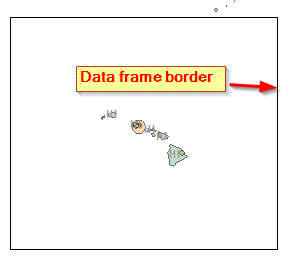
One challenge in displaying all 50 states is dealing with the vast amount of empty space between Hawaii, Alaska and the 48 contiguous states.
To resolve this issue, you will create three separate data frames: one for Hawaii, one for Alaska and one for the 48 states.
So as not to have to recreate all the layer symbols for each data frame, you will copy and paste the existing data frame twice.
Right-click anywhere on the data frame in the Layout View window and select Copy (make sure that you are in layout mode!).
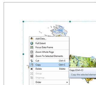
From the Edit pulldown menu, select Paste.
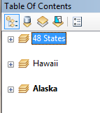
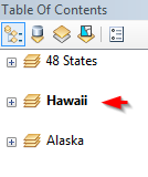
You should now see a duplicate of the original data frame in the TOC and in the map layout.
Rename the new data frame Hawaii.
You will now paste another copy of the data frame for Alaska.
From the Edit pulldown menu, select Paste.
Rename the new data frame Alaska.
Rename the original data frame 48 States.
Collapse all data frames in the TOC.
Right-click the Alaska data frame and select Activate.
This action make the Alaska data frame active in the Layout view.
Resize the Alaska data frame to about a quarter of the page.
Move it to the lower left hand corner of the map layout.
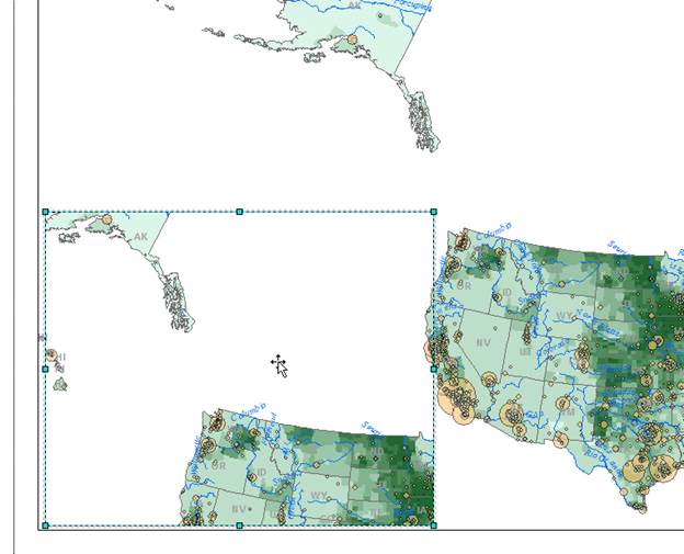
Next, you will resize and reposition the Hawaii data frame.
Selecting the correct data frame in a map layout when data frames overlap can be challenging. To ensure that you have selected the proper data frame, use the space bar.
Holding down the space bar, select a data frame in the data view window. Keep clicking on the overlapping data frames until you see Hawaii ‘bolded’ in the TOC. (Alternatively, you could have right-click the Hawaii data frame in the TOC and selected Activate).
Resize the Hawaii data frame and relocate it to the bottom of the map layout (you will refine the positioning later).
Activate the 48 States data frame (right-click on the data frame and select activate).
From the Tools toolbar, select the Zoom In icon (be careful not to select the Zoom In icon from the layout toolbar).
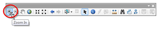
In the 48 States data frame, zoom in on the 48 States.
For the Hawaii and Alaska data frames zoom in on Hawaii and Alaska, respectively (don’t forget the activate the proper data frame).
Note: you will probably need to use the Pan tool
![]() to move around within each data
frame.
to move around within each data
frame.
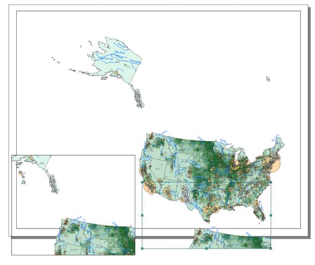
Clearly the orientation of both Hawaii and Alaska are not ideal. Also, you might note some slight distortion in their shapes. This is because they inherited a projected coordinate system best suited for the 48 states. To resolve this, you will define different coordinate systems for Hawaii and Alaska.
Right click on the Hawaii data frame and select Properties.
Select the Coordinate System tab.
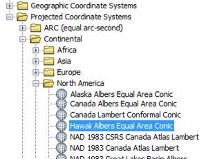
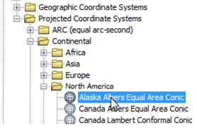
Select the following predefined coordinate system:
Projected Coordinate Systems >> Continental >> North America >> Hawaii Albers Equal Area Conic
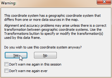
Click OK to close the Data Frame Properties window.
Click Yes to close a Warning window if it pops-up.
Right click on the Alaska data frame and select Properties.
Select the Coordinate System tab.
Select the following predefined coordinate system:
Projected Coordinate Systems >> Continental >> North America >> Alaska Albers Equal Area Conic
Click OK to close the Data Frame Properties window.
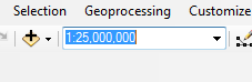
Next, you will set the scale to all three data frames so that they match (this is important if you are to place a scale bar in the final map layout).
For each data frame, set the scale to 1:25,000,000 (don’t forget to activate the data frame before changing the scale).
Next you will remove the data frame borders for all data frames.
Open the Hawaii data frame Properties window.
Select the Frame tab.
Under the Border option, select None.
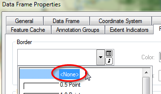
Click OK to close the Data Frame Properties window.
Using the procedure just outlined, remove the Alaska and 48 States data frame border.
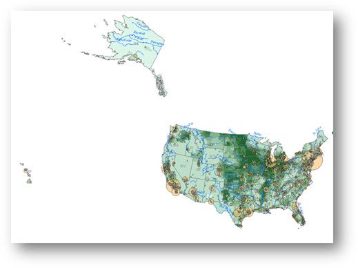
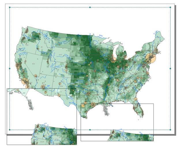
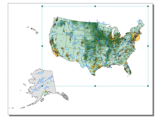
Rearrange the three data frames to match the following graphic.
Feel free to pan the maps ![]() within
each data frame as needed but do not change the scales (they should all
remain at 1:25,000,000). For example, make sure that the southern tip of Alaska
does not show up in the 48 States data frame.
within
each data frame as needed but do not change the scales (they should all
remain at 1:25,000,000). For example, make sure that the southern tip of Alaska
does not show up in the 48 States data frame.
Next, you will add a title, legend and scale bar.
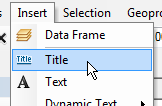
From the Insert pulldown menu, select Title.
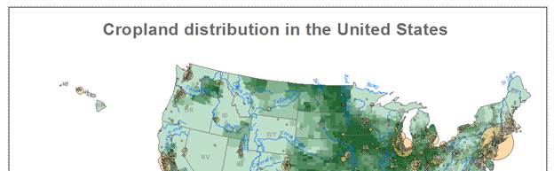
In the Insert Title window type Cropland distribution in the United States.
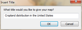
Click OK.
Move the title to the top of the page.
You can change the text properties by accessing its properties menu.
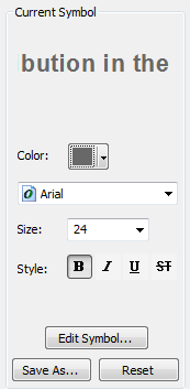
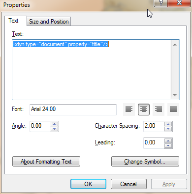
Right-click on the title and select Properties.
In the Properties window, click on the Change Symbol button.
In the Symbol Selector window, change the font size to 24, bold and color to 60% Gray.
Click OK to close the Symbol Selector window.
In the Properties window, set the character spacing to 2.00.
Click OK to close the Properties window.
Next, you will add a legend.
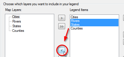
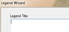
From the Insert pulldown menu, select Legend.
In the Legend Wizard window, remove Rivers
and States from the legend list by selecting them (select both while
holding down the control key) and clicking the single left arrow button ![]() .
.
Click Next.
Remove the text Legend from the Legend Title (leave the field blank).
Click Next.
Click Next again.
And click Next one more time.
Click Finish to close the legend wizard window.
By default, the legend window is created as a single column. This will clearly not fit in our current map layout.
At this point you might be wondering which data frame’s legend element was added. ArcMap will only add the legend element associated with the selected data frame. Since all three data frames in our map document share the exact same layers and associated symbology, it does not matter which data frame was selected when we added the legend element.
Like all map elements, we can access the legend element properties.
Right-click on the legend element and select Properties.
Select the Items tab.
In the Legend Properties window, select Counties and check off Place in new column.
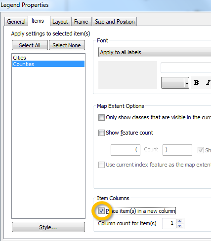
Click OK.
This last step placed the Counties legend element in a second column.
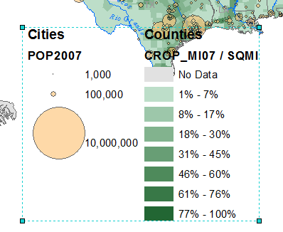
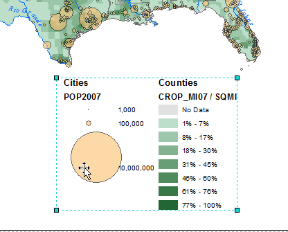
Resize the legend element so that it fits nicely under the 48 states data frame.
The legend elements are dynamically linked to the TOC. Therefore, to make changes to the legend labels/headers, one needs to change those items in the TOC.
Another way to change legend elements is to convert them to ‘graphic’ elements and make the edits within the layout view window. This provides more control over the placement of the legend elements. However, once the legend elements are converted, the dynamic link between the legend’s content and those inside the TOC is lost.
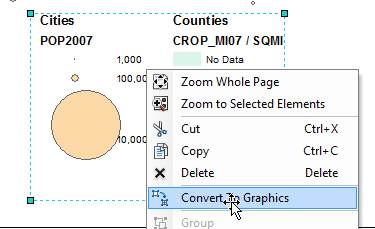
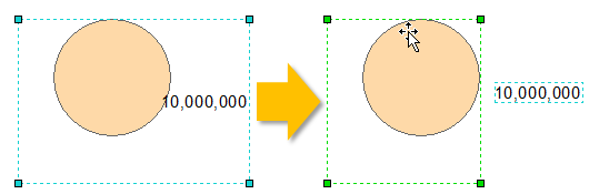
Right-click on the Legend element and select Convert to Graphics.
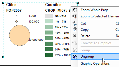
Next you have to ungroup the graphical elements.
Right click on the legend graphic and select Ungroup.
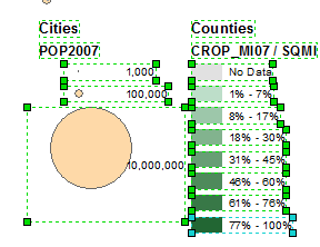
You can now edit the legend headings.
Right-click the Counties text graphic and select Properties.
In the Properties window, change the text to Percent cropland.
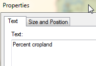
Click OK.
Select and delete the Crop_MI07 / SQMI text.
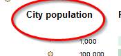
Likewise, rename the Cities text to City population and delete the POP2007 text.
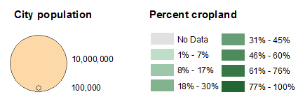
Now on your own, rearrange the legend elements as you see fit.
If you need to separate the text from the color swatch right-click the element and select ungroup.
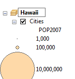
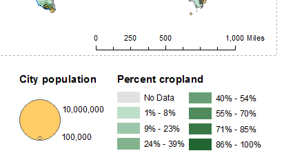
You can use this graphic as inspiration (note that the 1000 population symbol was removed in this example):
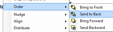
If you have overlapping graphics and wish to move the ‘front’ graphic to the ‘back’, right click on the graphic and select order >> Send to Back.
Next, you will add a scale bar.
Since all data frames inherent the same scale (1:25,000,000), it does not matter which data frame is selected when inserting a scale.
From the Insert pull-down menu, select Scale bar.
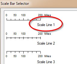
In the Scale bar Selector window, select Scale Line 1 (the top scale symbol).
Click on the properties button.
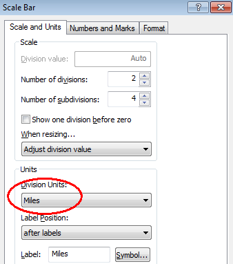
Under the Scale and Units tab ![]() , select Miles for
division units.
, select Miles for
division units.
Click OK to close the Scale bar window.
Click OK again to close the Scale Line properties window.
Move and resize the scale bar as needed.
We could add a north arrow indicator, but given that the coordinate system used does not do a good job in preserving north-south direction across the map’s extent, we will opt not to add this graphic.
On your own, finalize the map by making any touch-ups you see fit.
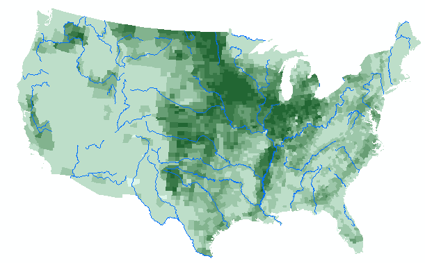
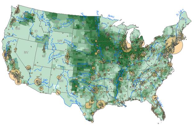
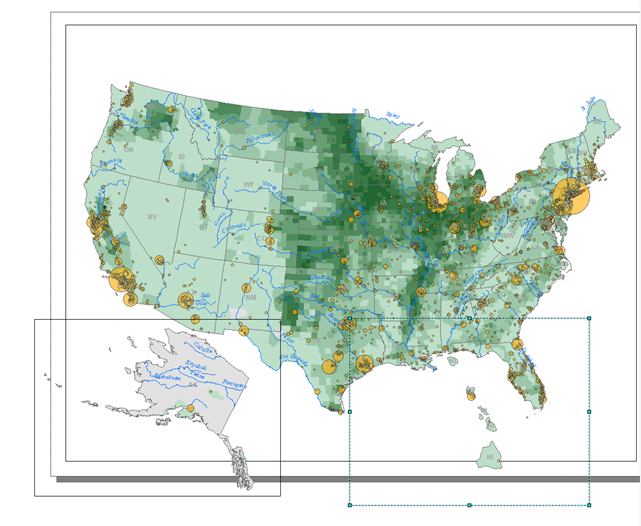
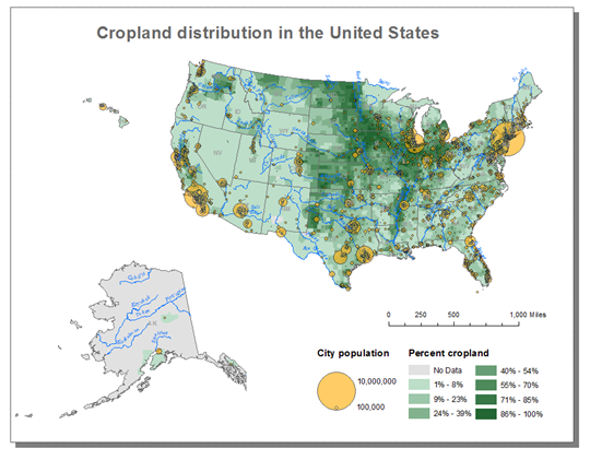
Feel free to glean inspiration from the following graphic:
Save your map document.
![]() Manuel Gimond, last modified on 7/10/2018
Manuel Gimond, last modified on 7/10/2018