| ggplot2 |
|---|
| 4.0.2 |
26 Fitting and Exploring Bivariate Models
Bivariate data typically consists of measurements or observations on two continuous variables. For instance, both wind speed and temperature might be recorded at specific locations. This contrasts with univariate data, where only a single continuous variable—such as temperature—is measured for each observation at two different locations.
Understanding how to model and analyze bivariate data is critical for uncovering relationships and trends between the variables. In this chapter, we will delve into common fitting strategies that are specifically tailored for bivariate datasets.
26.1 Scatter plot
A scatter plot is a widely used visualization tool for comparing values between two variables. In some cases, one variable is considered dependent on the other which is then referred to as the independent variable. The dependent variable, also known as the response variable, is typically plotted on the y-axis, while the independent variable, also called the factor (not to be confused with the factor data type in R, used as a grouping variable), is plotted on the x-axis.
In other situations, the focus may not be on a dependent-independent relationship. Instead, the goal might simply be to explore and understand the overall relationship between the two variables without assigning a hierarchical dependency.
The following figure shows a scatter plot of a vehicle’s miles-per-gallon (mpg) consumption as a function of horsepower (hp). In this exercise, we’ll seek to understand how a car’s miles-per-gallon (the dependent variable) can be related to its horsepower (the independent variable).
26.2 Fitting a model to the data
In univariate data analysis, we aim to reduce the data to manageable parameters providing a clearer “handle” on the dataset. Similarly, when working with bivariate data, we can start by fitting the simplest possible model. For the variable mpg, a straightforward approach is to use a measure of location, such as the mean.
The red line represents the fitted model. Mathematically, this model can be expressed as:
\[
\hat{mpg} = \hat{a}(hp)^0 = \hat{a}(1) + \epsilon = 20.09 + \epsilon
\] The equation is a 0th order polynomial model. The polynomial order is determined by the highest power to which the independent variable is raised (0 in this case). For now, note that regardless of hp’s observed value, its contribution to mpg remains constant.
The terms \(\hat{a}\) and \(\hat{b}\) are defined as the model’s estimated intercept and slope. The “hat” notation ( \(\hat{\ }\) ) in statistics typically indicates that a value is an estimate or a prediction derived from data or a statistical model. We will delve into the meanings of the coefficients \(a\) and \(b\) later in this section. \(\epsilon\) is the residual or the difference between each observation and the fitted model–it’s the part of the data not explained by the model.
This constant model serves as a baseline: it ignores the independent variable, hp, entirely. Comparing it to more complex models will help us assess how much explanatory power is gained by incorporating hp.
The pattern observed in the scatter plot suggests that as hp increases, mpg decreases. We can model this by fitting the line in such a way so as to capture the pattern generated by the points. The fitting strategy can be as simple as “eyeballing” the fit, or adopting more involved statistical methods like the least-squares method.
The following plot is an example of a line fitted to the data using the least-squares method.
The modeled line can be expressed mathematically as:
\[ \hat{mpg} = \hat{a} + \hat{b}(hp)^1 + \epsilon = 30.1 - 0.068(hp) + \epsilon \]
This is a 1st order polynomial where hp is raised to the power of 1. Here, the intercept \(a\) is the value mpg would take if hp were zero. The term \(b\) is the slope of the line and is interpreted as the change in \(y\) for every unit change in \(x\). In our example, for every one horsepower increase, the miles-per-gallon decreases by 0.068 miles-per-gallon.
Not all relationships will necessarily follow a perfectly straight line. Relationships can be curvilinear. Polynomial functions can take on many different non-linear shapes. The power to which the \(x\) variable is raised will define the nature of that shape. For example, to fit a quadratic line to the data, one can define the following model:
\[ \hat{mpg} = \hat{a} + \hat{b}(hp) + \hat{c}(hp)^2 + \epsilon \]
The model retains the slope term, \(b\), and adds the curvature coefficient, \(c\).
Fitting the model to the data using least squares method results in the following coefficients:
\[ \hat{mpg} = 40.4 -0.2(hp) + 0.0004(hp)^2 + \epsilon \]
The modeled line looks like:
26.3 A note on model assumptions
Polynomial models assume that the relationship between the independent and dependent variables can be described by a single global equation-such as a straight line or a smooth curve defined by a polynomial. This means the model applies the same mathematical rule across the entire range of the data. While this can be powerful and interpretable, it also means that polynomial models may struggle to capture local variations or nonlinear patterns that change across the range of the independent variable.
26.4 Generating bivariate plots with base R
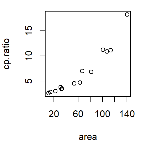
In R, a scatter plot can be easily created using the base plotting environment. Below, is an example of this process with the built-in mtcars dataset.
plot(mpg ~ hp, mtcars)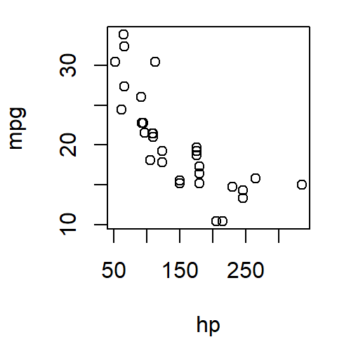
The formula mpg ~ hp can be interpreted as …mpg as a function of hp…, where mpg (miles per gallon) is plotted on the y-axis and hp (horsepower) on the x-axis.
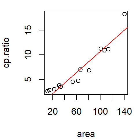
To overlay a regression line on the scatter plot, you first need to define a linear model using the lm() function.
M1 <- lm(mpg ~ hp, mtcars)Here, a first-order polynomial (linear) model is fitted to the data. The mpg ~ hp carries the same interpretation as in the plot() function. The model coefficients (intercept and slope) can be extracted as a numeric vector from the model M1 using the coef() function.
coef(M1)(Intercept) hp
30.09886054 -0.06822828 Once the model is defined, you can add the regression line to the plot by passing the M1 model to abline() as an argument.
plot(mpg ~ hp, mtcars)
abline(M1, col = "red")
In this example, the regression line is displayed in red.
To fit a second-order polynomial (quadratic) model, extend the formula by adding a second-order term using the I() function:
M2 <- lm(mpg ~ hp + I(hp^2), mtcars)When raising an independent variable \(x\) to a power using the hat (^) operator, you must wrap the term with I(). Without it, lm() may misinterpret the formula leading to unintended behavior.
Adding the quadratic regression line (or any higher-order polynomial model) to the plot requires generating predicted values using the predict() function. These predictions are then plotted using the lines() function:
plot(mpg ~ hp, mtcars)

# Create sequence of hp values to use in predicting mpg
x.pred <- data.frame( hp = seq(min(mtcars$hp), max(mtcars$hp), length.out = 50))

# Predict mpg values based on the quadratic model
y.pred <- predict(M2, x.pred)

# Add the quadratic regression line to the plot
lines(x.pred$hp, y.pred, col = "red")
In this code, we:
- Create a sequence of
hpvalues covering the range of the dataset. - Predict the corresponding
mpgvalues using the quadratic modelM2. - Add the predicted curve to the plot with
lines().
26.5 Generating bivariate plots with ggplot
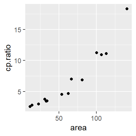
Using the ggplot2 package in R, a scatter plot can be created with minimal effort. Here’s an example using the built-in mtcars dataset:
library(ggplot2)

ggplot(mtcars, aes(x = hp, y = mpg)) + geom_point()
In this code, ggplot() initializes the plot and specifies the dataset (mtcars) and aesthetics (aes()), where x = hp and y = mpg. geom_point() adds points to create the scatter plot.
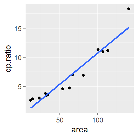
To add a linear regression line to the scatter plot, use the stat_smooth() function:
ggplot(mtcars, aes(x = hp, y = mpg)) + geom_point() +
             stat_smooth(method ="lm", se = FALSE)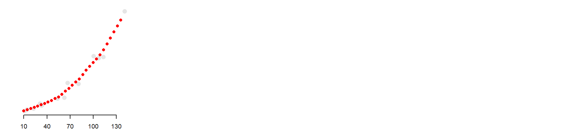
Here, the method = "lm" argument specifies that a linear model (lm) is used for the regression line. The se = FALSE argument prevents the addition of a confidence interval around the regression line. (Confidence intervals are not covered in this course). Note that there’s no need to create a separate model outside the ggplot pipeline, as the stat_smooth() function handles it automatically.
The stat_smooth() function can also fit higher-order polynomial models by specifying the desired formula. For instance, to fit a quadratic model:
ggplot(mtcars, aes(x = hp, y = mpg)) + geom_point() +
             stat_smooth(method ="lm", se = FALSE,  formula = y ~  x + I(x^2) )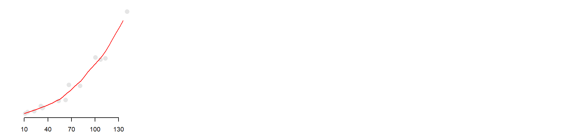
In this case, the formula argument defines the model as \(y= a + bx + cx^2\), where \(x\) and \(y\) refer to the x- and y-axes, respectively. The I() function ensures that the quadratic term (x^2) is treated correctly in the formula.
It’s worth noting that the formula directly references x and y instead of specific column names. This generality allows the formula to adapt to the axis mappings defined in the aes() function.
Examples of other formulae that can be defined in stat_smooth are shown next:
| Model Formula | Equation |
|---|---|
y ~ 1 |
\(y = a\) |
y ~ x |
\(y = a + bx\) (default model) |
y ~ x + I(x^2) |
\(y = a + bx + cx^2\) |
y ~ x + I(x^2) + I(x^3) |
\(y = a + bx + cx^2 + dx^3\) |
26.6 Summary
In this chapter, we explored how to model relationships between two continuous variables using parametric polynomial models. Starting with a constant model as a baseline, we progressed to linear and quadratic fits, each capturing more structure in the data.
Polynomial models are useful when the relationship between variables can be described by a simple mathematical expression. They are easy to interpret, efficient to compute, and well-suited for confirmatory analysis and prediction—especially when the form of the relationship is known or hypothesized.
In the next chapter, we’ll explore non-parametric alternatives like loess, which offer greater flexibility when the form of the relationship is unknown or nonlinear.