| tukeyedar |
|---|
| 0.5.0 |
30 Visualizing Variability Decomposition in Bivariate Models
In bivariate analysis, a key objective is to identify a model that maximizes our ability to explain the variability in the response variable, Y. The more variability in Y that is explained by the model, the smaller the uncertainty in estimating Y for each value of the predictor variable, X. This goal translates into minimizing the spread of residuals relative to the variability captured by the model.
The figure below illustrates this concept using three scenarios of increasing model complexity:
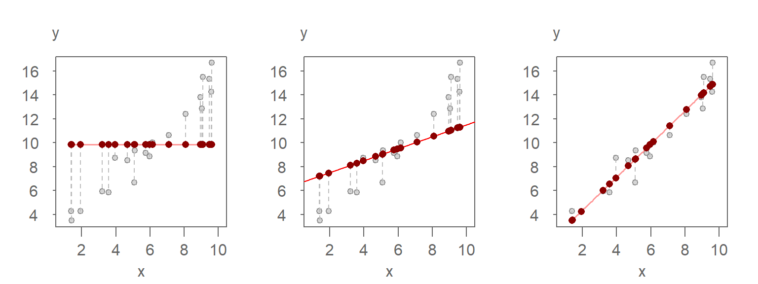
Left plot: A mean-only model (0th-order polynomial) predicts the same constant value for all observations. The red points represent the predicted values, and the vertical dashed lines show the residuals—the differences between the observed (grey) and predicted (red) values. Since the model does not account for any variation in X, all variability in Y remains unexplained.
Middle plot: A linear model (1st-order polynomial) is fitted to the data. The predicted values now vary with X, and the residuals are smaller than in the mean-only model. The model explains some of the variability in Y (about 4 units).
Right plot: A better-fitting linear model (also a 1st-order polynomial) explains a larger portion of the variability in Y. The predicted values span a wider range (about 11 units), and the residuals are relatively small-averaging about 1 unit-indicating that most of the variability in Y is now accounted for by the model.
While scatter plots like these can provide insight into model performance—especially in extreme cases—they are not always ideal for assessing how well a model explains variability across the full range of the data. A variability decomposition (VD) plot, first introduced in Chapter 21, is specifically designed to evaluate this aspect. It provides a more structured and comparative view of how much of the total variability is captured by the model versus what remains in the residuals.
In the next section, we’ll use the variability decomposition plot to formalize and visualize these differences more clearly.
30.1 Conceptual Overview
The variability decomposition plot visually partitions the total spread of the response variable into:
- Fitted values: representing the portion of variability explained by the model. These values are typically centered around zero to emphasize the range they cover rather than their absolute magnitude.
- Residuals: representing the portion of variability not explained by the model.
This decomposition is analogous to the concept behind \(R^2\), but it is presented graphically to support exploratory analysis and intuitive understanding.
30.2 Exploring VD for different scenarios
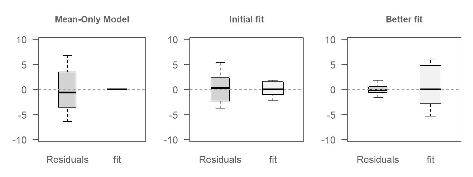
To illustrate how a model fit affects variability decomposition, we showcase three scenarios:
30.2.1 Scenario 1: Mean-Only Model
In this case, the model fits only the mean of \(Y\), ignoring any relationship with \(X\). Hence, all variability in \(Y\) is captured by the residuals.
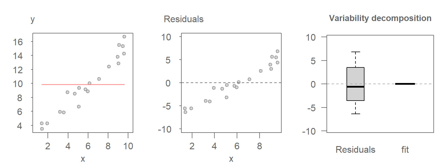
Here, the range covered by the Residuals boxplot matches that of the original values, as expected.
30.2.2 Scenario 2: A linear model
Here, a linear relationship between \(X\) and \(Y\) is introduced. The model captures some of a the variability in the data, and the residuals account for the rest.
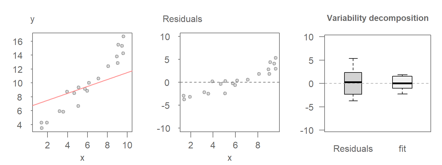
The Residuals boxplot covers a smaller range than was covered in scenario 1 with non-zero variability now being picked up by the fitted values.
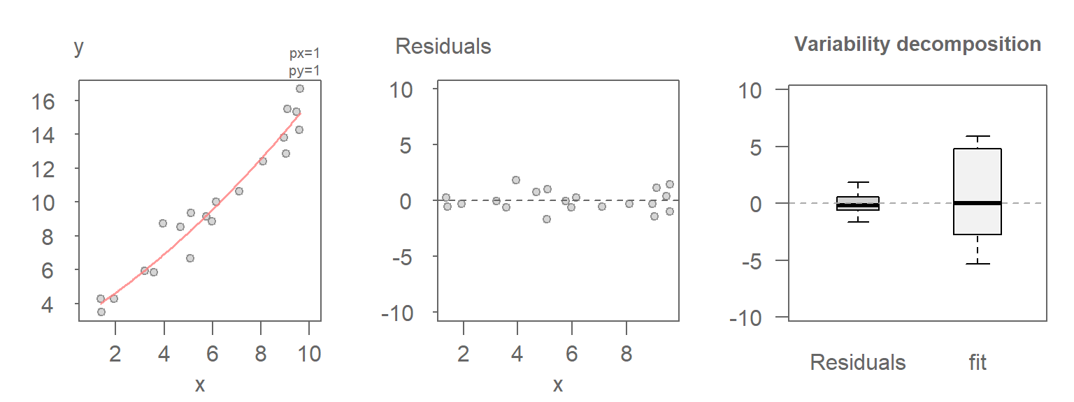
30.2.3 Scenario 3: A better-fitting model
In this last scenario, a better fitting model is used between \(Y\) and \(X\), thus reducing the amount of unexplained variability in the data.
30.2.4 Comparing the VD plots
The figure that follows shows the VD plots for the above scenarios side-by-side. Note the increasing amount of variability being explained by the fit vis-a-vis the residuals with improving model.
30.3 Interpreting VD plots in terms of predictive power
As the model explains more of the variability in \(Y\), our ability to make precise predictions or estimates of \(Y\) for a given value of \(X\) improves. This is because the residual spread (the part of the data not captured by the model) shrinks leaving less uncertainty in the predicted values.
In the VD plots above:
The mean-only model shows that all variability remains in the residuals. This means that knowing \(X\) tells us nothing about \(Y\); predictions are no better than guessing the average.
The initial linear model captures some structure, reducing the residual spread. Predictions improve, but there’s still considerable uncertainty.
The better-fitting model explains most of the variability in Y, leaving only a narrow band of residuals. This means that for any given X, the predicted Y is much more reliable.
This relationship between explained variability and predictive precision is central to model evaluation. The more variability the model accounts for, the more confidently we can use it to estimate outcomes.
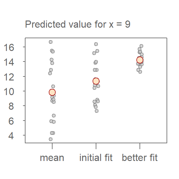
To illustrate this, the following plot shows the predicted values for a fixed value of \(x = 9\) across the three models. The red points represent the model’s estimate of \(y\), while the grey points represent the uncertainty derived from the residuals. As model fit improves, the spread of residuals narrows highlighting the increasing precision in estimating \(y\).
30.4 Generating a variability decomposition plot
The variability decomposition (VD) plot can be generated with the eda_vd function from the tukeyedar package. It takes as input a model generated by lm.
In an earlier chapter, it was determined that a 2nd order polynomial did a good job in capturing the relationship between mpg and hp from the mtcars dataset. We will therefore work off of that model in this example.
The following generates the scatter plot with the fitted model.
# Fit the model to the data
M2 <- lm(mpg ~ hp + I(hp^2), mtcars)
plot(mpg ~ hp, mtcars)
x.pred <- data.frame( hp = seq(min(mtcars$hp), max(mtcars$hp), length.out = 50))
y.pred <- predict(M2, x.pred)
lines(x.pred$hp, y.pred, col = "red")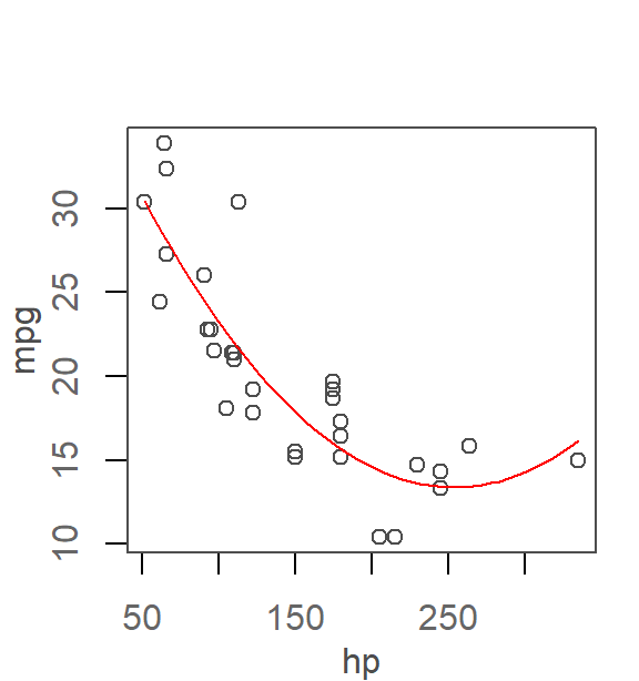
This next code chunk generates the resulting variability decomposition plot.
library(tukeyedar)

eda_vd(M2, type = "box")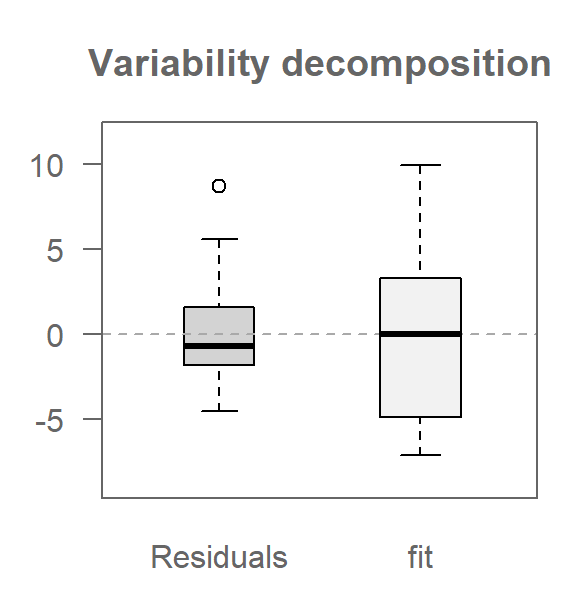
The box argument generates a boxplot of the fitted values instead of the default stacked points used in the univariate VD plots.
30.5 Summary
The variability decomposition (VD) plot provides a powerful visual framework for understanding how much of the total variability in a response variable is explained by a model versus what remains in the residuals. By comparing the spread of fitted values and residuals, we gain insight into the model’s explanatory power and its potential for making reliable predictions.
Through a series of controlled examples, we saw how increasing model complexity (from a mean-only model to a better fitting polynomial) leads to a greater proportion of variability being captured by the model. This reduction in residual spread translates directly into improved predictive precision.