eda_qq Generates an empirical QQ plot and a Tukey
mean-difference plot
Usage
eda_qq(
  x,
  y = NULL,
  fac = NULL,
  norm = FALSE,
  sym = FALSE,
  md = FALSE,
  p = 1L,
  tukey = FALSE,
  base = exp(1),
  fx = NULL,
  fy = NULL,
  show.par = TRUE,
  grey = 0.6,
  pch = 21,
  p.col = "grey50",
  p.fill = "grey80",
  size = 1,
  alpha = 0.8,
  med = TRUE,
  inner = 0.75,
  q = TRUE,
  q.type = 5,
  qcol = rgb(0, 0, 0, 0.05),
  tails = FALSE,
  tail.pch = 21,
  tail.p.col = "grey70",
  tail.p.fill = NULL,
  switch = FALSE,
  xlab = NULL,
  ylab = NULL,
  title = NULL,
  t.size = 1.2,
  plot = TRUE,
  ...
)
Arguments
- x
Vector for first variable, or a dataframe.
- y
Vector for second variable, or column defining the continuous variable if
xis a dataframe.- fac
Column defining the categorical variable if
xis a dataframe. The categorical column must be limited to two levels (groups). dataframe. Ignored ifxandyare vectors.- norm
Defunct. Use
eda_theoinstead.- sym
Defunct. Use
eda_syminstead.- md
Boolean determining if a Tukey mean-difference plot should be generated.
- p
Power transformation to apply to continuous variable(s).
- tukey
Boolean determining if a Tukey transformation should be adopted (FALSE adopts a Box-Cox transformation).
- base
Base used with the log() function if
p = 0.- fx
Formula to apply to x variable before pairing up with y. This is computed after any transformation is applied to the x variable.
- fy
Formula to apply to y variable before pairing up with x. This is computed after any transformation is applied to the y variable.
- show.par
Boolean determining if parameters such as power transformation and formula should be displayed.
- grey
Grey level to apply to plot elements (0 to 1 with 1 = black).
- pch
Point symbol type.
- p.col
Color for point symbol.
- p.fill
Point fill color passed to
bg(Only used forpchranging from 21-25).- size
Point size.
- alpha
Point transparency (0 = transparent, 1 = opaque). Only applicable if
rgb()is not used to define point color.- med
Boolean determining if median lines should be drawn.
- inner
Fraction of the data considered as "mid values". Defaults to 75%. Used to define shaded region boundaries,
q, or to identify which of the tail-end points are to be symbolized differently,tails=TRUE.- q
Boolean determining if
innerdata region should be shaded.- q.type
An integer between 1 and 9 selecting one of the nine quantile algorithms. (See
quantilefunction).- qcol
Fill color of inner quantile box.
- tails
Boolean determining if points outside of the
innerregion should be symbolized differently. Tail-end points are symbolized via thetail.pch,tail.p.colandtail.p.fillarguments.- tail.pch
Tail-end point symbol type (See
tails).- tail.p.col
Tail-end color for point symbol (See
tails).- tail.p.fill
Tail-end point fill color passed to
bg(Only used fortail.pchranging from 21-25).- switch
Boolean determining if the axes should be swapped in an empirical QQ plot. Only applies to dataframe input. Ignored if vectors are passed to the function.
- xlab
X label for output plot. Ignored if
xis a dataframe.- ylab
Y label for output plot. Ignored if
xis a dataframe.- title
Title to add to plot.
- t.size
Title size.
- plot
Boolean determining if plot should be generated.
- ...
Arguments passed on to
.eda_plot_xydatOptional data frame containing
xandy.pxPower transformation used in the input data to display if
show.par = TRUE.pyPower transformation used in the input data to display if
show.par = TRUE.raw_tickLogical. If
TRUE, original (untransformed) equally spaced tick values are displayed on the re-expressed axes.xlimX-axis range.
ylimY-axis range.
regLogical; whether to fit and display a regression line.
polyInteger; regression model polynomial degree (defaults to 1 for linear model).
robustLogical; if
TRUE, uses robust regression (MASS::rlm).rlm.dList; parameters for
MASS::rlm, (e.g.,list(psi = "psi.bisquare")).wOptional numeric vector of weights for regression.
lm.colRegression line color.
lm.lwNumeric; Regression line width.
lm.ltyNumeric; Regression line type.
sdLogical; whether to show ±1 SD lines.
mean.lLogical; whether to show x and y mean reference lines.
aspLogical; whether to preserve the aspect ratio (ignored if
square = FALSE).squareLogical; whether to create a square plotting window.
loeLogical; whether to plot loess smooth line.
loe.lwNumeric; Loess smooth line width.
loe.colLoess smooth color.
loe.ltyNumeric; Loess smooth line type.
loess.dList; parameters for
loess.smooth, e.g.,list(span = 0.7, degree = 1).statsLogical; if
TRUE, displays model statistics (R², β, p-value).stat.sizeText size for
statsplot display.hlineNumeric; location(s) of additional horizontal reference lines. Can be passed via the
c()function.vlineNumeric; location(s) of additional vertical reference lines. Can be passed via the
c()function.
Value
Returns a list with the following components:
data: Dataframe with inputxandyvalues. Data will be interpolated to smallest quantile batch if batch sizes differ. Values will reflect power transformation defined inp.p: Re-expression applied to original values.fx: Formula applied to x variable.fy: Formula applied to y variable.
Details
By default, the QQ plot will highlight the inner 75% of the data
for both x and y axes to mitigate the visual influence of extreme values.
The inner argument controls the extent of this region. For example
inner = 0.5 will highlight the IQR region.
If the shaded regions are too distracting, you can opt to have the
tail-end points symbolized differently by setting tails = TRUE and
q = FALSE. The tail-end point symbols can be customized via the
tail.pch, tail.p.col and tail.p.fill arguments.
The middle dashed line represents each batch's median value. It can be
turned off by setting med = FALSE
Console output prints the suggested multiplicative and additive offsets. It
adopts a resistant line fitting technique to derive the coefficients. The
suggested offsets output applies to the raw or re-expressed data but it
ignores any fx or fy transformations applied to the data.
Note that the suggested offsets may not always be the most parsimonious fit.
Eyeballing the offsets may sometimes result in a more satisfactory
characterization of the differences between batches. See the QQ plot
article for an introduction on its use and interpretation.
To generate a Tukey mean-difference plot, set med = TRUE.
For more information on this function and on interpreting a QQ plot see
the QQ plot article.
References
John M. Chambers, William S. Cleveland, Beat Kleiner, Paul A. Tukey. Graphical Methods for Data Analysis (1983)
Examples
# Passing data as a dataframe
singer <- lattice::singer
dat <- singer[singer$voice.part %in% c("Bass 2", "Tenor 1"), ]
eda_qq(dat, height, voice.part)
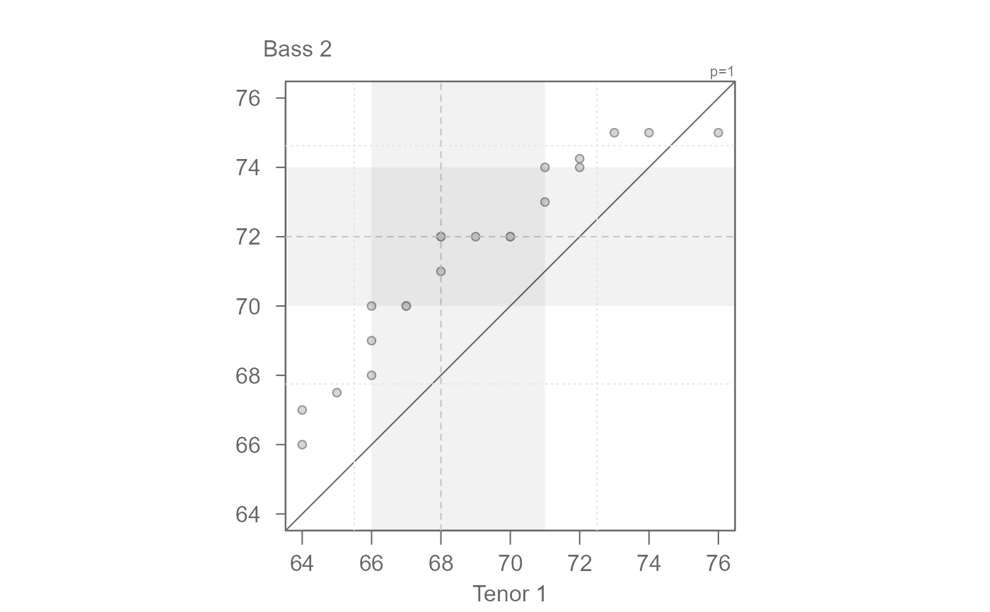 #> [1] "Suggested offsets:y = x * 1.04 + (-5.2163)"
# If the shaded region is too distracting, you can apply a different symbol
# to the tail-end points and different color to the points falling in the
# inner region.
eda_qq(dat, height, voice.part, q = FALSE, tails = TRUE, tail.pch = 3,
p.fill = "coral", size = 1.2, med = FALSE)
#> [1] "Suggested offsets:y = x * 1.04 + (-5.2163)"
# If the shaded region is too distracting, you can apply a different symbol
# to the tail-end points and different color to the points falling in the
# inner region.
eda_qq(dat, height, voice.part, q = FALSE, tails = TRUE, tail.pch = 3,
p.fill = "coral", size = 1.2, med = FALSE)
 #> [1] "Suggested offsets:y = x * 1.04 + (-5.2163)"
# For a more traditional look to the QQ plot
eda_qq(dat, height, voice.part, med = FALSE, q = FALSE)
#> [1] "Suggested offsets:y = x * 1.04 + (-5.2163)"
# For a more traditional look to the QQ plot
eda_qq(dat, height, voice.part, med = FALSE, q = FALSE)
 #> [1] "Suggested offsets:y = x * 1.04 + (-5.2163)"
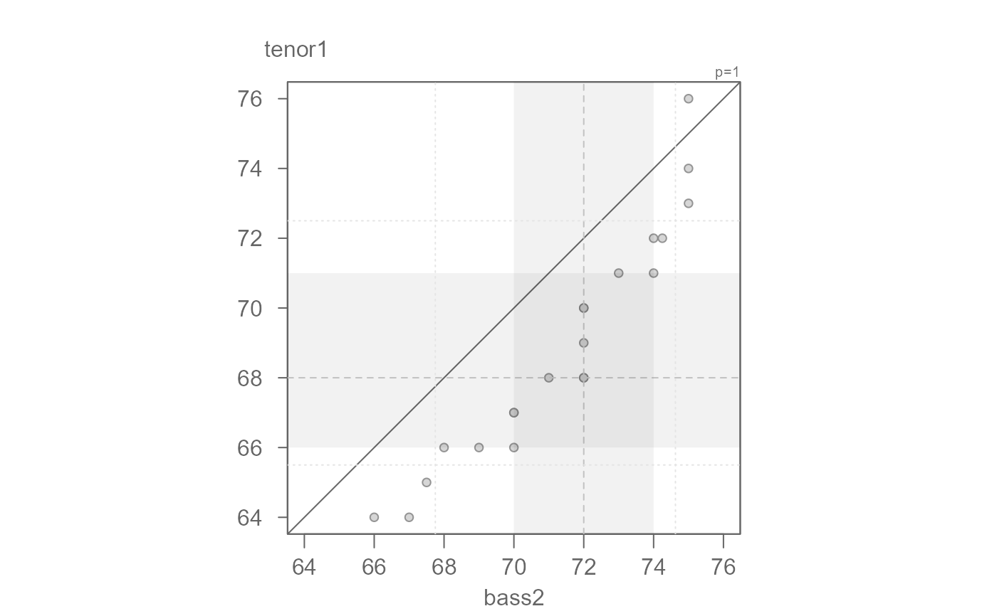
# Passing data as two separate vector objects
bass2 <- subset(singer, voice.part == "Bass 2", select = height, drop = TRUE )
tenor1 <- subset(singer, voice.part == "Tenor 1", select = height, drop = TRUE )
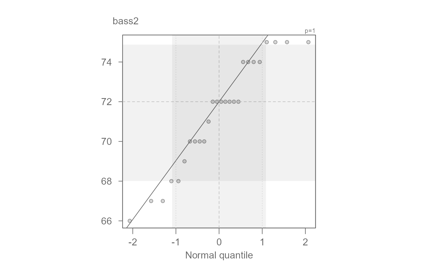
eda_qq(bass2, tenor1)
#> [1] "Suggested offsets:y = x * 1.04 + (-5.2163)"
# Passing data as two separate vector objects
bass2 <- subset(singer, voice.part == "Bass 2", select = height, drop = TRUE )
tenor1 <- subset(singer, voice.part == "Tenor 1", select = height, drop = TRUE )
eda_qq(bass2, tenor1)
 #> [1] "Suggested offsets:y = x * 1.04 + (-5.2163)"
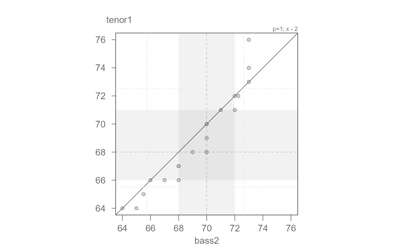
# The function suggests an offset of the form y = x * 1.04 - 5.2
eda_qq(bass2, tenor1, fx = "x * 1.04 - 5.2")
#> [1] "Suggested offsets:y = x * 1.04 + (-5.2163)"
# The function suggests an offset of the form y = x * 1.04 - 5.2
eda_qq(bass2, tenor1, fx = "x * 1.04 - 5.2")
 #> [1] "Suggested offsets:y = x * 1.04 + (-5.2163)"
# The suggested offset helps align the points along the x=y line, but we
# we might come up with a better characterization of this offset.
# There seems to be an additive offset of about 2 inches. By subtracting 2
# from the x variable, we should have points line up with the x=y line
eda_qq(bass2, tenor1, fx = "x - 2")
#> [1] "Suggested offsets:y = x * 1.04 + (-5.2163)"
# The suggested offset helps align the points along the x=y line, but we
# we might come up with a better characterization of this offset.
# There seems to be an additive offset of about 2 inches. By subtracting 2
# from the x variable, we should have points line up with the x=y line
eda_qq(bass2, tenor1, fx = "x - 2")
 #> [1] "Suggested offsets:y = x * 1.04 + (-5.2163)"
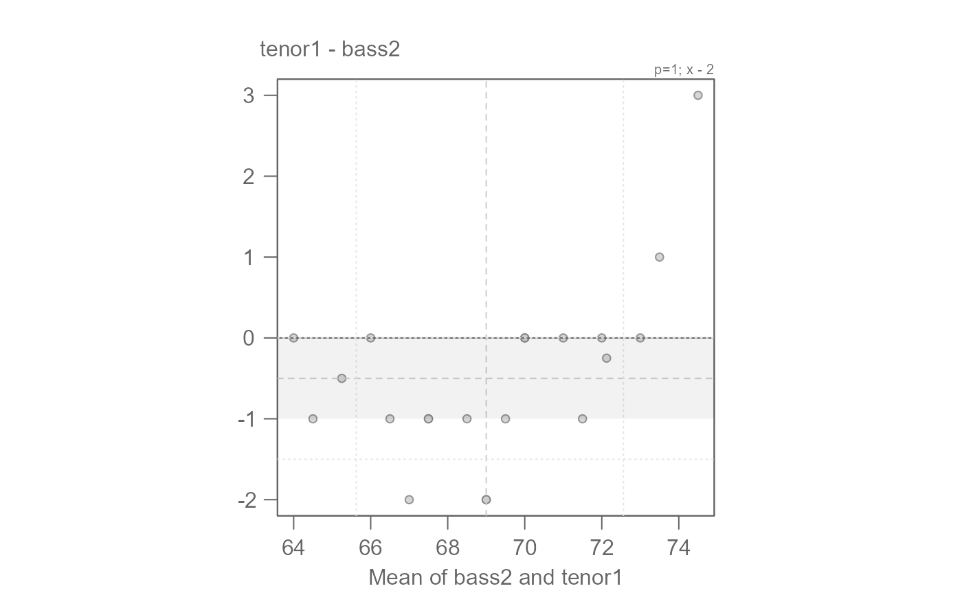
# We can fine-tune by generating the Tukey mean-difference plot
eda_qq(bass2, tenor1, fx = "x - 2", md = TRUE)
#> [1] "Suggested offsets:y = x * 1.04 + (-5.2163)"
# We can fine-tune by generating the Tukey mean-difference plot
eda_qq(bass2, tenor1, fx = "x - 2", md = TRUE)
 #> [1] "Suggested offsets:y = x * 1.04 + (-5.2163)"
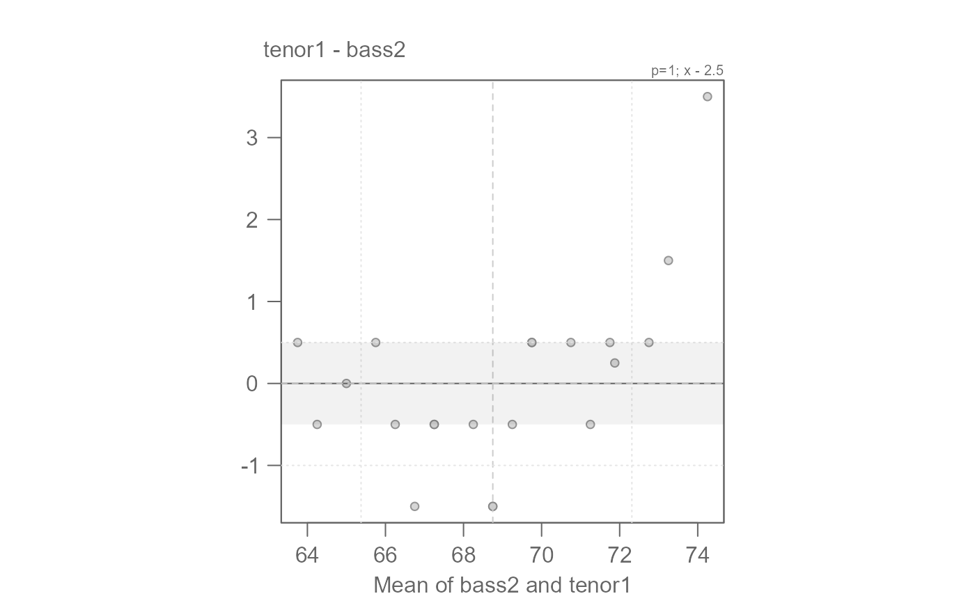
# An offset of another 0.5 inches seems warranted
# We can say that overall, bass2 singers are 2.5 inches taller than tenor1.
# The offset is additive.
eda_qq(bass2, tenor1, fx = "x - 2.5", md = TRUE)
#> [1] "Suggested offsets:y = x * 1.04 + (-5.2163)"
# An offset of another 0.5 inches seems warranted
# We can say that overall, bass2 singers are 2.5 inches taller than tenor1.
# The offset is additive.
eda_qq(bass2, tenor1, fx = "x - 2.5", md = TRUE)
 #> [1] "Suggested offsets:y = x * 1.04 + (-5.2163)"
# Note that the "suggested offset" in the console could have also been
# applied to the data (though this formula is a bit more difficult to
# interpret than our simple additive model)
eda_qq(bass2, tenor1, fx = "x * 1.04 -5.2", md = TRUE)
#> [1] "Suggested offsets:y = x * 1.04 + (-5.2163)"
# Note that the "suggested offset" in the console could have also been
# applied to the data (though this formula is a bit more difficult to
# interpret than our simple additive model)
eda_qq(bass2, tenor1, fx = "x * 1.04 -5.2", md = TRUE)
 #> [1] "Suggested offsets:y = x * 1.04 + (-5.2163)"
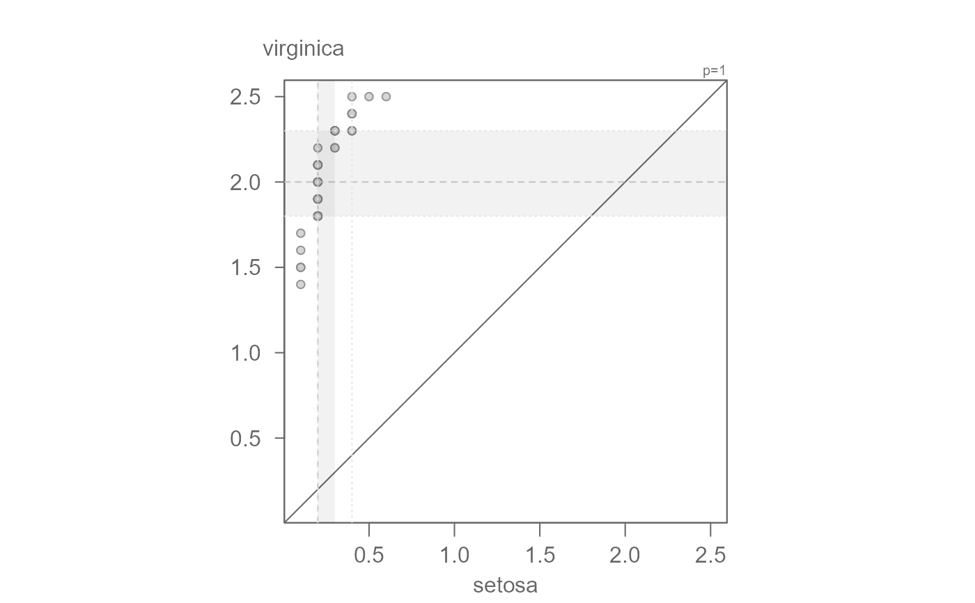
# Example 2: Sepal width
setosa <- subset(iris, Species == "setosa", select = Petal.Width, drop = TRUE)
virginica <- subset(iris, Species == "virginica", select = Petal.Width, drop = TRUE)
eda_qq(setosa, virginica)
#> [1] "Suggested offsets:y = x * 1.04 + (-5.2163)"
# Example 2: Sepal width
setosa <- subset(iris, Species == "setosa", select = Petal.Width, drop = TRUE)
virginica <- subset(iris, Species == "virginica", select = Petal.Width, drop = TRUE)
eda_qq(setosa, virginica)
 #> [1] "Suggested offsets:y = x * 1.7143 + (1.6286)"
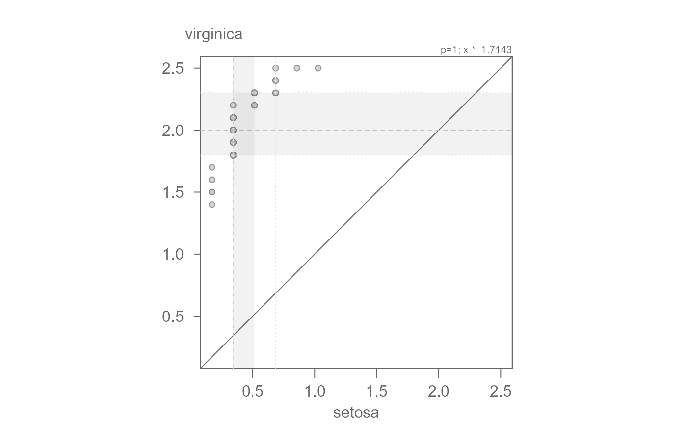
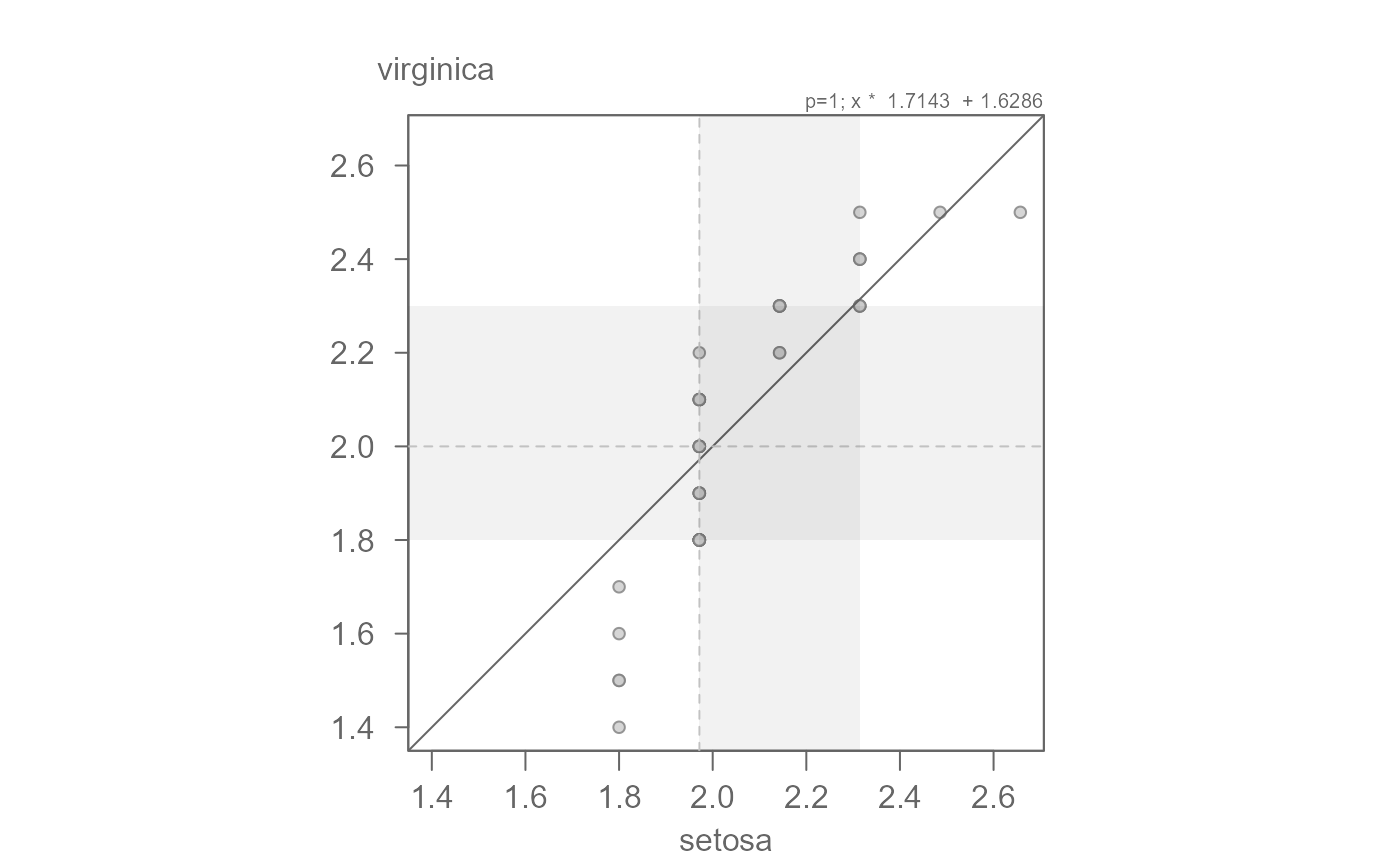
# The points are not completely parallel to the x=y line suggesting a
# multiplicative offset. The slope may be difficult to eyeball. The function
# outputs a suggested slope and intercept. We can start with that
eda_qq(setosa, virginica, fx = "x * 1.7143")
#> [1] "Suggested offsets:y = x * 1.7143 + (1.6286)"
# The points are not completely parallel to the x=y line suggesting a
# multiplicative offset. The slope may be difficult to eyeball. The function
# outputs a suggested slope and intercept. We can start with that
eda_qq(setosa, virginica, fx = "x * 1.7143")
 #> [1] "Suggested offsets:y = x * 1.7143 + (1.6286)"
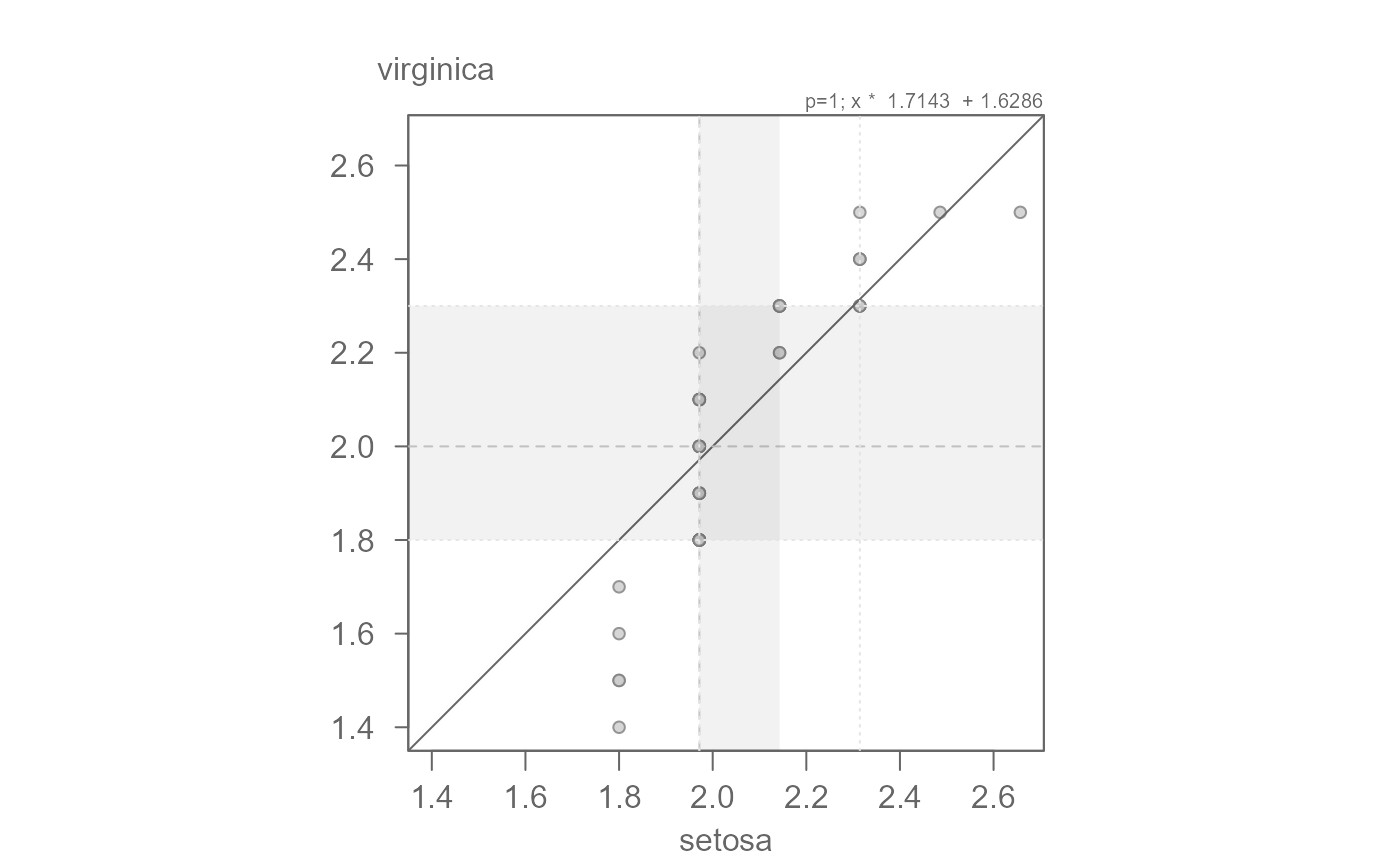
# Now let's add the suggested additive offset.
eda_qq(setosa, virginica, fx = "x * 1.7143 + 1.6286")
#> [1] "Suggested offsets:y = x * 1.7143 + (1.6286)"
# Now let's add the suggested additive offset.
eda_qq(setosa, virginica, fx = "x * 1.7143 + 1.6286")
 #> [1] "Suggested offsets:y = x * 1.7143 + (1.6286)"
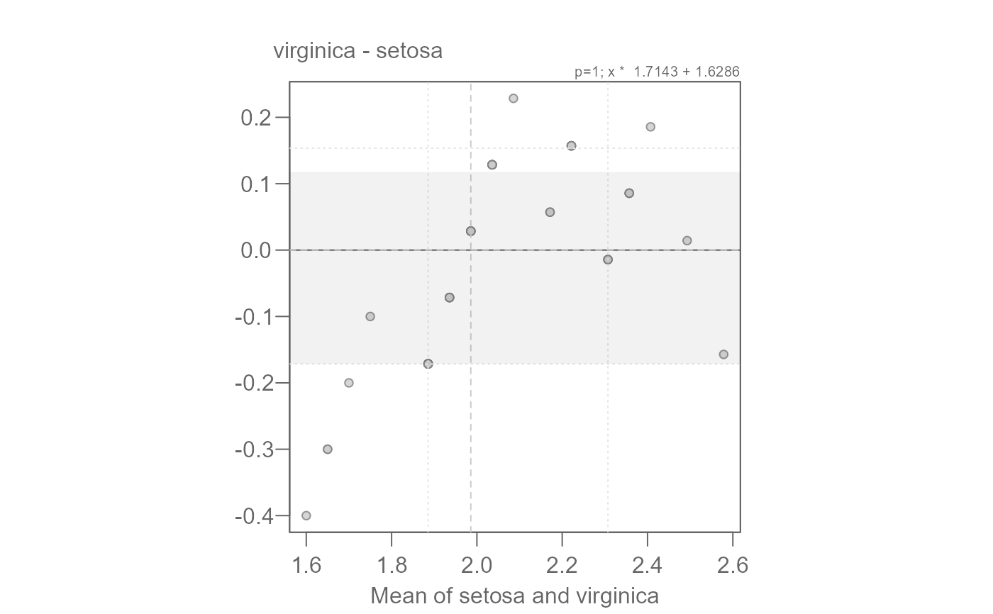
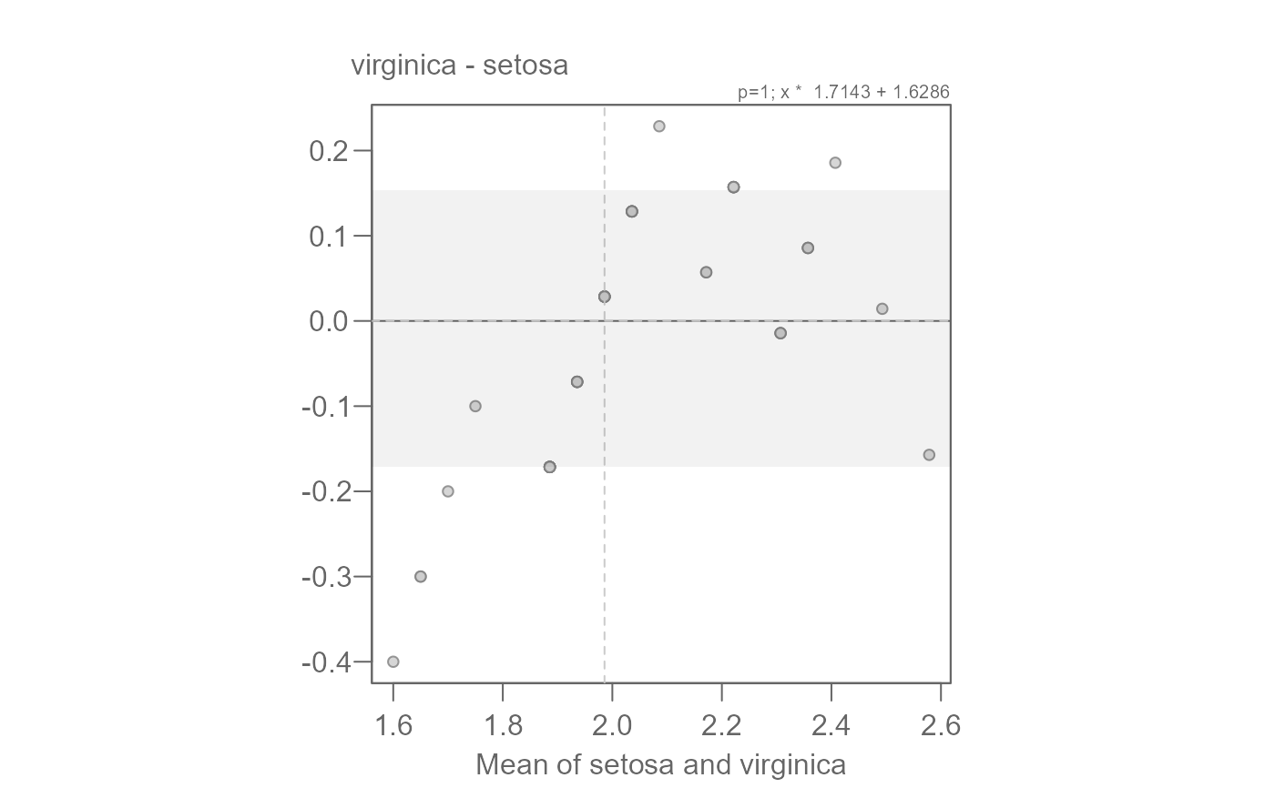
# We can confirm this value via the mean-difference plot
# Overall, we have both a multiplicative and additive offset between the
# species' petal widths.
eda_qq(setosa, virginica, fx = "x * 1.7143 + 1.6286", md = TRUE)
#> [1] "Suggested offsets:y = x * 1.7143 + (1.6286)"
# We can confirm this value via the mean-difference plot
# Overall, we have both a multiplicative and additive offset between the
# species' petal widths.
eda_qq(setosa, virginica, fx = "x * 1.7143 + 1.6286", md = TRUE)
 #> [1] "Suggested offsets:y = x * 1.7143 + (1.6286)"