The empirical QQ plot (and derived Tukey mean-difference plot)
Manuel Gimond
2026-06-05
Source:vignettes/qq.Rmd
qq.RmdIntroduction
The empirical quantile-quantile plot (QQ plot) is probably one of the most underused and least appreciated plots in univariate analysis. It is used to compare two distributions across their full range of values. It is a generalization of the boxplot in that it does not limit the comparison to just the median and upper and lower quartiles. In fact, it compares all values by matching each value in one batch to its corresponding quantile in the other batch. The sizes of each batch need not be the same. If they differ, the larger batch is interpolated down to the smaller batch’s set of quantiles.
A QQ plot does not only help visualize the differences in distributions, but it can also model the relationship between both batches. Note that this is not to be confused with modeling the relationship between a bivariate dataset where the latter pairs up the points by observational units whereas a QQ plot pairs up the values by their matching quantiles.
Anatomy of the eda_qq plot
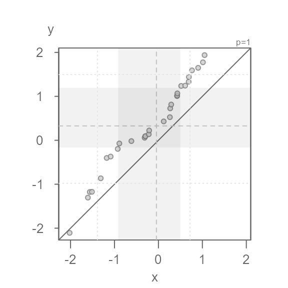
#> [1] "Suggested offsets:y = x * 1.4573 + (0.9914)"- Each point represents matching quantiles from each batch.
- The shaded region represent each batch’s middle values ( 75% of middle values by default).
- The dashed lines inside the shaded boxes represent each batch’s medians.
- The upper right-hand text indicates the power
transformation applied to the both batches (default is a power of
1which is original measurement scale). If a formula is applied to one or both batches, it too will appear in the upper right-hand text. - The
eda_qqwill also output the suggested relationship between the y variable and the x variable in the console. It bases this on each batch’s interquartile values. - If the output is assigned to a new object, that object will store a
list of the following values: the
xvalue (interpolated if needed), theyvalue (interpolated if needed), the power parameter (p), the formula applied to the x variable, and the formula applied to the y variable.
An overview of some of the function arguments
Data type
The function will accept a dataframe with a column of the
quantitative variable of interest, and a column of the category each
measurement belongs to. It will also accept two separate vector
objects. For example, to pass two separate vector object,
x and y, type:

If the data are in a dataframe, type:
dat <- data.frame(val = c(x, y), cat = rep(c("x", "y"), each = 30))
eda_qq(dat, val, cat)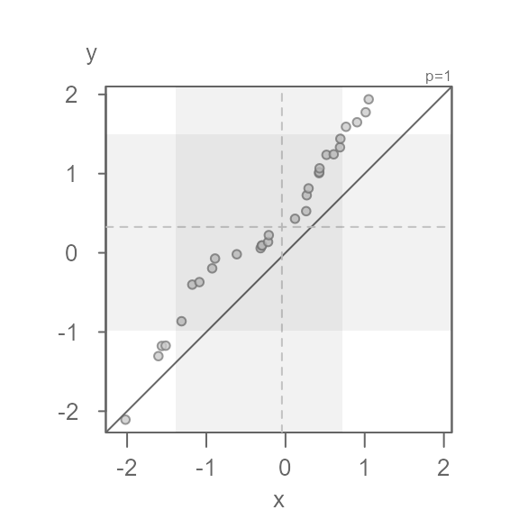
Suppressing the plot
You can suppress the plot and have the x and y values outputted to a
list in the data dataframe. If the batches did not match in
size, the output will show their interpolated values such that the
output batches match in size.
The output will also include the power parameter applied to both
batches as well as any formula applied to one or both batches
(fx is the formula applied to the x variable and
fy is the formula applied to the y variable).
Q <- eda_qq(x,y, plot = FALSE)
#>  [1] "Suggested offsets:y = x * 1.12 + (0.5619)"
Q
#>  $data
#>              x           y
#>  1  -2.0207122 -2.10710669
#>  2  -1.6048333 -1.30465821
#>  3  -1.5620907 -1.17618932
#>  4  -1.5128732 -1.17253191
#>  5  -1.3126378 -0.86423268
#>  6  -1.1770882 -0.40162859
#>  7  -1.0871906 -0.37002087
#>  8  -0.9258832 -0.19629536
#>  9  -0.8896555 -0.07210822
#>  10 -0.6152073 -0.01829722
#>  11 -0.3140113  0.05826287
#>  12 -0.2996734  0.09105884
#>  13 -0.2954234  0.09371398
#>  14 -0.2199849  0.13698992
#>  15 -0.2108781  0.22318119
#>  16  0.1202060  0.43006689
#>  17  0.2608893  0.52597363
#>  18  0.2680445  0.72665767
#>  19  0.2910663  0.81351407
#>  20  0.4239690  1.00612388
#>  21  0.4262605  1.01831440
#>  22  0.4301416  1.06713353
#>  23  0.5176361  1.23708449
#>  24  0.6085180  1.24360530
#>  25  0.6880919  1.33232007
#>  26  0.6929772  1.43973056
#>  27  0.7640838  1.59125312
#>  28  0.9037644  1.64852115
#>  29  1.0124869  1.77464625
#>  30  1.0503544  1.93823390
#>
#>  $p
#>  [1] 1
#>
#>  $fx
#>  NULL
#>
#>  $fy
#>  NULL
Defining the grey region
The grey region highlights the core of both batches. By default, this
is set to 75%. Its boundaries can be modified via the inner
argument.
For example, to highlight the mid 68% of values, type:
eda_qq(x, y, inner = 0.68)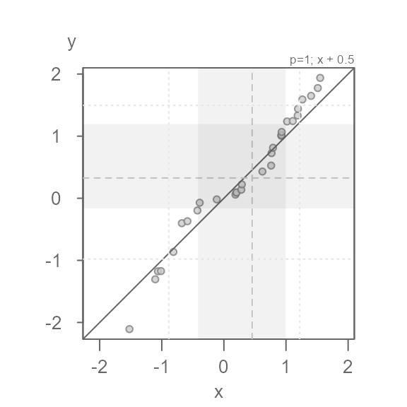
You can suppress the plotting of the shaded region by setting
q = FALSE.
Applying different symbol to tail-end points
If the grey region is too distracting, but you still wish to
distinguish identify the inner core values from the tail-end values, you
can set tails = TRUE to enable to the point symbol option,
and q = FALSE to remove the grey region.
eda_qq(x, y, tails = TRUE, q = FALSE)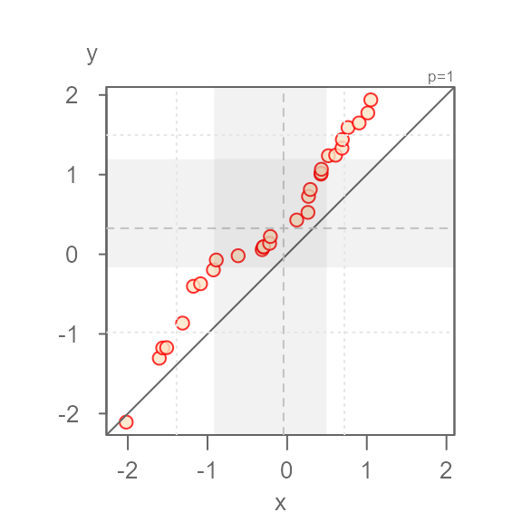
By default, the tail-end points are symbolized using an open point
symbol (as opposed to a filled point symbol applied t the inner core
points). The tail-end point symbol can be modfied via the
tail.pch, tail.col andtail.fill
arguments. For example, to change the tail-end point symbol to a
+ symbol, type:
eda_qq(x, y, tails = TRUE, q = FALSE, tail.pch = 3)
If you want greater emphasis to be placed on the inner core points, change its symbol color. For example:
eda_qq(x, y, tails = TRUE, q = FALSE, tail.pch = 3, p.fill = "coral3")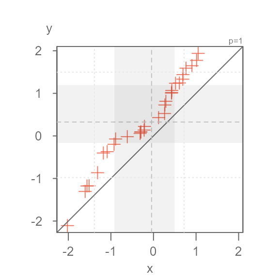
Applying a formula to one of the batches
You can apply a formula to a batch via the fx argument
for the x-variable and the fy argument for the y-variable.
The formula is passed as a text string. For example, to add
0.5 to the x values, type:
eda_qq(x, y, fx = "x + 0.5")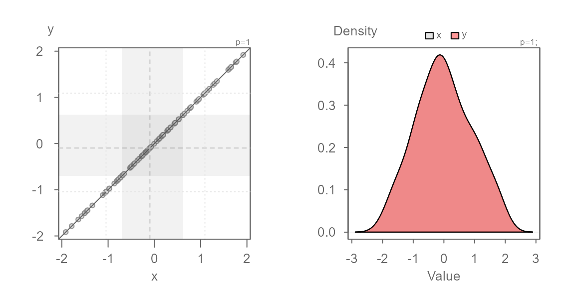
Quantile type
There are many different quantile algorithms available in R. To see
the full list of quantile types, refer to the quantile help page:
?quantile. By default, eda_qq() adopts
q.type = 5. In general, the choice of quantiles will not
really matter, especially for large datasets. If you want to adopt R’s
default type, set q.type = 7.
Point symbols
The default point type, color and size applied to all points
(or just the inner core points if tails = TRUE) can be
modified via the pch, p.col (and/or
p.fill) and size arguments. The color can be
either a built-in color name (you can see the full list by typing
colors()) or the rgb() function. If you define
the color using one of the built-in color names, you can adjust its
transparency via the alpha argument. An alpha
value of 0 renders the point completely transparent and a
value of 1 renders the point completely opaque. The point
symbol can take on two color parameters depending on point type. If
pch is any number between 21 and 25, p.fill
will define its fill color and p.col will define its border
color. For any other point symbol type, the p.fill argument
is ignored.
Here are a few examples:
eda_qq(x, y, p.fill = "bisque", p.col = "red", size = 1.2)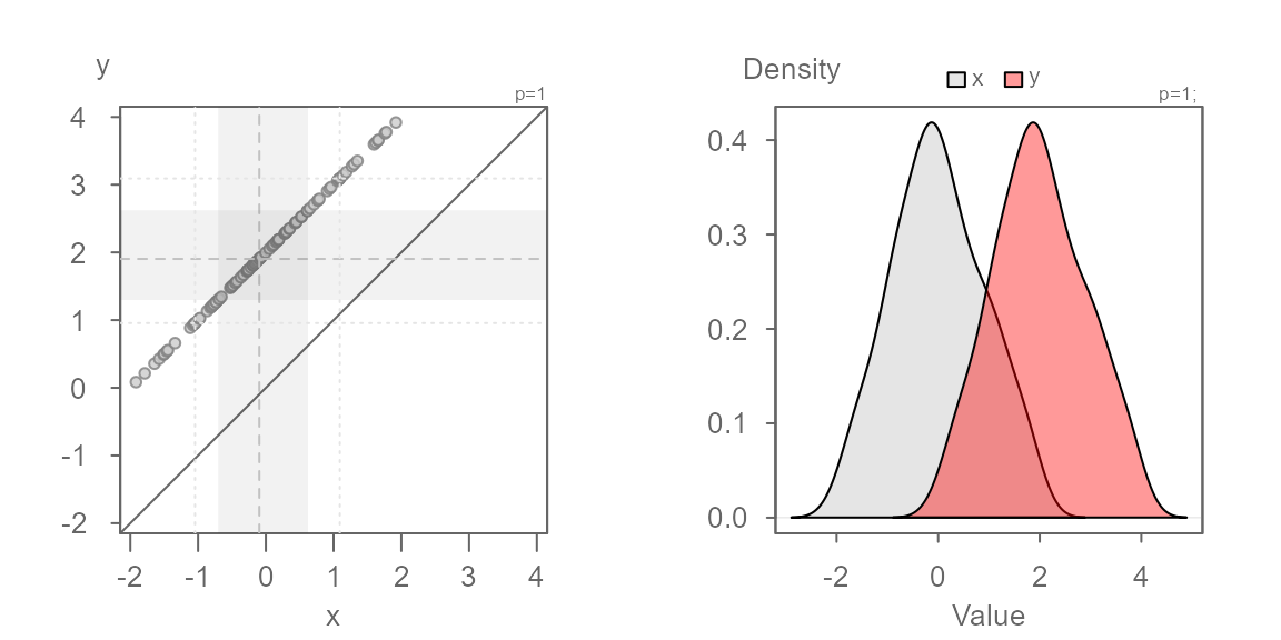
eda_qq(x, y, pch = 16, p.col = "tomato2", size = 1.5, alpha = 0.5)
eda_qq(x, y, pch = 3, p.col = "tomato2", size = 1.5)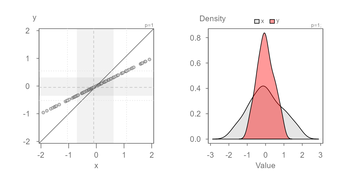
Interpreting a QQ plot
To help interpret the following QQ plots, we’ll compare each plot to its matching kernel density plot.
Identical distributions
In this first example, we will generate a QQ plot of two identical distributions.
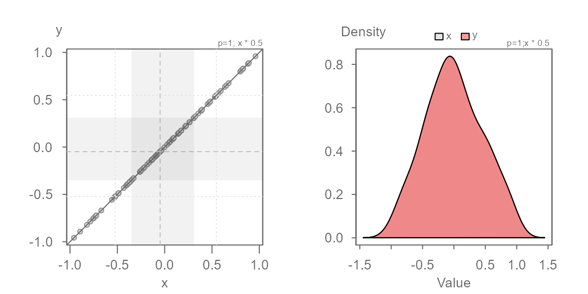
When two distributions are identical, the points will line up along the `\(x=y\) line as shown above. This will also generate overlapping density plots as seen on the right plot.
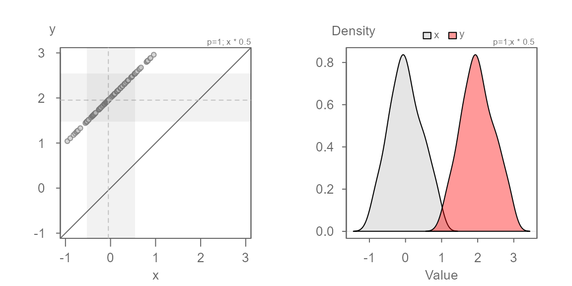
Additive offset
We will work off of the same batches, but this time we will offset
the second batch, y, by 2. This case is
referred to as an additive offset.
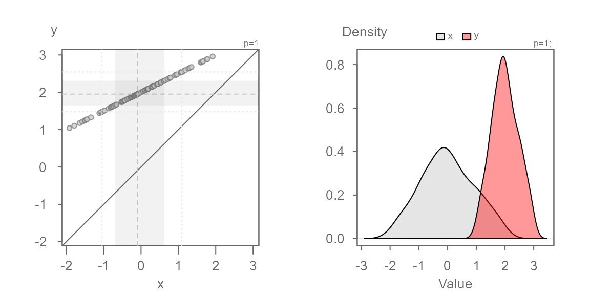
You’ll note that the points are parallel to the \(x=y\) line. This indicates that the
distributions have the exact same shape. But, they do not fall on the
\(x=y\) line–they are offset by
+2 units when measured along the y-axis, as expected. We
can confirm this by adding 2 to the x
batch:

The points now overlap the \(x=y\) line perfectly. The density distribution overlap exactly as well.
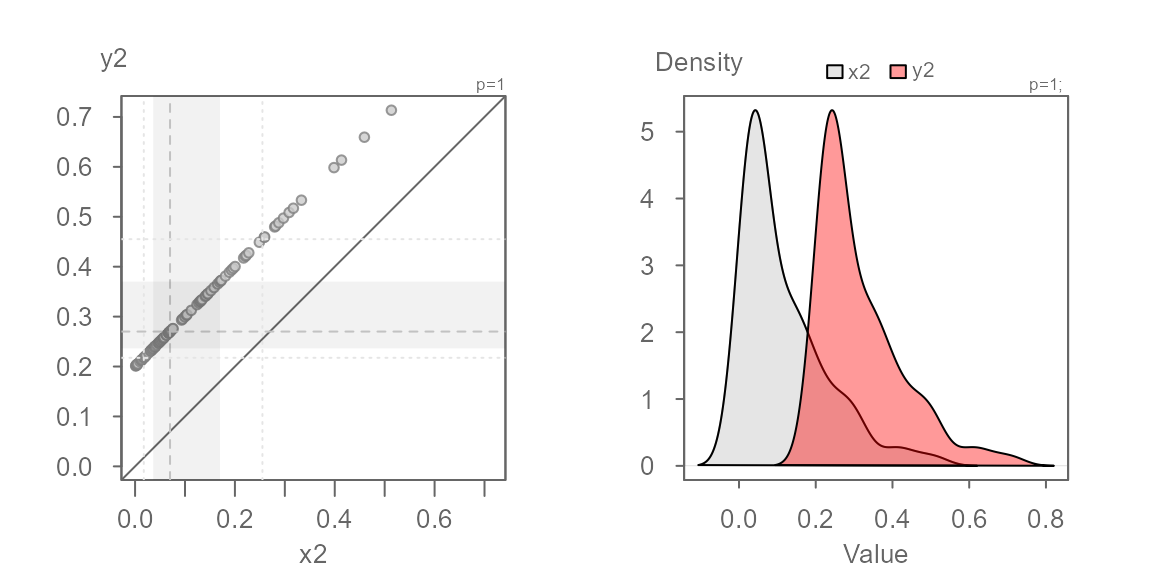
Multiplicative offset
Next, we explore two batches that share the same central value but
where the second batch is 0.5 times that of the first. This
case is referred to as a multiplicative offset.

Here, the series of points are at an angle of the \(x=y\) line yet, you’ll note that the points
follow a perfectly straight line. This suggests a multiplicative offset
with no change in location. This indicates that the “shape” between the
batches are similar, but that one is “wider” than the other. Here,
y is half as wide as x. We can also state that
x is twice as wide as y
We know the multiplicative offset since we synthetically generated
the values x and y. But in practice eyeballing
the multiplier from the plot is not straightforward. We can use the
suggested offset of 0.5 displayed in the console to help
guide us. We can also use the angle between the points and the \(x=y\) line to judge the direction to take
when choosing a multiplier. If the points make up an angle that is less
than the \(x=y\) line, we want to
choose an x multiplier that is less than 1. If
the angle is greater than the \(x=y\)
line, we want to choose a multiplier that is greater than
1.
Here, we know that the multiplier is 0.5. Let’s confirm
this with the following code chunk:
Both additive and multiplicative offset
In this next example, we add both a multiplicative and an additive offset to the data.
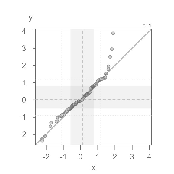
We now see both a multiplicative offset (the points form an angle to the \(x=y\) line) and an additive offset (the points do not intersect the \(x=y\) line). This suggests that the width of the batches differ and that their values are offset by a constant value across the full range of values. It’s usually best to first identify the multiplicative offset such that the points are rendered parallel to the \(x=y\) line. Once the multiplier is identified, we can then identify the additive offset.
No surprise, the multiplier of 0.5 renders the series of
points parallel to the \(x=y\) line. We
can now eyeball the offset of +2 when measuring the
distance between any of the points and the \(x=y\) line when measured along the
y-axis.
We can model the relationship between y and x as \(y = x * 0.5 + 2\).
Batches need not be symmetrical
So far, we have worked with a normally distributed dataset. But note that any distribution can be used in a QQ plot. For example, two equally skewed distributions that differ by their central values will generate points that are perfectly lined up.
Since both distributions have an identical shape, the points will follow a straight line regardless of the nature of the shape (skewed, unimodal, bimodal, etc…).
When distributions are not symmetrical, you should be careful in not letting the long tails of the distribution bias your interpretation of the plots given that the tail-end values will take up a disproportionately larger portion of the plot. Tail-end values tend to be noisy and will undoubtedly generate a QQ plot that may suggest that the distributions are inherently dissimilar. For example, if we generate a plain vanilla plot (i.e. one without the built-in inner core guides) of two batches pulled from an identical theoretical distribution, we get the following QQ plot.
Note how the tail-end values deviate from the \(x=y\) line. They take up nearly a third of the plot leading one to place a disproportionate emphasis on these values. Adding the grey regions and the median value lines helps us identify the bulk of the data (inner 75% by default).
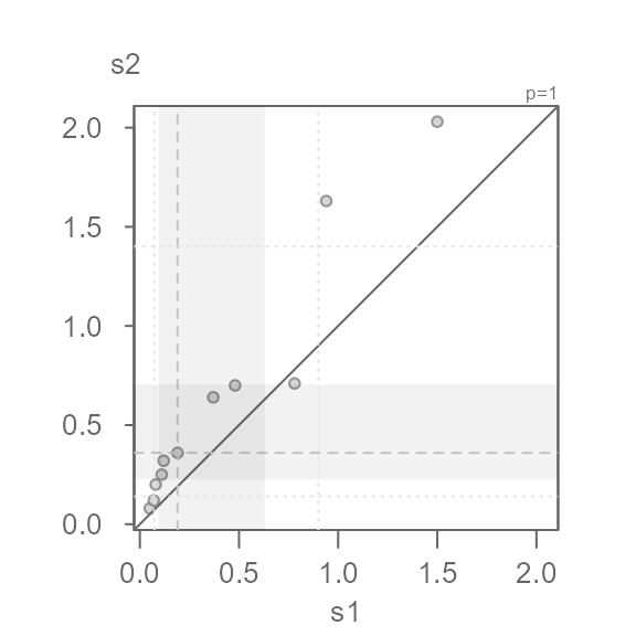
Power transformation
The eda_qq function allows you to apply a power
transformation to both batches. Note that transforming just one batch
makes little sense since you end up comparing two batches measured on a
different scale. In this example, we make use of R’s
Indometh dataset where we compare indometacin plasma
concentrations between two test subjects.
s1 <- subset(Indometh, Subject == 1, select = conc, drop = TRUE) # Test subject 1
s2 <- subset(Indometh, Subject == 2, select = conc, drop = TRUE) # Test subject 2
eda_qq(s1, s2)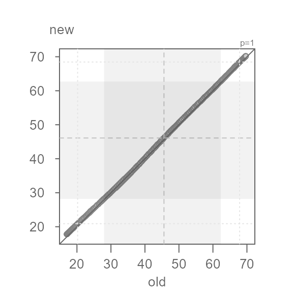
The QQ plot’s shaded regions are shifted towards lower values. The
shaded regions show the mid 75% of values for each batch. When the
regions are shifted towards lower values or higher values, this suggests
skewed data. Another telltale sign of a skewed dataset is the gradual
dispersion of the points in any of the two diagonal directions. Here, we
go from a relatively high density of points near the lower values and a
lower density of points near higher values. This does not preclude us
from identifying multiplicative/additive offsets, but many statistical
procedures benefit from a symmetrical distribution. Given that the
values are measures of concentration, we might want to adopt a
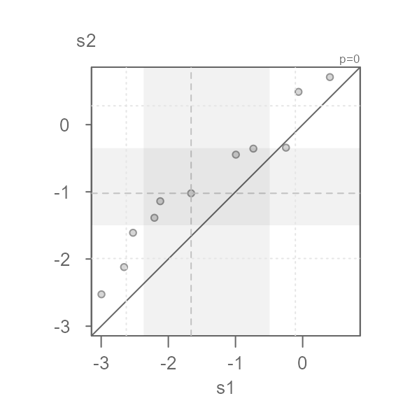
log transformation. The power transformation is defined
with the p argument (a power parameter value of
0 defines a log transformation).
eda_qq(s1, s2, p = 0)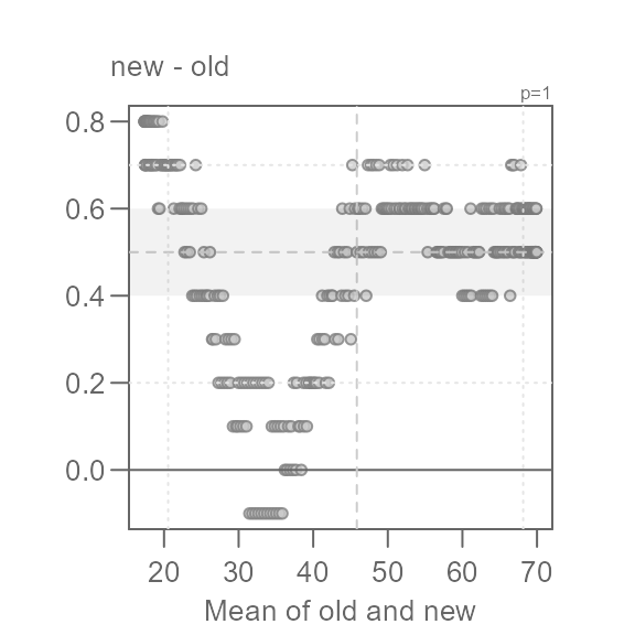
#> [1] "Suggested offsets:y = x * 0.8508 + (0.3914)"This seems to do a decent job of symmetrizing both distributions.
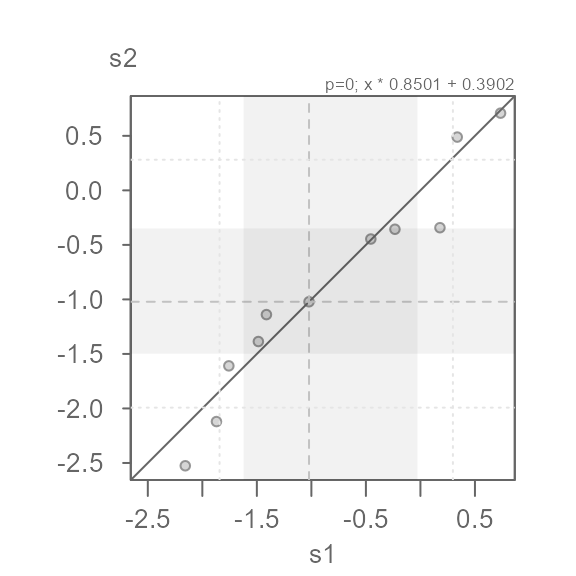
Note that the suggested offset displayed in the console applies to the transformed dataset. We can verify this by applying the offset to the x batch.
eda_qq(s1, s2, p = 0, fx = "x * 0.8501 + 0.3902")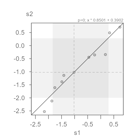
We can characterize the differences in indometacin plasma concentrations between subject 1 and subject 2 as \(log(conc)_{s2} = log(conc)_{s1} * 0.8501 + 0.3902\)
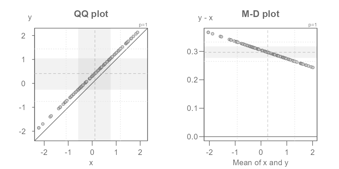
The Tukey mean-difference plot
The Tukey mean-difference plot is simply an
extension of the QQ plot whereby the plot is rotated such that the \(x=y\) line becomes horizontal. This can be
useful in helping identify subtle differences between the point pattern
and the line. The plot is rotated 45° by mapping the difference between
both batches to the y-axis, and mapping the mean between both
batches to the x-axis. For example, the following figure on the left
(the QQ plot) shows the additive offset between both batches but it
fails to clearly identify the multiplicative offset. The latter can be
clearly seen in the Tukey mean-difference plot (on the right) which is
invoked by setting the argument md = TRUE.
set.seed(321)
x <- rnorm(10)
y <- x * 0.97 + 0.3
eda_qq(x, y, title = "QQ plot")
eda_qq(x, y, md = TRUE, title = "M-D plot")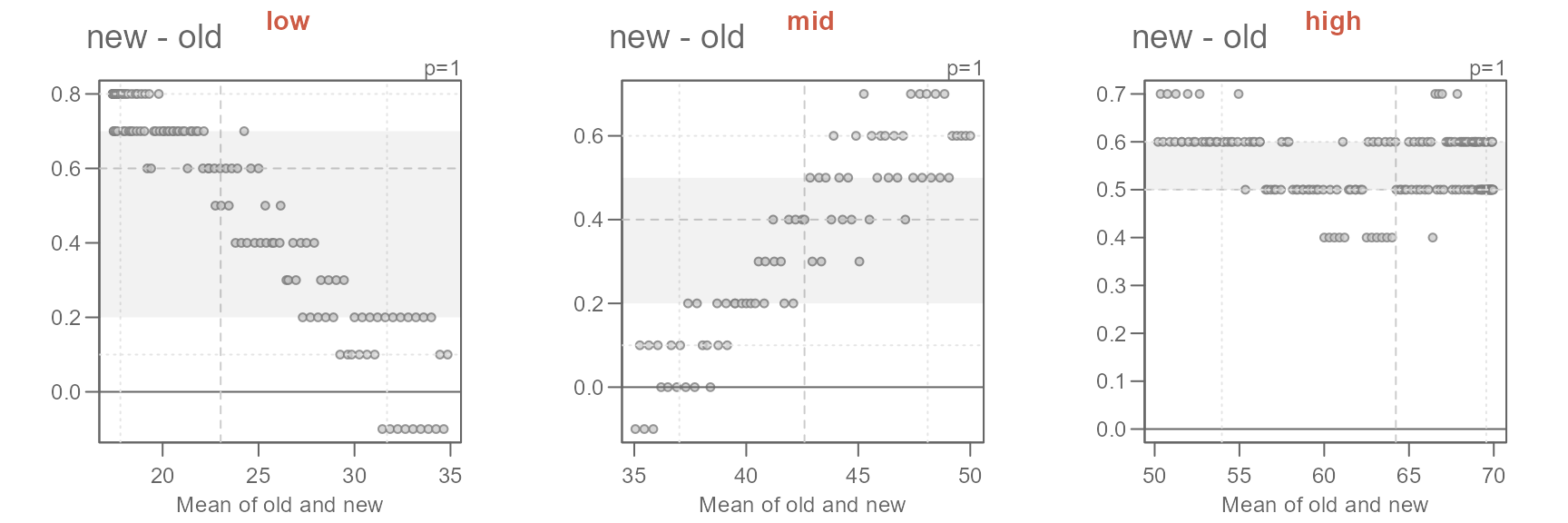
Note that the mean-difference plot highlights the mid
difference values defined by the inner argument.
This does not clearly reflect the mid values shown in the QQ plot. If
you want the mean-difference plot to show the inner core values, set
tails to TRUE. In doing so, you might want to
disable the shaded region to have most of the emphasis placed on the
points.
eda_qq(x, y, md = TRUE, tails = TRUE, q = FALSE)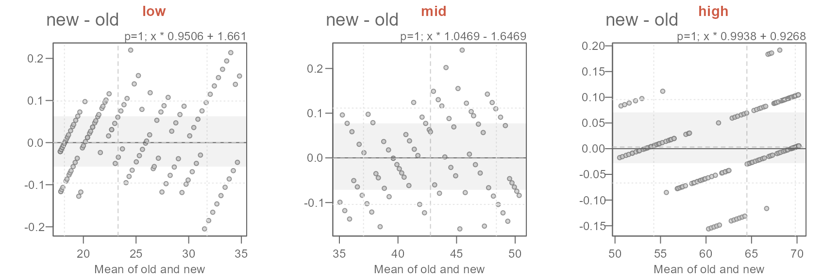
Creating a QQ plot matrix
A separate function, eda_qqmat, is used to create a QQ
plot matrix. It adopts many of the same arguments available in the
eda_qq function, but it does not adopt some of
eda_qq’s default settings. For example, the inner region
shading parameter q is set to FALSE–this to
minimize clutter in the densely packed matrix. Instead, points Falling
outside of the inner region are symbolized with an open point
symbol. For example, to generate an empirical QQ plot matrix of singer
height values conditioned of voice parts type:
You can, of course, adopt the same point symbol for all points by
setting tails = FALSE.
The matrix limits the output to the lower triangle given that the
matrix is symmetrical. If you wish to add the upper triangle, set
upper = TRUE.
Additive offsets can be distracting if the goal is to compare spreads
across each group. The function offers the option to generate a
residuals QQ plot matrix (resid = TRUE) by subtracting the
input values with the group mean (stat = mean) or median
(stat = median). For example, to generate a residuals QQ
plot of singer height, type:
eda_qqmat(singer, height, voice.part, resid = TRUE)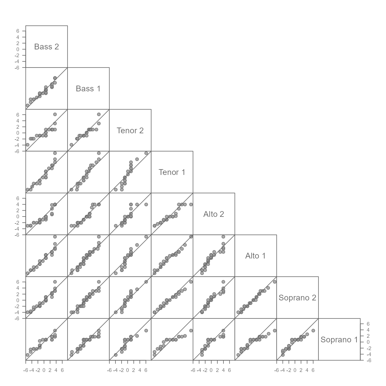
A working example
Many datasets will have distributions that differ not only additively
and/or multiplicatively, but also by their general shape. This may
create complex point patterns in your QQ plot. Such cases can be
indicative of different processes at play for different ranges
of values. We’ll explore such a case using wat95 and
wat05 datasets available in this package. The data
represent derived normal temperatures for the 1981-2010 period
(wat95) and the 1991-2020 period (wat05) for
the city of Waterville, Maine (USA). We will subset the data to the
daily average normals, avg:
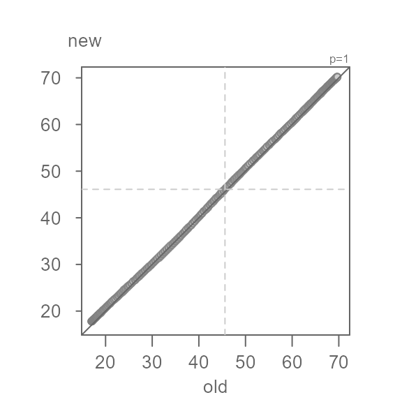
old <- wat95$avg # legacy temperature normals
new <- wat05$avg # current temperature normals
We will now compare their distributions. We’ll omit the shaded region for now.
Q <- eda_qq(old, new, q = FALSE)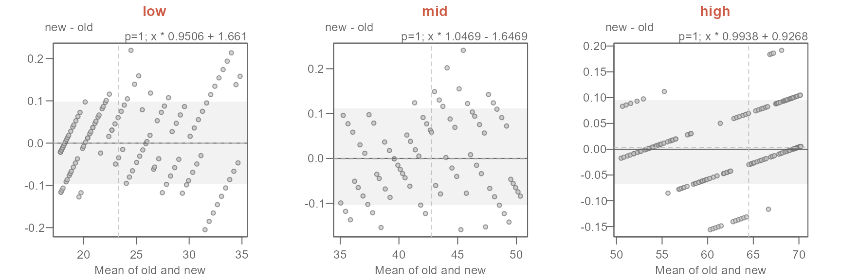
At first glance, the batches do not seem to differ. But how close are
the points to the \(x=y\) line? We will
rotate the plot to zoom in on the \(x=y\) line by setting
md = TRUE.
Q <- eda_qq(old, new, md = TRUE)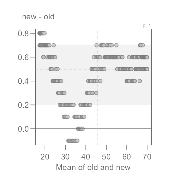
This view is proving to be far more insightful. Note that for most of
the data, we have an overall offset of 0.5 suggesting that the new
normals are about 0.5°F. warmer. We could stop there, but the pattern
observed in the Tukey mean-difference plot is far from random. In fact,
we can break the pattern into three distinct ones at around 35°F and
50°F. We will categorize these groups as low,
mid and high values.
This next chunk of code will generate three separate QQ plots for each range of values.
labs <- c("low", "mid", "high")
out <- Q$data
out$avg <- (out$old + out$new) / 2
out2 <- split(out, cut(out$avg, c(min(out$avg), 35, 50, max(out$avg)),
                       labels = labs, include.lowest = TRUE))
sapply(labs, FUN = \(x) {eda_qq(out2[[x]]$old, out2[[x]]$new ,
                                xlab = "old", ylab = "new", md = T)
                         title(x, line = 3, col.main = "orange")} )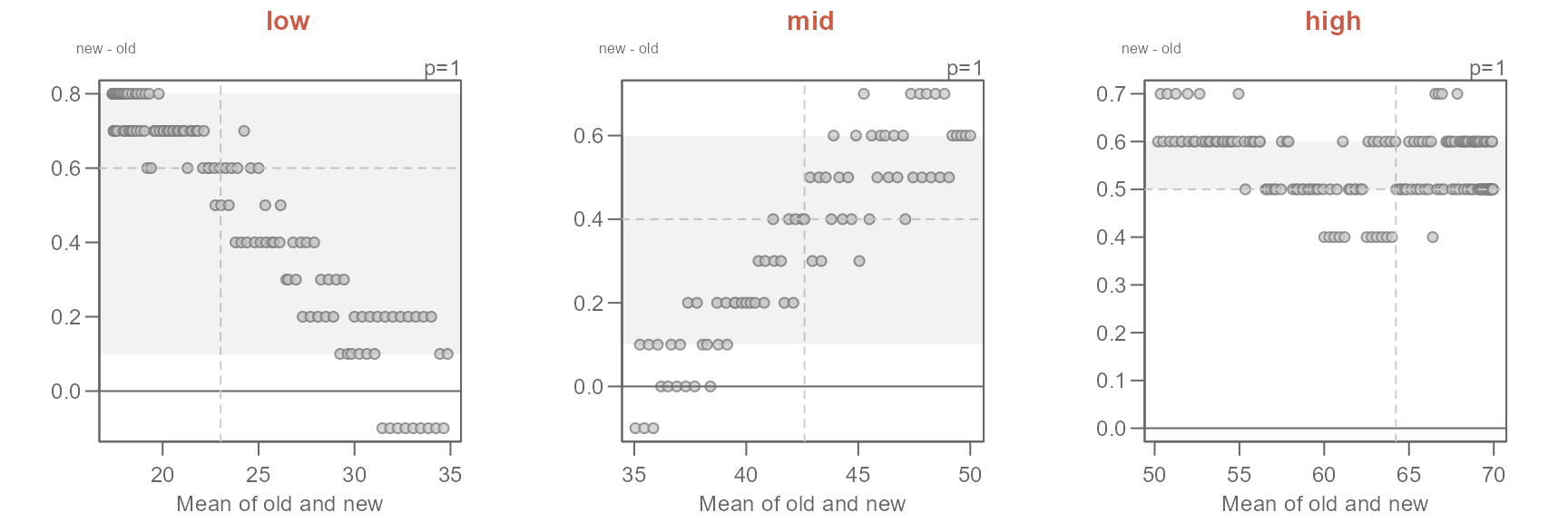
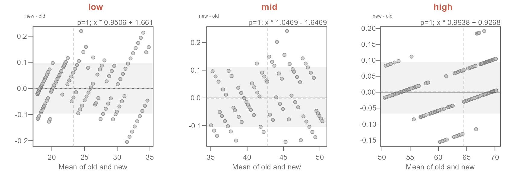
#>  [1] "Suggested offsets:y = x * 0.9507 + (1.6599)"
#>  [1] "Suggested offsets:y = x * 1.047 + (-1.6502)"
#>  [1] "Suggested offsets:y = x * 0.9938 + (0.9268)"
The suggested offsets are displayed in the console for each group.
It is important to note that we are splitting the paired values generated from the earlier
eda_qqfunction (out$avg) and not the values from the original datasets (oldandnew). Had we split the original data prior to combining them witheda_qq, we could have generated different patterns in the QQ and Tukey plots. This is because this approach could generate different quantile pairs.
Next, we’ll adopt the suggested offsets generated in the console.
xform <- c("x * 0.9506 + 1.661",
           "x * 1.0469 - 1.6469",
           "x * 0.9938 + 0.9268")
names(xform) <- labs
sapply(labs, FUN = \(x) {eda_qq(out2[[x]]$old, out2[[x]]$new,
                                fx = xform[x],
                                xlab = "old", ylab = "new", md = T)
                         title(x, line = 3, col.main = "coral3")}
)
The proposed offsets seem to do a good job in characterizing the differences in temperatures.
The characterization of the differences in normal temperatures between the old and new set of normals can be formalized as follows:
\[ new = \begin{cases} old * 0.9506 + 1.661, & T_{avg} < 35 \\ old * 1.0469 - 1.6469, & 35 \le T_{avg} < 50 \\ old * 0.9938 + 0.9268, & T_{avg} \ge 50 \end{cases} \]
The key takeaways from this analysis can be summarized as follows:
- Overall, the new normals are about 0.5°F warmer.
- The offset is not uniform across the full range of temperature values.
- For lower temperature (those less than 35°F), the new normals have a slightly narrower distribution and are about 1.7°F warmer.
- For the mid temperature values (between 35°F and 50°F) the new normals have a slightly wider distribution and are overall about 1.6°F cooler.
- For the higher range of temperature values (those greater than 50°F), the new normals have a slightly narrower distribution and are about 0.9°F warmer.