Chapter 12 Hypothesis testing
12.1 IRP/CSR
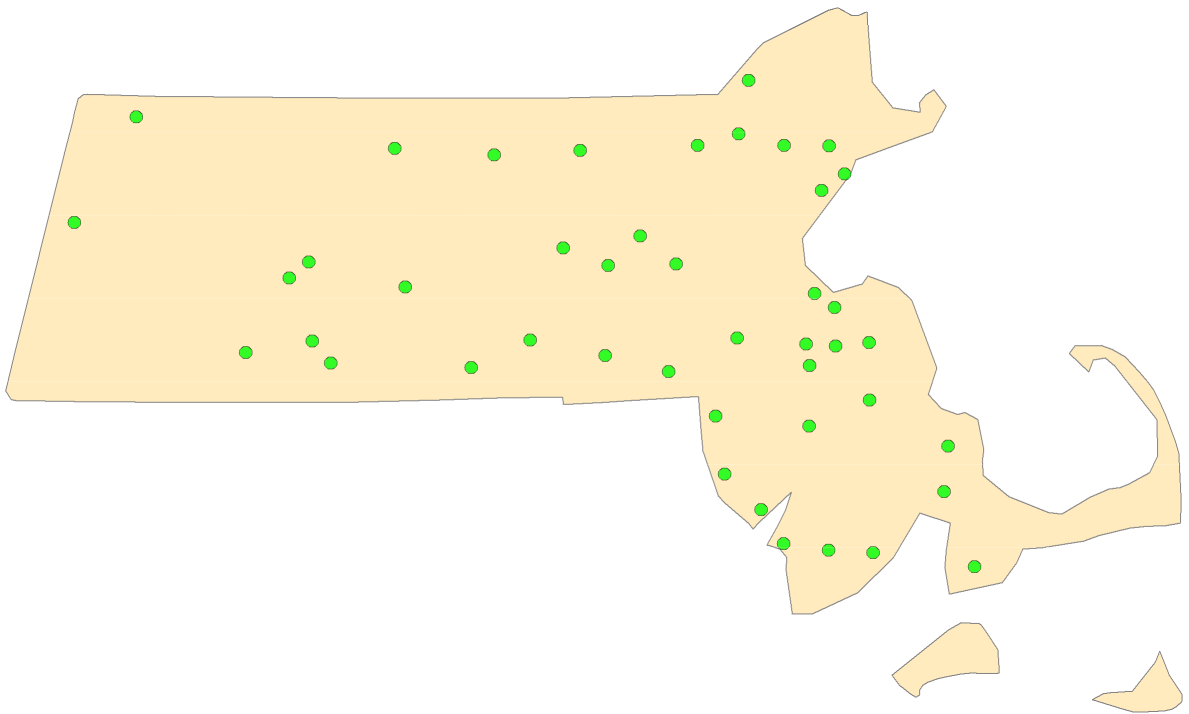
Figure 12.1: Could the distribution of Walmart stores in MA have been the result of a CSR/IRP process?
Popular spatial analysis techniques compare observed point patterns to ones generated by an independent random process (IRP) also called complete spatial randomness (CSR). CSR/IRP satisfy two conditions:
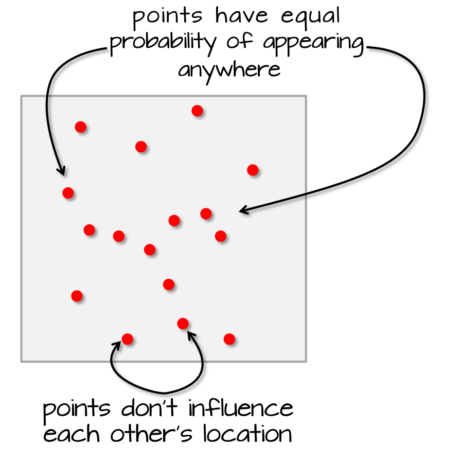
Any event has equal probability of occurring in any location, a 1st order effect.
The location of one event is independent of the location of another event, a 2nd order effect.
In the next section, you will learn how to test for complete spatial randomness. In later sections, you will also learn how to test for other non-CSR processes.
12.2 Testing for CSR with the ANN tool
12.2.1 ArcGIS’ Average Nearest Neighbor Tool
ArcMap offers a tool (ANN) that tests whether or not the observed first order nearest neighbor is consistent with a distribution of points one would expect to observe if the underlying process was completely random (i.e. IRP). But as we will learn very shortly, ArcMap’s ANN tool has its limitations.
12.2.1.1 A first attempt
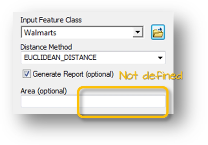
Figure 12.2: ArcGIS’ ANN tool. The size of the study area is not defined in this example.
ArcGIS’ average nearest neighbor (ANN) tool computes the 1st nearest neighbor mean distance for all points. It also computes an expected mean distance (ANNexpected) under the assumption that the process that lead to the observed pattern is completely random.
ArcGIS’ ANN tool offers the option to specify the study surface area. If the area is not explicitly defined, ArcGIS will assume that the area is defined by the smallest area encompassing the points.
ArcGIS’ ANN analysis outputs the nearest neighbor ratio computed as:
\[ ANN_{ratio}=\dfrac{ANN}{ANN_{expected}} \]
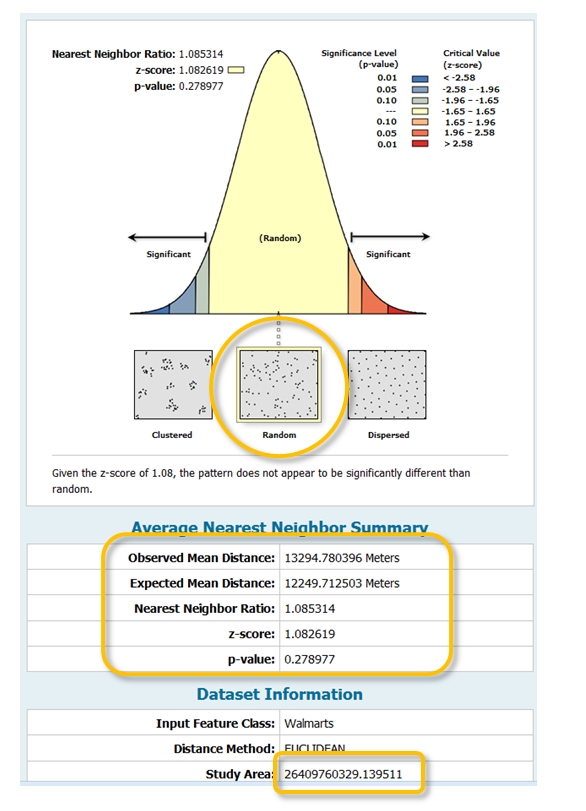
Figure 12.3: ANN results indicating that the pattern is consistent with a random process. Note the size of the study area which defaults to the point layer extent.
If ANNratio is 1, the pattern results from a random process. If it’s greater than 1, it’s dispersed. If it’s less than 1, it’s clustered. In essence, ArcGIS is comparing the observed ANN value to ANNexpected one would compute if a complete spatial randomness (CSR) process was at play.
ArcGIS’ tool also generates a p-value (telling us how confident we should be that our observed ANN value is consistent with a perfectly random process) along with a bell shaped curve in the output graphics window. The curve serves as an infographic that tells us if our point distribution is from a random process (CSR), or is more clustered/dispersed than one would expect under CSR.
For example, if we were to run the Massachusetts Walmart point location layer through ArcGIS’ ANN tool, an ANNexpected value of 12,249 m would be computed along with an ANNratio of 1.085. The software would also indicate that the observed distribution is consistent with a CSR process (p-value of 0.28).
But is it prudent to let the software define the study area for us? How does it know that the area we are interested in is the state of Massachusetts since this layer is not part of any input parameters?
12.2.1.2 A second attempt
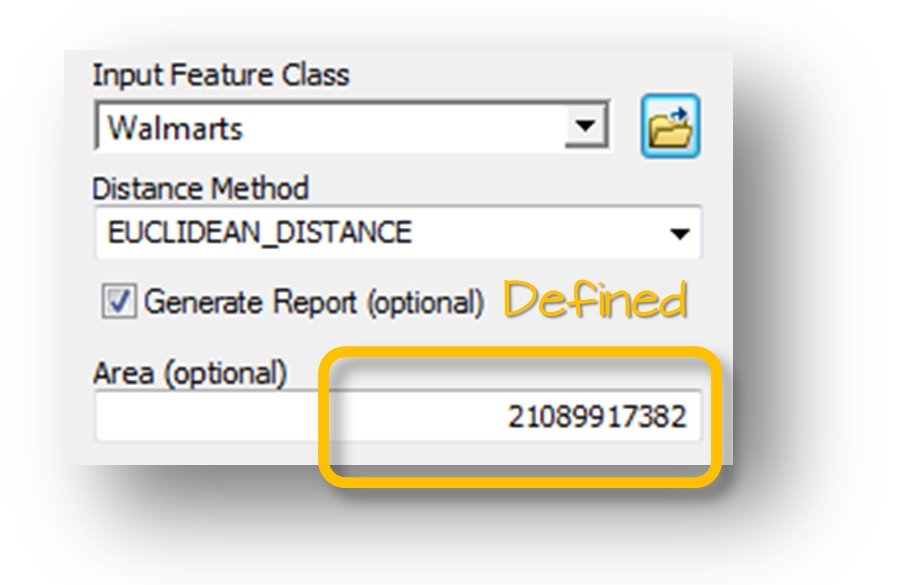
Figure 12.4: ArcGIS’ ANN tool. The size of the study is defined in this example.
Here, we explicitly tell ArcGIS that the study area (Massachusetts) covers 21,089,917,382 m² (note that this is the MA shapefile’s surface area and not necessarily representative of MA’s actual surface area). ArcGIS’ ANN tool now returns a different output with a completely different conclusion. This time, the analysis suggests that the points are strongly dispersed across the state of Massachusetts and the very small p-value (p = 0.006) tells us that there is less than a 0.6% chance that a CSR process could have generated our observed point pattern. (Note that the p-value displayed by ArcMap is for a two-sided test).
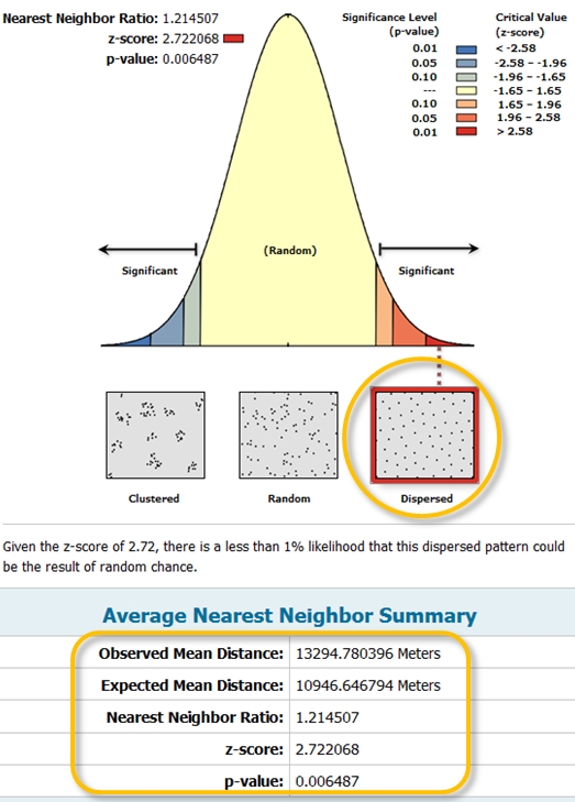
Figure 12.5: ArcGIS’ ANN tool output. Note the different output result with the study area size defined. The output indicates that the points are more dispersed than expected under IRP.
So how does ArcGIS estimate the ANNexpected value under CSR? It does so by taking the inverse of the square root of the number of points divided by the area, and multiplying this quotient by 0.5.
\[ ANN_{Expected}=\dfrac{0.5}{\sqrt{n/A}} \]
In other words, the expected ANN value under a CSR process is solely dependent on the number of points and the study extent’s surface area.
Do you see a problem here? Could different shapes encompassing the same point pattern have the same surface area? If so, shouldn’t the shape of our study area be a parameter in our ANN analysis? Unfortunately, ArcGIS’ ANN tool cannot take into account the shape of the study area. An alternative work flow is outlined in the next section.
12.2.2 A better approach: a Monte Carlo test
The Monte Carlo technique involves three steps:
First, we postulate a process–our null hypothesis, \(Ho\). For example, we hypothesize that the distribution of Walmart stores is consistent with a completely random process (CSR).
Next, we simulate many realizations of our postulated process and compute a statistic (e.g. ANN) for each realization.
Finally, we compare our observed data to the patterns generated by our simulated processes and assess (via a measure of probability) if our pattern is a likely realization of the hypothesized process.
Following our working example, we randomly re-position the location of our Walmart points 1000 times (or as many times computationally practical) following a completely random process–our hypothesized process, \(Ho\)–while making sure to keep the points confined to the study extent (the state of Massachusetts).
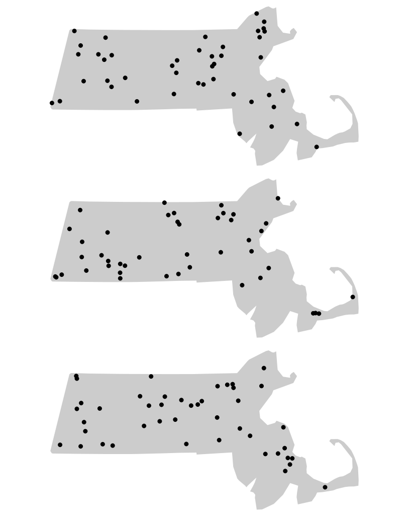
Figure 12.6: Three different outcomes from simulated patterns following a CSR point process. These maps help answer the question how would Walmart stores be distributed if their locations were not influenced by the location of other stores and by any local factors (such as population density, population income, road locations, etc…)
For each realization of our process, we compute an ANN value. Each simulated pattern results in a different ANNexpected value. We plot all ANNexpected values using a histogram (this is our \(Ho\) sample distribution), then compare our observed ANN value of 13,294 m to this distribution.
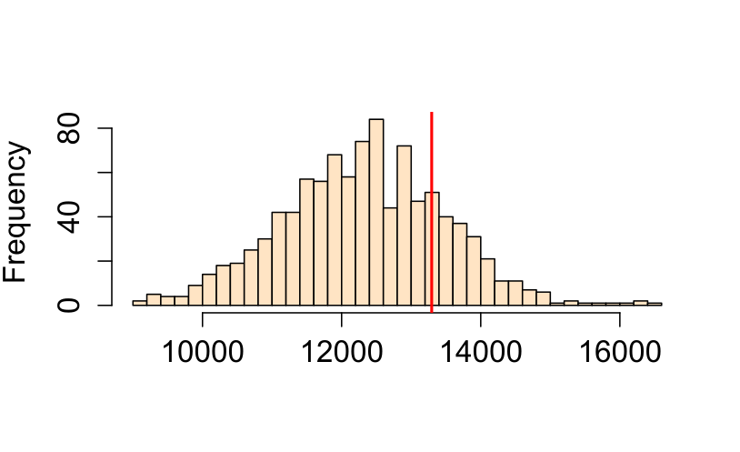
Figure 12.7: Histogram of simulated ANN values (from 1000 simulations). This is the sample distribution of the null hypothesis, ANNexpected (under CSR). The red line shows our observed (Walmart) ANN value. About 32% of the simulated values are greater (more extreme) than our observed ANN value.
Note that by using the same study region (the state of Massachusetts) in the simulations we take care of problems like study area boundary and shape issues since each simulated point pattern is confined to the exact same study area each and every time.
12.2.2.1 Extracting a \(p\)-value from a Monte Carlo test
The p-value can be computed from a Monte Carlo test. The procedure is quite simple. It consists of counting the number of simulated test statistic values more extreme than the one observed. If we are interested in knowing the probability of having simulated values more extreme than ours, we identify the side of the distribution of simulated values closest to our observed statistic, count the number of simulated values more extreme than the observed statistic then compute \(p\) as follows:
\[ \dfrac{N_{extreme}+1}{N+1} \]
where Nextreme is the number of simulated values more extreme than our observed statistic and N is the total number of simulations. Note that this is for a one-sided test.
A practical and more generalized form of the equation looks like this:
\[ \dfrac{min(N_{greater}+1 , N + 1 - N_{greater})}{N+1} \]
where \(min(N_{greater}+1 , N + 1 - N_{greater})\) is the smallest of the two values \(N_{greater}+1\) and \(N + 1 - N_{greater}\), and \(N_{greater}\) is the number of simulated values greater than the observed value. It’s best to implement this form of the equation in a scripting program thus avoiding the need to visually seek the side of the distribution closest to our observed statistic.
For example, if we ran 1000 simulations in our ANN analysis and found that 319 of those were more extreme (on the right side of the simulated ANN distribution) than our observed ANN value, our p-value would be (319 + 1) / (1000 + 1) or p = 0.32. This is interpreted as “there is a 32% probability that we would be wrong in rejecting the null hypothesis Ho.” This suggests that we would be remiss in rejecting the null hypothesis that a CSR process could have generated our observed Walmart point distribution. But this is not to say that the Walmart stores were in fact placed across the state of Massachusetts randomly (it’s doubtful that Walmart executives make such an important decision purely by chance), all we are saying is that a CSR process could have been one of many processes that generated the observed point pattern.
If a two-sided test is desired, then the equation for the \(p\) value takes on the following form:
\[ 2 \times \dfrac{min(N_{greater}+1 , N + 1 - N_{greater})}{N+1} \]
where we are simply multiplying the one-sided p-value by two.
12.3 Alternatives to CSR/IRP
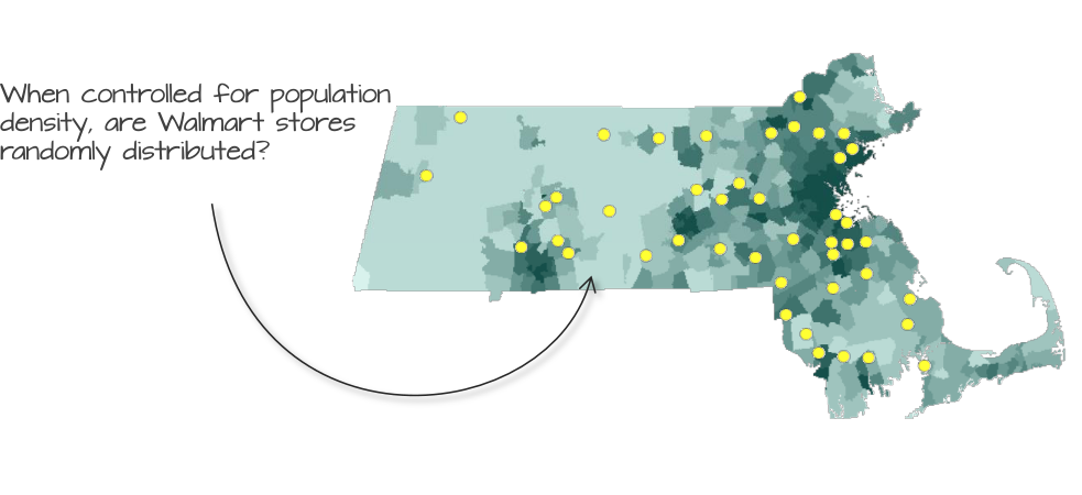
Figure 12.8: Walmart store distribution shown on top of a population density layer. Could population density distribution explain the distribution of Walmart stores?
The assumption of CSR is a good starting point, but it’s often unrealistic. Most real-world processes exhibit 1st and/or 2nd order effects. We therefore may need to correct for a non-stationary underlying process. We can simulate the placement of Walmart stores using the population density layer as our inhomogeneous point process. We can test this hypothesis by generating random points that follow the population density distribution.
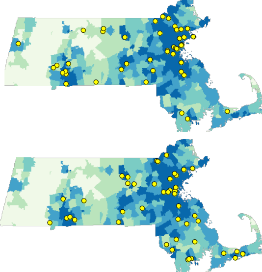
Figure 12.9: Examples of two randomly generated point patterns using population density as the underlying process.
Note that even though we are not referring to a CSR/IRP point process, we are still treating this as a random point process since the points are randomly located following the underlying population density distribution. Using the same Monte Carlo (MC) techniques used with IRP/CSR processes, we can simulate thousands of point patterns (following the population density) and compare our observed ANN value to those computed from our MC simulations.
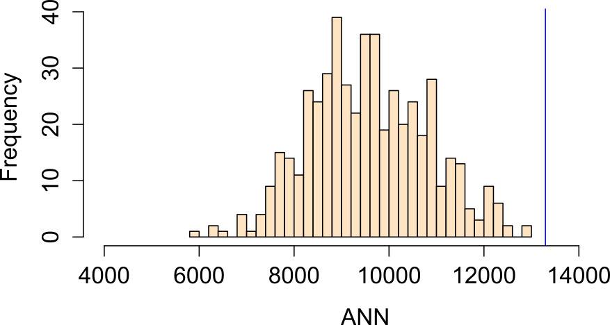
Figure 12.10: Histogram showing the distribution of ANN values one would expect to get if population density distribution were to influence the placement of Walmart stores.
In this example, our observed ANN value falls far to the right of our simulated ANN values indicating that our points are more dispersed than would be expected had population density distribution been the sole driving process. The percentage of simulated values more extreme than our observed value is 0% (i.e. a p-value \(\backsimeq\) 0.0).
Another plausible hypothesis is that median household income could have been the sole factor in deciding where to place the Walmart stores.
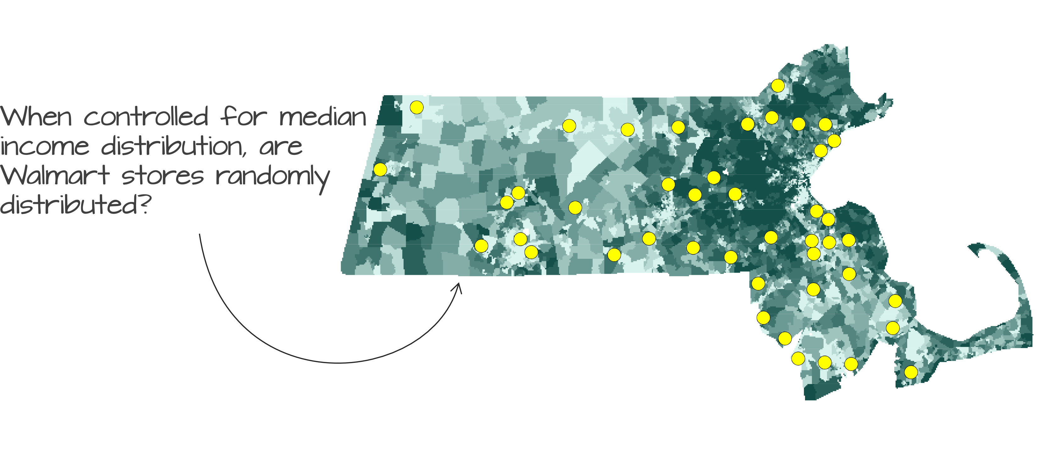
Figure 12.11: Walmart store distribution shown on top of a median income distribution layer.
Running an MC simulation using median income distribution as the underlying density layer yields an ANN distribution where about 16% of the simulated values are more extreme than our observed ANN value (i.e. p-value = 0.16):
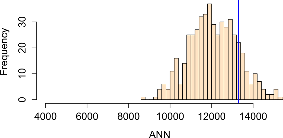
Figure 12.12: Histogram showing the distribution of ANN values one would expect to get if income distribution were to influence the placement of Walmart stores.
Note that we now have two competing hypotheses: a CSR/IRP process and median income distribution process. Both cannot be rejected. This serves as a reminder that a hypothesis test cannot tell us if a particular process is the process involved in the generation of our observed point pattern; instead, it tells us that the hypothesis is one of many plausible processes.
It’s important to remember that the ANN tool is a distance based approach to point pattern analysis. Even though we are randomly generating points following some underlying probability distribution map we are still concerning ourselves with the repulsive/attractive forces that might dictate the placement of Walmarts relative to one another–i.e. we are not addressing the question “can some underlying process explain the X and Y placement of the stores” (addressed in section 12.5). Instead, we are controlling for the 1st order effect defined by population density and income distributons.
12.4 Monte Carlo test with K and L functions
MC techniques are not unique to average nearest neighbor analysis. In fact, they can be implemented with many other statistical measures as with the K and L functions. However, unlike the ANN analysis, the K and L functions consist of multiple test statistics (one for each distance \(r\)). This results in not one but \(r\) number of simulated distributions. Typically, these distributions are presented as envelopes superimposed on the estimated \(K\) or \(L\) functions. However, since we cannot easily display the full distribution at each \(r\) interval, we usually limit the envelope to a pre-defined acceptance interval. For example, if we choose a two-sided significance level of 0.05, then we eliminate the smallest and largest 2.5% of the simulated K values computed for for each \(r\) intervals (hence the reason you might sometimes see such envelopes referred to as pointwise envelopes). This tends to generate a saw-tooth like envelope.
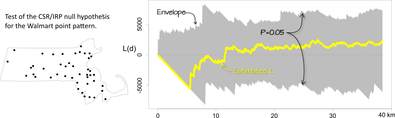
Figure 12.13: Simulation results for the IRP/CSR hypothesized process. The gray envelope in the plot covers the 95% significance level. If the observed L lies outside of this envelope at distance \(r\), then there is less than a 5% chance that our observed point pattern resulted from the simulated process at that distance.
The interpretation of these plots is straight forward: if \(\hat K\) or \(\hat L\) lies outside of the envelope at some distance \(r\), then this suggests that the point pattern may not be consistent with \(H_o\) (the hypothesized process) at distance \(r\) at the significance level defined for that envelope (0.05 in this example).
One important assumption underlying the K and L functions is that the process is uniform across the region. If there is reason to believe this not to be the case, then the K function analysis needs to be controlled for inhomogeneity in the process. For example, we might hypothesize that population density dictates the density distribution of the Walmart stores across the region. We therefore run an MC test by randomly re-assigning Walmart point locations using the population distribution map as the underlying point density distribution (in other words, we expect the MC simulation to locate a greater proportion of the points where population density is the greatest).
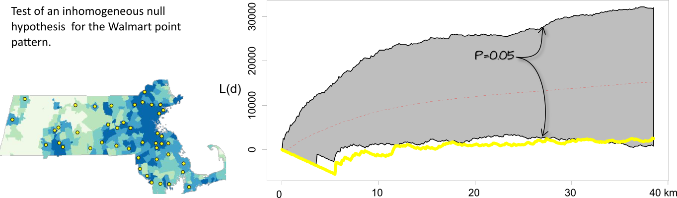
Figure 12.14: Simulation results for an inhomogeneous hypothesized process. When controlled for population density, the significance test suggests that the inter-distance of Walmarts is more dispersed than expected under the null up to a distance of 30 km.
It may be tempting to scan across the plot looking for distances \(r\) for which deviation from the null is significant for a given significance value then report these findings as such. For example, given the results in the last figure, we might not be justified in stating that the patterns between \(r\) distances of 5 and 30 are more dispersed than expected at the 5% significance level but at a higher significance level instead. This problem is referred to as the multiple comparison problem–details of which are not covered here.
12.5 Testing for a covariate effect
The last two sections covered distance based approaches to point pattern analysis. In this section, we explore hypothesis testing on a density based approach to point pattern analysis: The Poisson point process model.
Any Poisson point process model can be fit to an observed point pattern, but just because we can fit a model does not imply that the model does a good job in explaining the observed pattern. To test how well a model can explain the observed point pattern, we need to compare it to a base model (such as one where we assume that the points are randomly distributed across the study area–i.e. IRP). The latter is defined as the null hypothesis and the former is defined as the alternate hypothesis.
For example, we may want to assess if the Poisson point process model that pits the placement of Walmarts as a function of population distribution (the alternate hypothesis) does a better job than the null model that assumes homogeneous intensity (i.e. a Walmart has no preference as to where it is to be placed). This requires that we first derive estimates for both models.
A Poisson point process model (of the the Walmart point pattern) implemented in a statistical software such as R produces the following output for the null model:
Stationary Poisson process
Fitted to point pattern dataset 'P'
Intensity: 2.1276e-09
             Estimate      S.E.   CI95.lo  CI95.hi Ztest      Zval
log(lambda) -19.96827 0.1507557 -20.26375 -19.6728   *** -132.4545
and the following output for the alternate model.
Nonstationary Poisson process
Fitted to point pattern dataset 'P'

Log intensity:  ~pop

Fitted trend coefficients:
  (Intercept)           pop
-2.007063e+01  1.043115e-04

                 Estimate         S.E.       CI95.lo       CI95.hi Ztest
(Intercept) -2.007063e+01 1.611991e-01 -2.038657e+01 -1.975468e+01   ***
pop          1.043115e-04 3.851572e-05  2.882207e-05  1.798009e-04    **
                   Zval
(Intercept) -124.508332
pop            2.708284
Problem:
 Values of the covariate 'pop' were NA or undefined at 0.7% (4 out of 572) of
the quadrature points
Thus, the null model (homogeneous intensity) takes on the form:
\[ \lambda(i) = e^{-19.96} \]
and the alternate model takes on the form:
\[ \lambda(i) = e^{-20.1 + 1.04^{-4}population} \]
The models are then compared using the likelihood ratio test which produces the following output:
| Npar | Df | Deviance | Pr(>Chi) |
|---|---|---|---|
| 5 | NA | NA | NA |
| 6 | 1 | 4.253072 | 0.0391794 |
The value under the heading PR(>Chi) is the p-value which gives us the probability we would be wrong in rejecting the null. Here p=0.039 suggests that there is an 3.9% chance that we would be remiss to reject the base model in favor of the alternate model–put another way, the alternate model may be an improvement over the null.