Chapter 5 Statistical maps
5.1 Introduction
In the previous chapter, we explored how visual variables–particularly color–can be used to symbolize spatial features. We examined the perceptual dimensions of hue, lightness, and saturation, and how different color schemes (qualitative, sequential, and divergent) can be matched to the nature of the data being mapped. We also saw how classification intervals influence the appearance and interpretability of choropleth maps.
This chapter builds on those foundations by shifting focus from the aesthetics and perception of map design to the statistical logic behind classification schemes. Rather than choosing breaks arbitrarily or purely for visual balance, we explore how statistical principles can guide the discretization of continuous spatial data. This includes methods such as equal intervals, quantiles, boxplots, and standard deviation units, each offering a different lens through which to interpret spatial distributions.
We also extend the discussion to mapping uncertainty, a critical but often overlooked aspect of spatial analysis. Many datasets–especially those derived from surveys–carry margins of error or standard errors that affect how confidently we can interpret mapped patterns. This chapter introduces techniques for visualizing uncertainty and simulating its impact on spatial rankings and statistical relationships.
5.2 Statistical distribution maps
Many spatial datasets contain continuous variables, meaning that each geographic unit–such as a polygon in a data layer–can have a unique value. When these values are mapped using a one-to-one color assignment, the result is a type of thematic map known as a choropleth map, where each polygon is shaded according to its attribute value. For example, a map of Massachusetts showing median household income with a unique color for each tract would produce a visually complex and potentially overwhelming display.
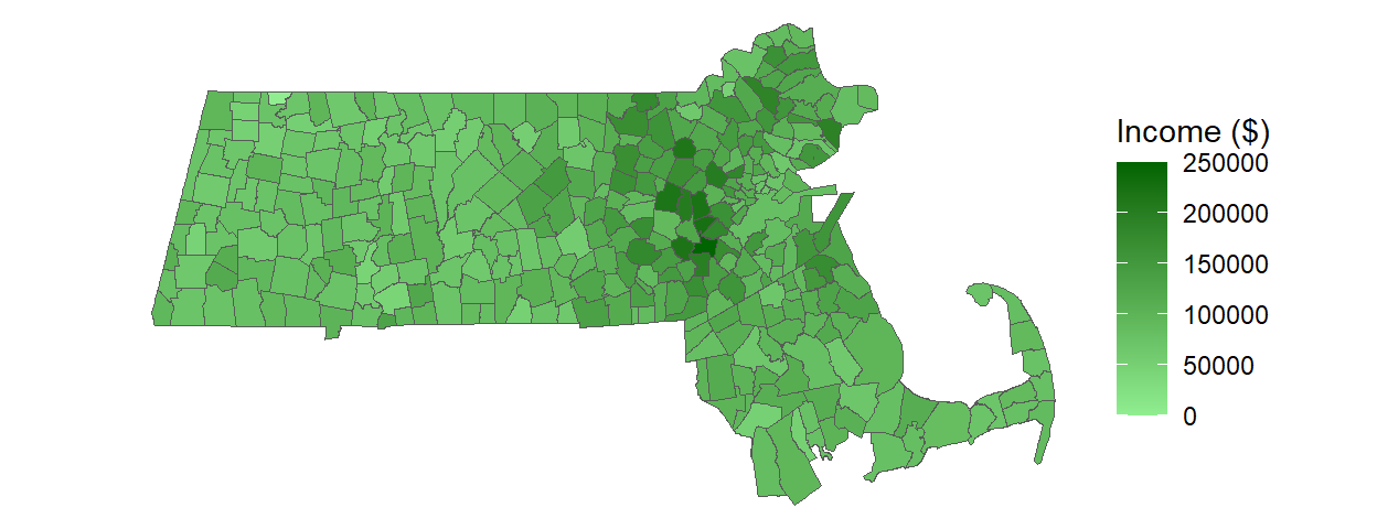
Figure 5.1: Example of a continuous color scheme applied to a choropleth map.
While technically accurate, such maps often obscure broader patterns and make interpretation difficult. To address this, we turn to statistical classification methods that group continuous values into meaningful categories, allowing for clearer visual communication and more effective spatial analysis.
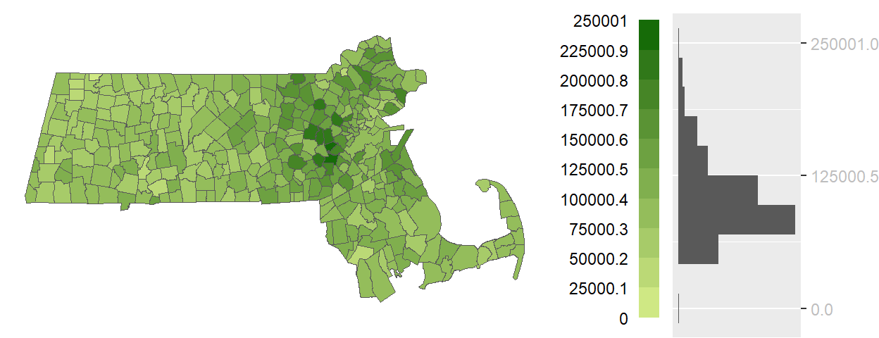
Figure 5.2: An equal interval choropleth map using 10 bins.
The histogram accompanying the map is rotated vertically to align each bin with its corresponding color swatch. The length of each gray bar in the histogram reflects the number of polygons assigned to each color category, offering a quick sense of how values are distributed across the map.
An equal interval classification scheme divides the full range of data values into intervals of equal width. This approach ensures that each color swatch represents the same span of values, making it easier to compare differences between categories. Because this method does not assume a central reference point, a sequential color scheme—typically progressing from light to dark—is used to convey increasing magnitude.
5.2.1 Quantile map
While equal interval classification offers intuitive comparisons by assigning each color swatch an equal range of values, it can be misleading when the data are unevenly distributed. In such cases, many polygons may cluster within a few intervals, leaving others sparsely populated. This imbalance can obscure meaningful spatial patterns.
Quantile classification addresses this issue by dividing the data into intervals that each contain an equal number of observations. For example, a map using six quantiles ensures that each color swatch is applied to approximately the same number of polygons. This approach enhances the map’s exploratory power and can help reveal spatial clusters that might be hidden in an equal interval map.
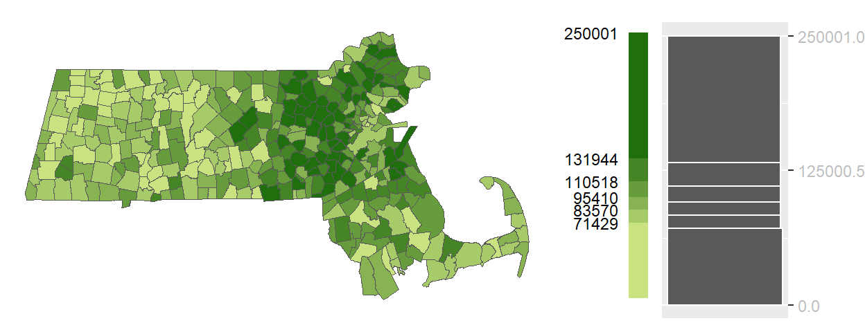
Figure 5.3: Example of a quantile map.
You’ll note the differing color swatch lengths in the color bar reflecting the different ranges of values covered by each color swatch. For example, the darkest color swatch covers the largest range of values, [131944, 250001], yet it is applied to the same number of polygons as most other color swatches in this classification scheme.
5.2.2 Boxplot map
Another approach to classifying continuous spatial data is to use summary statistics that describe the distribution’s central tendency and spread. The boxplot, a common statistical visualization, provides five summary statistics including the median, the upper and lower quartiles (within which 50% of the data lie–also known as the interquartile range,IQR), and upper and lower “whiskers” that encompass 1.5 times the interquartile range. The boxplot may also display “outliers”–data points that may be deemed unusual or not characteristic of the bulk of the data.
In the context of mapping, these summary statistics can be used to define classification breaks. A boxplot map applies color swatches to polygons based on where their values fall within the boxplot-defined intervals.
This method is particularly useful when the goal is to highlight the shape of the distribution–whether it is symmetrical, skewed, or contains outliers. Because the boxplot includes a measure of centrality (the median), a divergent color scheme is often appropriate. This allows the map to visually emphasize deviations from the center, helping to identify regions that are unusually high or low relative to the bulk of the data.
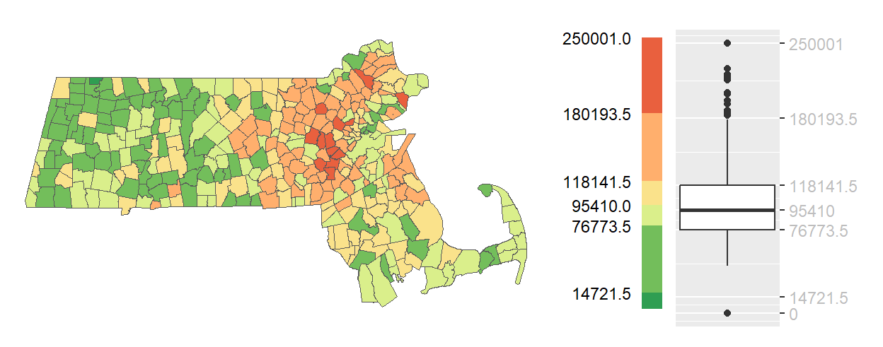
Figure 5.4: Example of a boxplot map.
Boxplot maps strike a balance between statistical rigor and visual interpretability. They are especially effective when the data distribution is not normal and when understanding the spread and extremes is as important as identifying central values.
5.2.3 IQR map
The interquartile range (IQR) map is a simplified version of the boxplot map that focuses on the middle 50% of the data. Instead of dividing the distribution into multiple segments, the IQR map reduces the classification to just three categories: values within the IQR, values below the IQR, and values above the IQR.
This approach is particularly useful when the goal is to highlight the “core” of the distribution–those observations that are neither exceptionally high nor low. By emphasizing the middle range, the IQR map can reveal spatial patterns that are less influenced by outliers or extreme values. For example, while previous maps may have consistently emphasized an east-west gradient in income across Massachusetts, the IQR map may show that middle-income households are more evenly distributed across the state.
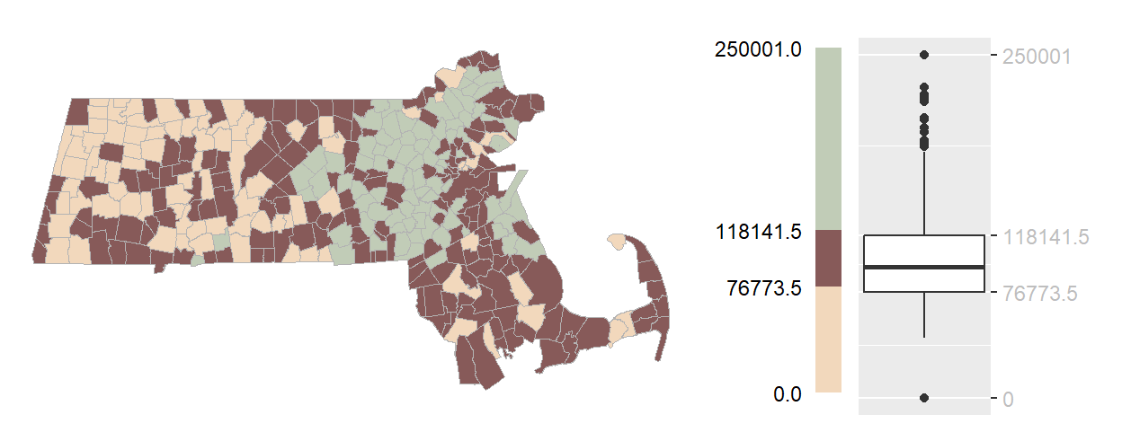
Figure 5.5: Example of an IQR map.
Visually, the IQR category benefits from being assigned a darker hue to distinguish it from the lighter tones used for the upper and lower extremes. This design choice helps draw attention to the central portion of the data while still acknowledging regions with higher and lower values.
5.2.4 Standard deviation map
When a dataset approximates a normal (bell-shaped) distribution, classification based on standard deviation units can be a powerful way to highlight how values deviate from the mean. In a standard deviation map, class breaks are defined at regular intervals above and below the mean–typically at ±1, ±2, and ±3 standard deviations. This creates a symmetrical classification scheme centered on the average value.
Each class represents a specific range of deviation from the mean, making it easy to identify which regions fall within the expected range and which stand out as unusually high or low. For example, areas within one standard deviation of the mean might be considered typical, while those beyond two or three standard deviations may be flagged as exceptional.
This method is particularly useful when the data are approximately normally distributed and when the goal is to emphasize variation relative to the average. A divergent color scheme is typically used, with a neutral color at the mean and increasingly intense hues in opposite directions to represent values above and below the mean.
This method is particularly useful when the data are approximately normally distributed and when the goal is to emphasize variation relative to the average. A divergent color scheme is typically used, with a neutral color at the mean and increasingly intense hues in opposite directions to represent values above and below the mean.
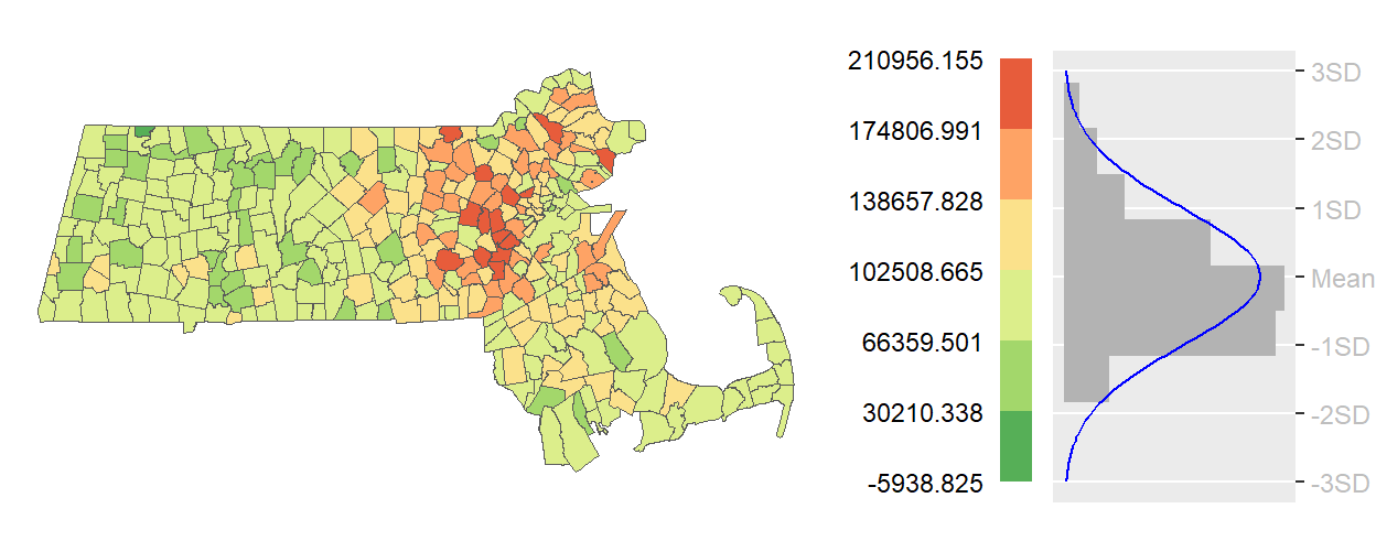
Figure 5.6: Example of a standard deviation map.
However, caution is warranted when applying this method to skewed data (as seems to the be the case in the working example). If the distribution is not symmetrical, the resulting map may misrepresent the data by assigning more polygons to one side of the mean. In such cases, the visual balance of the map may not reflect the actual distribution of values.
5.2.5 Outlier maps
While previous classification schemes aim to represent the full range or central tendencies of a dataset, outlier maps focus specifically on identifying and emphasizing extreme values–those that fall significantly above or below the bulk of the distribution. These maps are particularly useful when the goal is to highlight regions that deviate sharply from expected norms, such as areas with unusually high income, low population density, or elevated disease rates.
Outliers can be defined in several ways, depending on the statistical framework used. Examples of boxplot outlier map, standard deviation outlier map and quantile otulier map follow.
5.2.5.1 Boxplot outlier map
A boxplot outlier map identifies values that fall outside the whiskers of a boxplot–typically 1.5 times the interquartile range (IQR) above the lower and upper quartiles. These regions are often assigned darker hues, while all other values are grouped into a single lighter category to draw attention to the extremes.
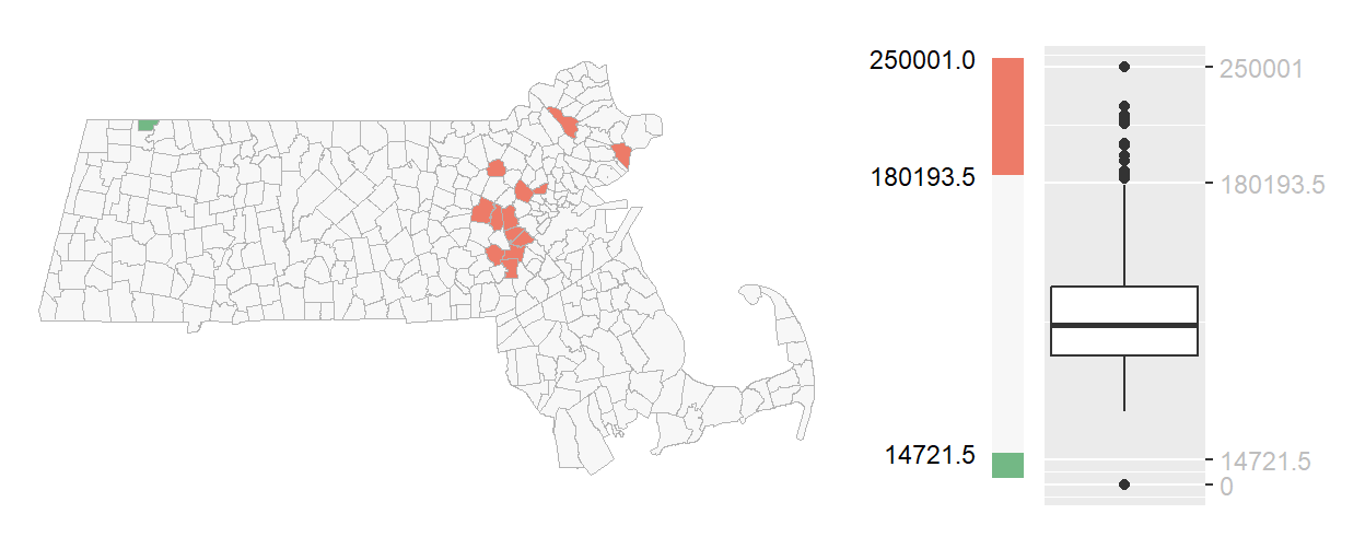
Figure 5.7: Example of a boxplot outlier choropleth map.
You’ll note the asymmetrical distribution of outliers with a little over a dozen regions with unusually high income values and just one region with unusually low income values.
5.2.5.2 standard deviation outlier map
A standard deviation outlier map flags values beyond ±2 standard deviations from the mean. If the data follow a normal distribution, this corresponds to roughly the top and bottom 2.5 percent of observations. These outliers are visually emphasized using a divergent color scheme, often with neutral tones for typical values and saturated colors for extremes.
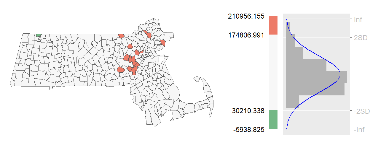
Figure 5.8: Example of a standard deviation outlier choropleth map.
5.2.5.3 Quantile otulier map
A quantile outlier map defines outliers based on percentile thresholds. For instance, the top and bottom 2.5% of values can be isolated by dividing the data into 40 quantiles and mapping only the outermost ones. This method is especially useful when the data distribution is skewed or non-normal.
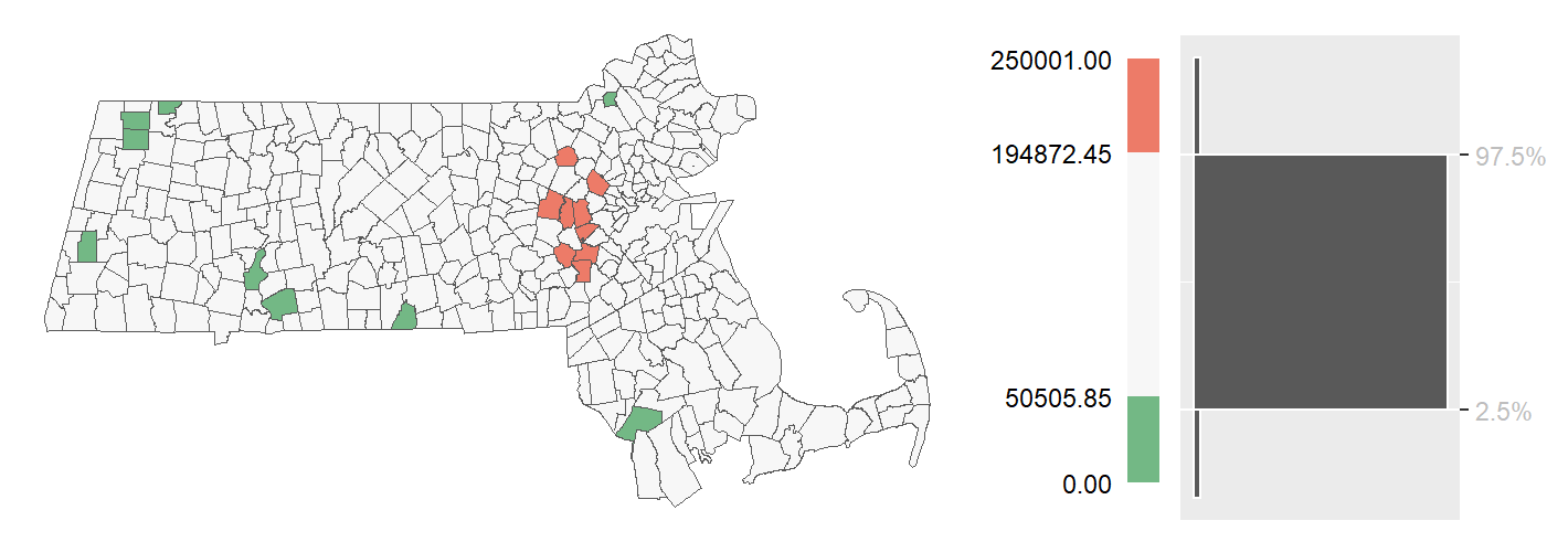
Figure 5.9: Example of a quantile outlier choropleth map where the top and bottom 2.5% regions are characterized as outliers.
5.3 Mapping uncertainty
Many spatial datasets–particularly those derived from surveys like the U.S. Census Bureau’s American Community Survey (ACS)–are not direct measurements but estimates accompanied by a measure of uncertainty. This uncertainty is often expressed as a margin of error (MoE) or a standard error (SE), which reflects the confidence we have in the reported values. For example, the ACS uses a 90% confidence interval, meaning there is a 90% chance that the true value lies within the reported range.
Mapping such data presents a challenge: how do we visualize both the estimate and its uncertainty in a way that supports meaningful spatial interpretation?
One common approach is to display side-by-side maps—one showing the estimated values and another showing the associated SE or MoE.
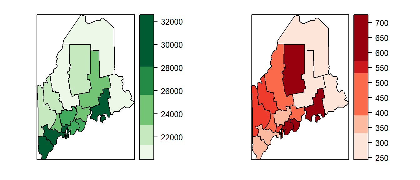
Figure 5.10: Maps of income estimates (left) and associated standard errors (right).
An alternative is to overlay uncertainty directly onto the estimate map using textures or hatch marks. For example, a map of income estimates might use shades of green to represent income levels, with different hatch patterns indicating the degree of uncertainty. This approach allows viewers to assess both value and reliability simultaneously.
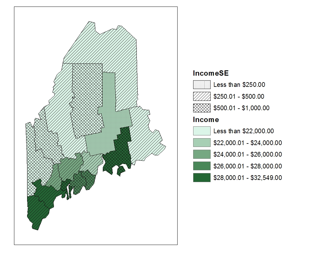
Figure 5.11: Map of estimated income (in shades of green) superimposed with different hash marks representing the ranges of income SE.
Another technique involves mapping the upper and lower bounds of the confidence interval as separate maps. This can help visualize the full range of possible values but may still suffer from the same interpretive challenges as side-by-side maps.
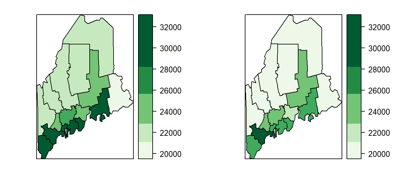
Figure 5.12: Maps of top end of 90 percent income estimate (left) and bottom end of 90 percent income estimate (right).
5.3.1 Assessing confidence in spatial patterns
While the maps presented earlier in this chapter offer ways to visualize uncertainty—such as margins of error or standard errors—they do not fully address a key reason we map data in the first place: to compare values across space. In spatial analysis, we are often interested in identifying patterns of high or low values and ranking regions accordingly. However, these comparisons assume that the observed estimates are stable and that their relative order will persist across samples. This assumption is problematic.
To illustrate this, we begin by examining confidence interval plots for each polygon. These plots reveal that many regions have overlapping intervals, meaning that their true values could plausibly fall above or below those of neighboring regions. For example, a county that appears to have a lower income than its neighbor may, in fact, have a higher income if a different sample were taken. This overlap undermines the reliability of spatial rankings and calls into question the robustness of apparent patterns.
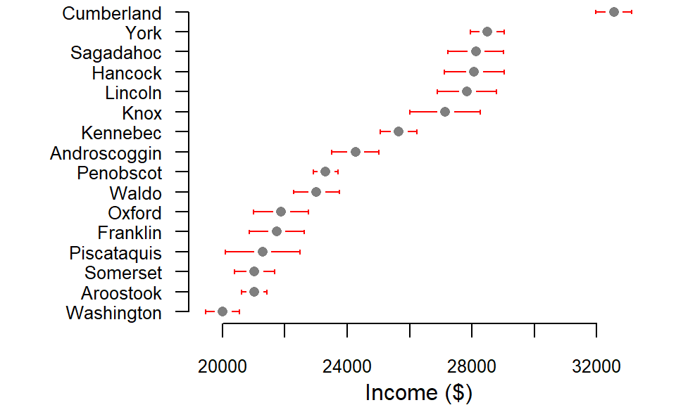
Figure 5.13: Income estimates by county with 90 percent confidence interval. Note that many counties have overlapping estimate ranges.
Consider, for instance, Piscataquis County, whose income estimate (represented by the gray point in the plot) appears lower than that of neighboring Oxford County. At first glance, this suggests a clear ranking between the two. However, when we examine their confidence intervals, we see substantial overlap—indicating that this apparent difference may not be statistically reliable. If a new sample were drawn from each county, the resulting estimates could easily shift, potentially placing Piscataquis above Oxford in income rankings. The following example illustrates how such reversals can occur when uncertainty is taken into account.
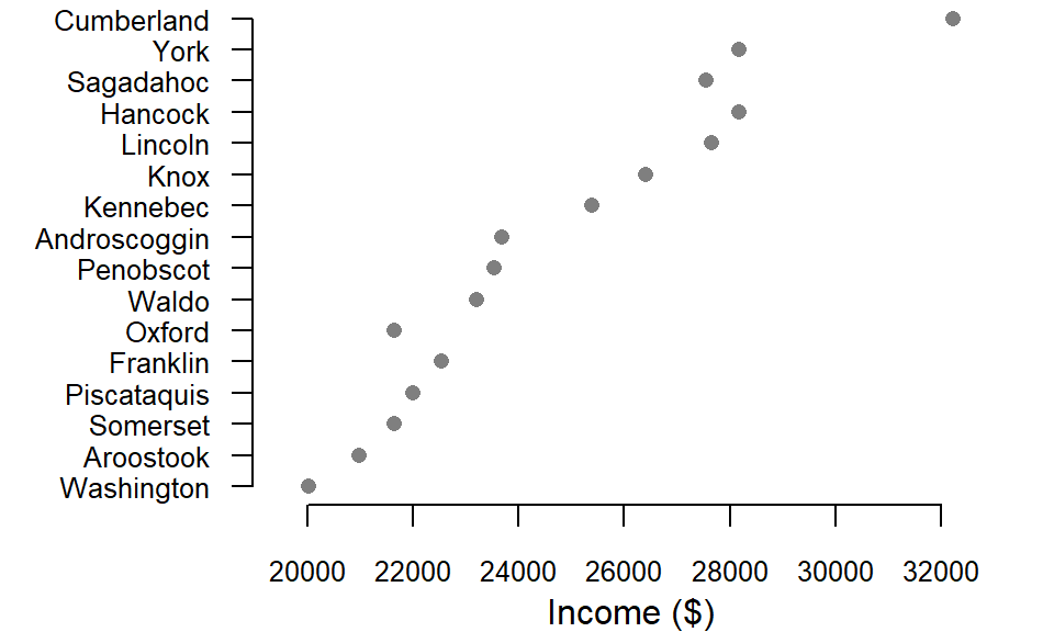
Figure 5.14: Example of income estimates one could expect to sample based on the 90 percent confidence interval shown in the previous plot.
In one such simulated sample, Oxford County’s income estimate drops below that of both Piscataquis and Franklin counties—reversing the original ranking. A similar shift is observed for Sagadahoc County, which falls behind two other counties, Hancock and Lincoln. These changes underscore how uncertainty can affect not just individual estimates, but the broader spatial hierarchy we infer from mapped data. What appears to be a clear pattern in the original map may, in fact, be a fragile construct shaped by sampling variability.
How do the spatial patterns in the original estimated income map hold up when uncertainty is introduced? By comparing it with a simulated income map–generated from values sampled within each county’s confidence interval–we can begin to assess the stability of observed rankings and the reliability of apparent spatial patterns.
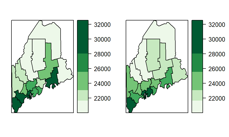
Figure 5.15: Original income estimate (left) and realization of a simulated sample (right).
A few more simulated samples (using the 90% confidence interval) are shown below:
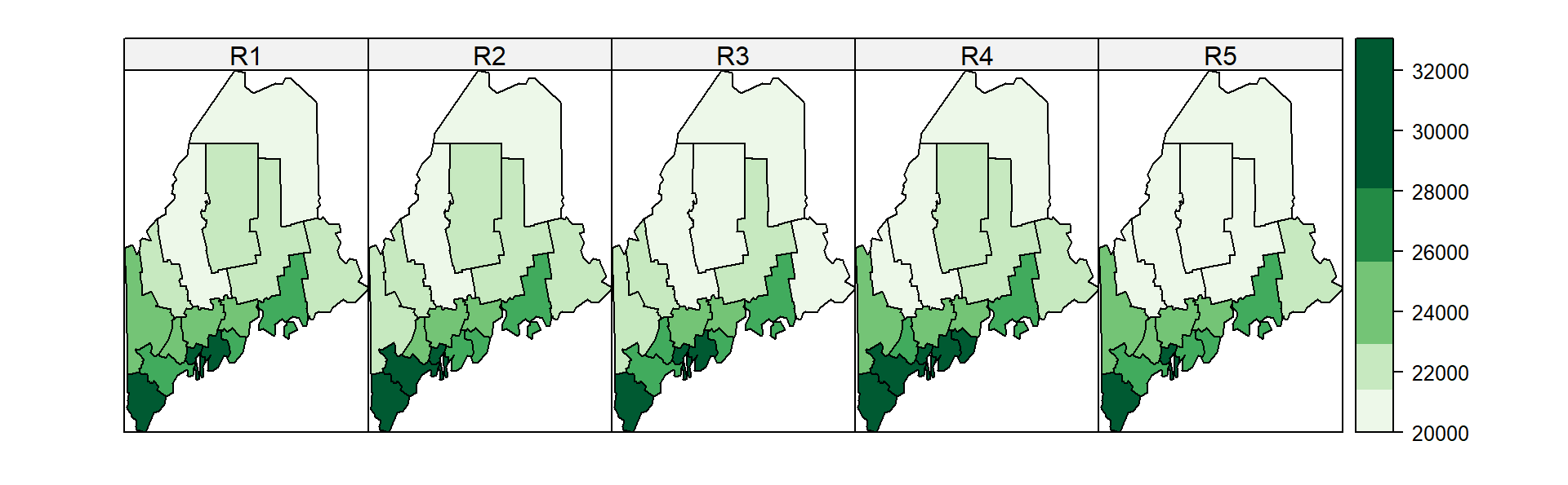
Figure 5.16: Original income estimate (left) and realizations from simulated samples (R2 through R5).
5.3.2 Class comparison maps
Effectively conveying both estimates and their associated uncertainty in a single map remains a challenge. As Sun and Wong (Sun and Wong 2010) note, the appropriate strategy often depends on the context and purpose of the analysis. One useful approach is the class comparison method, which evaluates whether a polygon’s margin of error (MoE) extends beyond the boundaries of its assigned classification. In this method, the map displays not only the estimated value but also whether the confidence interval surrounding that estimate crosses into adjacent classes.
For example, if we adopt the classification breaks [0 , 20600 , 22800 , 25000 , 27000 , 34000 ], we find that many polygons have MoEs that span multiple class boundaries.
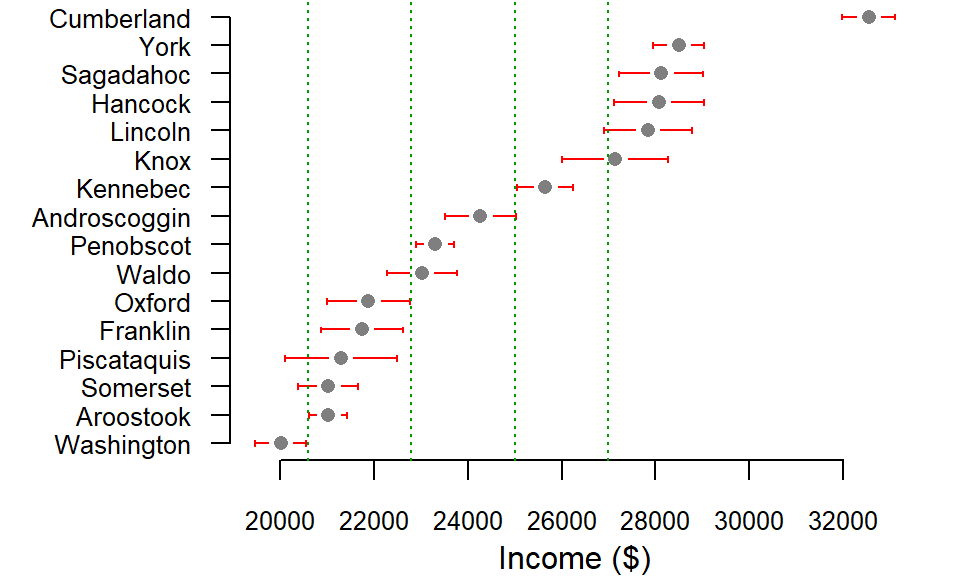
Figure 5.17: Income estimates by county with 90 percent confidence interval. Note that many of the counties’ MoE have ranges that cross into an adjacent class.
Take Piscataquis county, for example. Its estimate is assigned the second classification break (20600 to 22800 ), yet its lower confidence interval stretches into the first classification break indicating that we cannot be 90% confident that the estimate is assigned the proper class (i.e. its true value could fall into the first class). Other counties such as Cumberland and Penobscot don’t have that problem since their 90% confidence intervals fall inside the classification breaks.
This information can be mapped as a hatch mark overlay. For example, income could be plotted using varying shades of green with hatch symbols indicating if the lower interval crosses into a lower class (135° hatch), if the upper interval crosses into an upper class (45° hatch), if both interval ends cross into a different class (90°-vertical-hatch) or if both interval ends remain inside the estimate’s class (no hatch).

Figure 5.18: Plot of income with class comparison hatches.
5.4 Summary
This chapter explores statistical approaches to mapping continuous spatial data, focusing on how classification schemes influence the interpretation of choropleth maps. Building on the visual principles introduced in the previous chapter, it introduces methods such as equal interval, quantile, boxplot, interquartile range (IQR), and standard deviation classifications. Each technique offers a different lens for revealing spatial patterns and understanding data distributions.
The chapter also introduces outlier maps, which emphasize extreme values using statistical definitions derived from boxplots, standard deviations, or quantiles. These maps are particularly useful for identifying regions that deviate sharply from the norm.
Mapping uncertainty (especially in datasets derived from surveys) is also addressed. Techniques such as confidence interval plots, simulated sample maps, and class comparison overlays are used to assess the reliability of spatial rankings and classifications. These methods highlight the fragility of apparent patterns and promote more cautious, statistically informed interpretations of mapped data.