Chapter 1 Introduction to GIS
1.1 What is a GIS?
A Geographic Information System is a multi-component environment used to create, manage, visualize and analyze data and its spatial counterpart. It’s important to note that most datasets you will encounter in your lifetime can all be assigned a spatial location whether on the earth’s surface or within some arbitrary coordinate system (such as a soccer field or a gridded petri dish). So in essence, any dataset can be represented in a GIS: the question then becomes “does it need to be analyzed in a GIS environment?” The answer to this question depends on the purpose of the analysis. If, for example, we are interested in identifying the ten African countries with the highest conflict index scores for the 1966-78 period, a simple table listing those scores by country is all that is needed.
| Country | Conflicts | Country | Conflicts |
|---|---|---|---|
| EGYPT | 5246 | LIBERIA | 980 |
| SUDAN | 4751 | SENEGAL | 933 |
| UGANDA | 3134 | CHAD | 895 |
| ZAIRE | 3087 | TOGO | 848 |
| TANZANIA | 2881 | GABON | 824 |
| LIBYA | 2355 | MAURITANIA | 811 |
| KENYA | 2273 | ZIMBABWE | 795 |
| SOMALIA | 2122 | MOZAMBIQUE | 792 |
| ETHIOPIA | 1878 | IVORY COAST | 758 |
| SOUTH AFRICA | 1875 | MALAWI | 629 |
| MOROCCO | 1861 | CENTRAL AFRICAN REPUBLIC | 618 |
| ZAMBIA | 1554 | CAMEROON | 604 |
| ANGOLA | 1528 | BURUNDI | 604 |
| ALGERIA | 1421 | RWANDA | 487 |
| TUNISIA | 1363 | SIERRA LEONE | 423 |
| BOTSWANA | 1266 | LESOTHO | 363 |
| CONGO | 1142 | NIGER | 358 |
| NIGERIA | 1130 | BURKINA FASO | 347 |
| GHANA | 1090 | MALI | 299 |
| GUINEA | 1015 | THE GAMBIA | 241 |
| BENIN | 998 | SWAZILAND | 147 |
Data source: Anselin, L. and John O’Loughlin. 1992. Geography of international conflict and cooperation: spatial dependence and regional context in Africa. In The New Geopolitics, ed. M. Ward, pp. 39-75.
A simple sort on the Conflict column reveals that EGYPT, SUDAN, UGANDA, ZAIRE, TANZANIA, LIBYA, KENYA, SOMALIA, ETHIOPIA, SOUTH AFRICA are the top ten countries.
What if we are interested in knowing whether countries with a high conflict index score are geographically clustered, does the above table provide us with enough information to help answer this question? The answer, of course, is no. We need additional data pertaining to the geographic location and shape of each country. A map of the countries would be helpful.
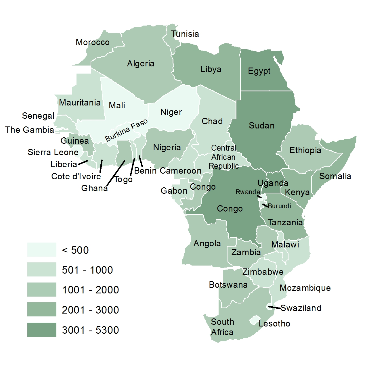
Figure 1.1: Choropleth representation of African conflict index scores. Countries for which a score was not available are not mapped.
This example demonstrates how spatial data can uncover spatial patterns that are invisible in tabular formats. It highlights the importance of integrating location into data analysis. Maps often prioritize spatial relationships, while tables emphasize numerical comparisons. Understanding this hierarchy helps choose the right tool for the question.
Maps are ubiquitous: available online and in various print medium. But we seldom ask how the boundaries of the map features are encoded in a computing environment? After all, if we expect software to assist us in the analysis, the spatial elements of our data should be readily accessible in a digital form. Spending a few minutes thinking through this question will make you realize that simple tables or spreadsheets are not up to this task. A more complex data storage mechanism is required. This is the core of a GIS environment: a spatial database that facilitates the storage and retrieval of data that define the spatial boundaries, lines or points of the entities we are studying. This may seem trivial, but without a spatial database, most spatial data exploration and analysis would not be possible!
1.1.1 GIS software
Many GIS software applications are available–both commercial and open source. Two popular applications are ArcGIS Pro and QGIS.
1.1.1.1 ArcGIS
A popular commercial desktop GIS software is ArcGIS Pro developed by Esri (pronounced ez-ree). Esri was once a small land-use consulting firm which did not start developing GIS software until the mid 1970s. ArcGIS Pro comes in different licensing levels and can be purchased with additional add-on packages. As such, a single license can range from a few thousand dollars to well over ten thousand dollars. In addition to software licensing costs, ArcGIS is only available for Windows operating systems–so, if your workplace is a Mac only environment, the purchase of a Windows PC would add to the expense.
1.1.2 QGIS
A very capable open source (free) GIS software is QGIS. It encompasses most of the functionality included in ArcGIS Pro. If you are looking for a GIS application for your Mac or Linux environment, QGIS is a wonderful choice given its multi-platform support. Built into the current versions of QGIS are functions from another open source software: GRASS. GRASS has been around since the 1980’s and has many advanced GIS data manipulation functions however, its use is not as intuitive as that of QGIS or ArcGIS (hence the preferred QGIS alternative).
1.2 What is Spatial Analysis?
A distinction is made in this course between GIS and spatial analysis. In mainstream GIS software, the term analysis typically refers to operations such as data manipulation and querying. In contrast, spatial analysis focuses on the statistical examination of spatial patterns and the processes that may have generated them. More broadly, spatial analysis seeks to answer questions like: “What could have caused the observed spatial pattern?” It is an exploratory process in which we quantify spatial patterns and investigate the underlying mechanisms that may explain their distribution.
For example, imagine you record the location of each tree within a well-defined study area. Mapping these locations is a typical GIS task. Once the trees are mapped, you may begin to draw inferences about the spatial pattern: Are the trees clustered or dispersed? Is tree density consistent across the study area? Could environmental factors such as soil type or slope have influenced the observed distribution? These are the kinds of questions addressed through spatial analysis, using quantitative and statistical techniques to explore and explain spatial patterns.
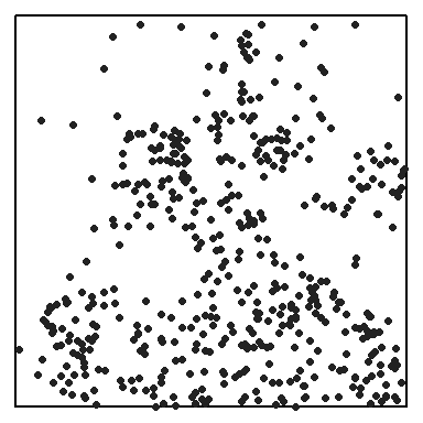
Figure 1.2: Distribution of Maple trees in a 1,000 x 1,000 ft study area.
In this course, you’ll learn that while popular GIS software like ArcGIS Pro excels at creating and manipulating spatial data, it is limited when it comes to analyzing the patterns and processes that may have produced those data. To move beyond basic data handling and explore deeper spatial relationships, we turn to more robust quantitative tools. One such tool is R–a free, open-source data analysis environment.
R offers one of the richest collections of spatial data analysis and statistical packages available today. Learning to work in the R programming environment will be highly beneficial, as many of the skills you acquire are transferable to a wide range of quantitative analysis tasks, both spatial and non-spatial.
R can be installed on both Windows and Mac operating systems. Another related piece of software that you might find useful is RStudio which offers a nice interface to R. To learn more about data analysis in R, visit the ES218 course website.
1.3 What’s in an Acronym?
GIS is a ubiquitous technology. Many of you are taking this course in part because you have seen GIS listed as a “desirable”” or “required” skill in job postings. Often, GIS is thought of primarily as a “map-making” tool, a perception shared by many casual users in the workforce. While visualizing data is indeed a key feature of GIS, it is equally important to consider what data is being visualized and why.
O’Sullivan and Unwin (O’Sullivan and Unwin 2010) use the term accidental geographer to describe individuals “whose understanding of geographic science is based on the operations made possible by GIS software”. Building on this idea, we introduce the term accidental data analyst–someone whose grasp of data and its analysis is limited to the point-and-click interfaces of popular software such as spreadsheets, statistical packages, and GIS platforms. The aggressive marketing of GIS technology has at times, placed technology ahead of purpose and theory. This concern is not unique to GIS; similar issues arose decades ago when personal computers made it easier to graph non-spatial data and perform statistical procedures.
The different purposes of mapping spatial data closely parallel the goals of graphing non-spatial data. John Tukey (Tukey 1972) identified three broad categories of graphical displays:
- “Graphs from which numbers are to be read off–substitutes for tables.
- Graphs intended to show the reader what has already been learned (by some other technique)–these we shall sometimes impolitely call propaganda graphs.
- Graphs intended to let us see what may be happening over and above what we have already described- these are the analytical graphs that are our main topic.”
A GIS-based analogy to Tukey’s categories might be:
- Reference maps (USGS maps, hiking maps, road maps): used to navigate landscapes or identify locations of interest.
- Presentation maps: designed to convey a specific narrative. While we avoid Tukey’s term “propaganda,” it’s worth noting that maps can be used to persuade.
- Statistical maps: created to manipulate raw data in ways that reveal patterns not immediately visible. These often require multiple data transformations and may benefit from being explored both within and outside a spatial context.
This course emphasizes the last two categories of spatial data visualization, with a particular focus on statistical maps.
1.4 Course Roadmap
This course is divided into two main parts, each focusing on distinct aspects of spatial data science.
1.4.1 Part 1: Working with Spatial Data
This section introduces foundational GIS concepts and tools for data manipulation and visualization.
- Introduction to GIS & Spatial Analysis
- What is GIS?
- What is spatial analysis?
- GIS software overview
- Feature Representation
- Vector vs. Raster
- Object vs. Field views
- Scale and attribute tables
- GIS Data Management
- File formats and project organization
- Managing data in ArcGIS
- Symbolizing Features
- Color theory and classification
- Choropleth mapping techniques
- Statistical Maps
- Mapping distributions and uncertainty
- Classification intervals and outlier detection
- Pitfalls to Avoid
- MAUP, ecological fallacy, unstable rates
- Good Map Making Tips
- Map elements, layout, and typography
- Spatial Operations and Vector Overlays
- Selection, overlays, and spatial queries
- Coordinate Systems
- Geographic vs. projected systems
- Spatial properties and geodesic geometries
- Map Algebra
- Local, focal, zonal, and global raster operations
1.4.2 Part 2: Exploratory Spatial Data Analysis
This section focuses on statistical analysis of spatial patterns.
- Spatial Trends
- First order analysis of field variables
- Fitting polynomial models
- Spatial Autocorrelation
- Second order property of field variables
- Global and local Moran’s I
- Point Pattern Analysis: First order analysis
- Density and distance-based methods
- Testing for CSR processes
- Point Pattern Analysis: Second order analysis
- ANN analysis
- K and L functions
- Paired correlation function
- Spatial Interpolation
- Deterministic (IDW, Thiessen) and statistical (Kriging) methods