Chapter 14 Spatial Interpolation
Given a distribution of point meteorological stations showing precipitation values, how I can I estimate the precipitation values where data were not observed?
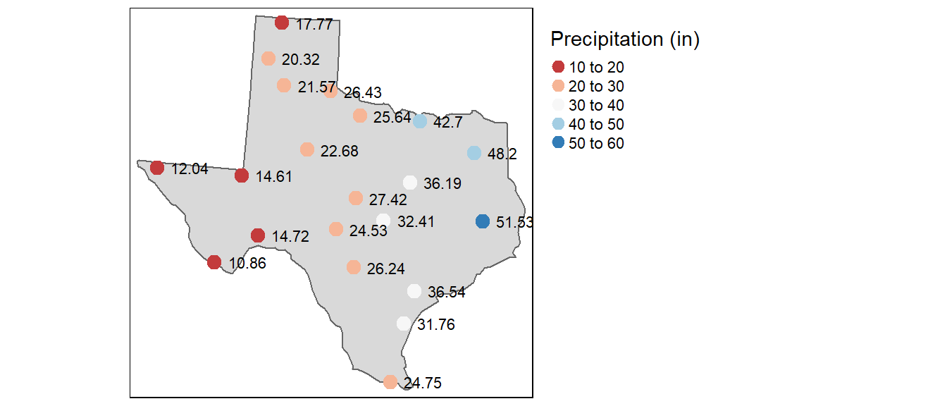
Figure 14.1: Average yearly precipitation (reported in inches) for several meteorological sites in Texas.
To help answer this question, we need to clearly define the nature of our point dataset. We’ve already encountered point data earlier in the course where our interest was in creating point density maps using different kernel windows. However, the point data used represented a complete enumeration of discrete events or observations–i.e. the entity of interest only occurred a discrete locations within a study area and therefore could only be measured at those locations. Here, our point data represents sampled observations of an entity that can be measured anywhere within our study area. So creating a point density raster from this data would only make sense if we were addressing the questions like “where are the meteorological stations concentrated within the state of Texas?”.
Another class of techniques used with points that represent samples of a continuous field are interpolation methods. There are many interpolation tools available, but these tools can usually be grouped into two categories: deterministic and statistical interpolation methods.
14.1 Deterministic Approach to Interpolation
We will explore two deterministic methods: proximity (aka Thiessen) techniques and inverse distance weighted techniques (IDW for short).
14.1.1 Proximity interpolation
This is probably the simplest (and possibly one of the oldest) interpolation method. It was introduced by Alfred H. Thiessen more than a century ago. The goal is simple: Assign to all unsampled locations the value of the closest sampled location. This generates a tessellated surface whereby lines that split the midpoint between each sampled location are connected thus enclosing an area. Each area ends up enclosing a sample point whose value it inherits.
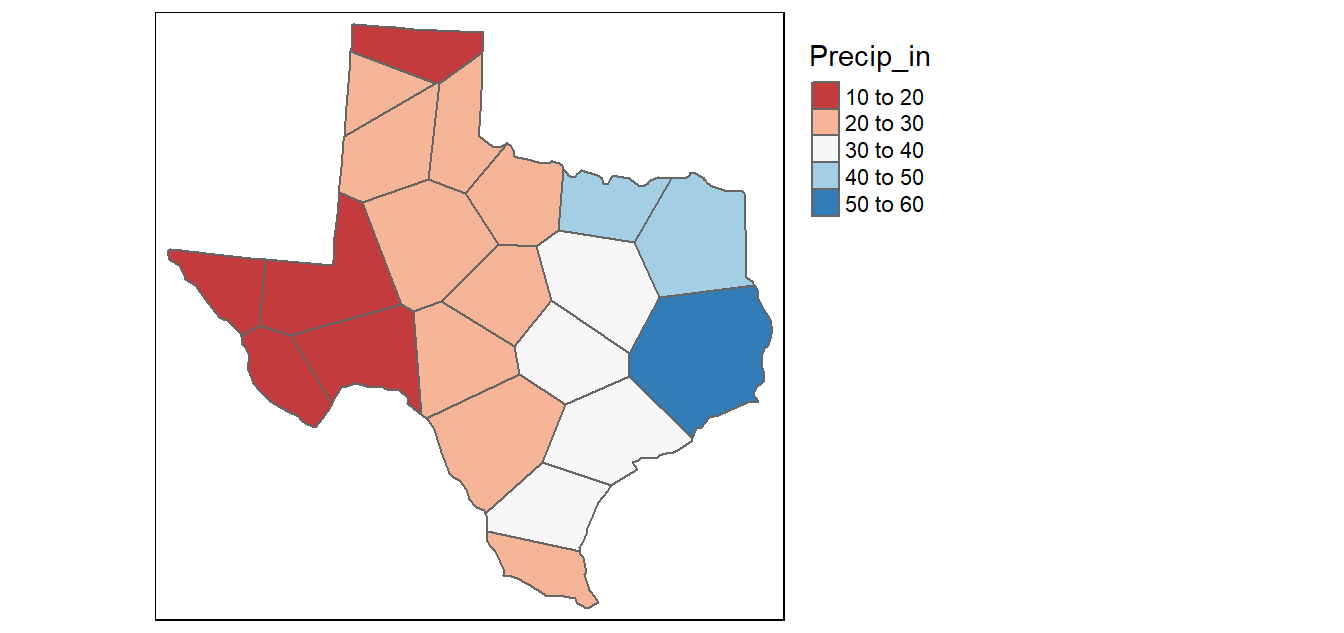
Figure 14.2: Tessellated surface generated from discrete point samples. This is also known as a Thiessen interpolation.
One problem with this approach is that the surface values change abruptly across the tessellated boundaries. This is not representative of most surfaces in nature.
Thiessen’s method was very practical in his days when computers did not exist. But today, computers afford us more advanced methods of interpolation as we will see next.
14.1.2 Inverse Distance Weighted (IDW)
The IDW technique computes an average value for unsampled locations using values from nearby weighted locations. The weights are proportional to the proximity of the sampled points to the unsampled location and can be specified by the IDW power coefficient. The larger the power coefficient, the stronger the weight of nearby points as can be gleaned from the following equation that estimates the value \(z\) at an unsampled location \(j\):
\[ \hat{Z_j} = \frac{\sum_i{Z_i/d^n_{ij}}}{\sum_i{1/d^n_{ij}}} \] The carat \(\hat{}\) above the variable \(z\) reminds us that we are estimating the value at \(j\). The parameter \(n\) is the weight parameter that is applied as an exponent to the distance thus amplifying the irrelevance of a point at location \(i\) as distance to \(j\) increases. So a large \(n\) results in nearby points wielding a much greater influence on the unsampled location than a point further away resulting in an interpolated output looking like a Thiessen interpolation. On the other hand, a very small value of \(n\) will give all points within the search radius equal weight such that all unsampled locations will represent nothing more than the mean values of all sampled points within the search radius.
In the following figure, the sampled points and values are superimposed on top of an (IDW) interpolated raster generated with a \(n\) value of 2.
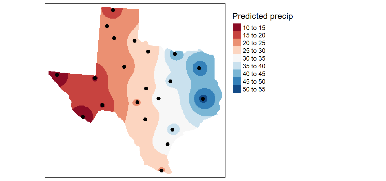
Figure 14.3: An IDW interpolation of the average yearly precipitation (reported in inches) for several meteorological sites in Texas. An IDW power coefficient of 2 was used in this example.
In the following example, an \(n\) value of 15 is used to interpolate precipitation. This results in nearby points having greater influence on the unsampled locations. Note the similarity in output to the proximity (Thiessen) interpolation.
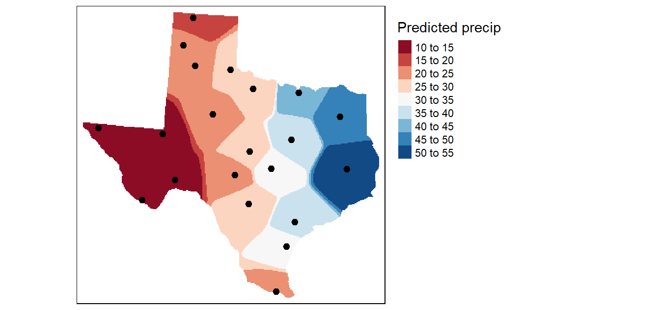
Figure 14.4: An IDW interpolation of the average yearly precipitation (reported in inches) for several meteorological sites in Texas. An IDW power coefficient of 15 was used in this example.
14.1.3 Fine tuning the interpolation parameters
Finding the best set of input parameters to create an interpolated surface can be a subjective proposition. Other than eyeballing the results, how can you quantify the accuracy of the estimated values? One option is to split the points into two sets: the points used in the interpolation operation and the points used to validate the results. While this method is easily implemented (even via a pen and paper adoption) it does suffer from significant loss in power–i.e. we are using just half of the information to estimate the unsampled locations.
A better approach (and one easily implemented in a computing environment) is to remove one data point from the dataset and interpolate its value using all other points in the dataset then repeating this process for each point in that dataset (while making sure that the interpolator parameters remain constant across each interpolation). The interpolated values are then compared with the actual values from the omitted point. This method is sometimes referred to as jackknifing or leave-one-out cross-validation.
The performance of the interpolator can be summarized by computing the root-mean of squared residuals (RMSE) from the errors as follows:
\[ RMSE = \sqrt{\frac{\sum_{i=1}^n (\hat {Z_{i}} - Z_i)^2}{n}} \]
where \(\hat {Z_{i}}\) is the interpolated value at the unsampled location i (i.e. location where the sample point was removed), \(Z_i\) is the true value at location i and \(n\) is the number of points in the dataset.
We can create a scatterplot of the predicted vs. expected precipitation values from our dataset. The solid diagonal line represents the one-to-one slope (i.e. if the predicted values matched the true values exactly, then the points would fall on this line). The red dashed line is a linear fit to the points which is here to help guide our eyes along the pattern generated by these points.
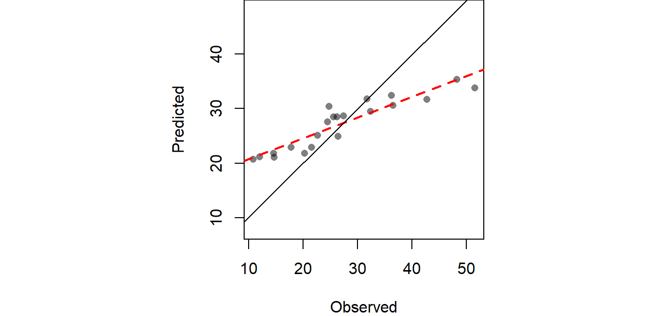
Figure 14.5: Scatter plot pitting predicted values vs. the observed values at each sampled location following a leave-one-out cross validation analysis.
The computed RMSE from the above working example is 6.989 inches. We can extend our exploration of the interpolator’s accuracy by creating a map of the confidence intervals. This involves layering all \(n\) interpolated surfaces from the aforementioned jackknife technique, then computing the confidence interval for each location ( pixel) in the output map (raster). If the range of interpolated values from the jackknife technique for an unsampled location \(i\) is high, then this implies that this location is highly sensitive to the presence or absence of a single point from the sample point locations thus producing a large confidence interval (i.e. we can’t be very confident of the predicted value). Conversely, if the range of values estimated for location \(i\) is low, then a small confidence interval is computed (providing us with greater confidence in the interpolated value). The following map shows the 95% confidence interval for each unsampled location (pixel) in the study extent.
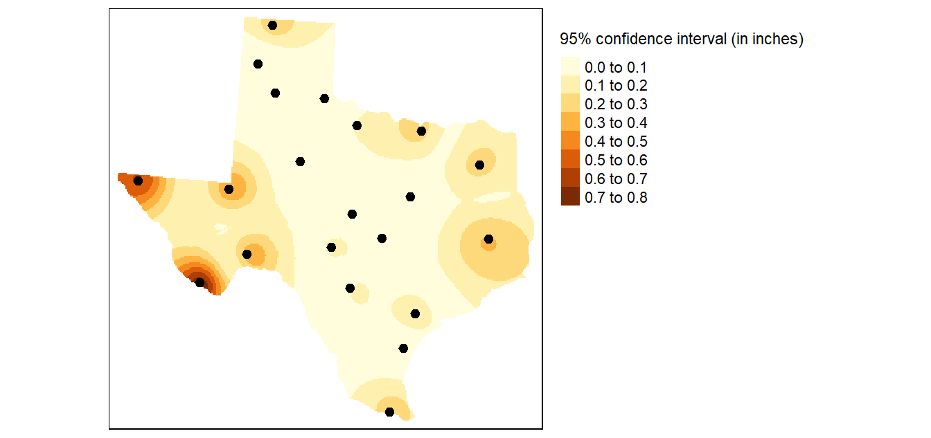
Figure 14.6: In this example an IDW power coefficient of 2 was used and the search parameters was confined to a minimum number of points of 10 and a maximum number of points of 15. The search window was isotropic. Each pixel represents the range of precipitation values (in inches) around the expected value given a 95% confidence interval.
IDW interpolation is probably one of the most widely used interpolators because of its simplicity. In many cases, it can do an adequate job. However, the choice of power remains subjective. There is another class of interpolators that makes use of the information provided to us by the sample points–more specifically, information pertaining to 1st and 2nd order behavior. These interpolators are covered next.
14.2 Statistical Approach to Interpolation
The statistical interpolation methods include surface trend and Kriging.
14.2.1 Trend Surfaces
It may help to think of trend surface modeling as a regression on spatial coordinates where the coefficients apply to those coordinate values and (for more complicated surface trends) to the interplay of the coordinate values. We will explore a 0th order, 1st order and 2nd order surface trend in the following sub-sections.
14.2.1.1 0th Order Trend Surface
The first model (and simplest model), is the 0th order model which takes on the following expression: Z = a where the intercept a is the mean precipitation value of all sample points (27.1 in our working example). This is simply a level (horizontal) surface whose cell values all equal 27.1.
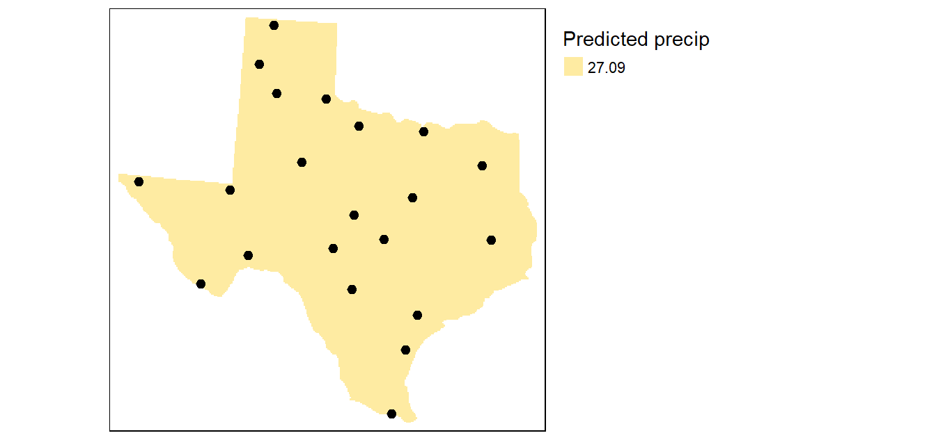
Figure 14.7: The simplest model where all interpolated surface values are equal to the mean precipitation.
This makes for an uninformative map. A more interesting surface trend map is one where the surface trend has a slope other than 0 as highlighted in the next subsection.
14.2.1.2 1st Order Trend Surface
The first order surface polynomial is a slanted flat plane whose formula is given by: Z = a + bX + cY where X and Y are the coordinate pairs.
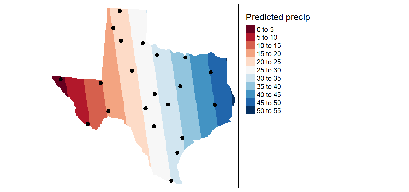
Figure 14.8: Result of a first order interpolation.
The 1st order surface trend does a good job in highlighting the prominent east-west trend. But is the trend truly uniform along the X axis? Let’s explore a more complicated surface: the quadratic polynomial.
14.2.1.3 2nd Order Trend Surface
The second order surface polynomial (aka quadratic polynomial) is a parabolic surface whose formula is given by: \(Z = a + bX + cY + dX^2 + eY^2 + fXY\)
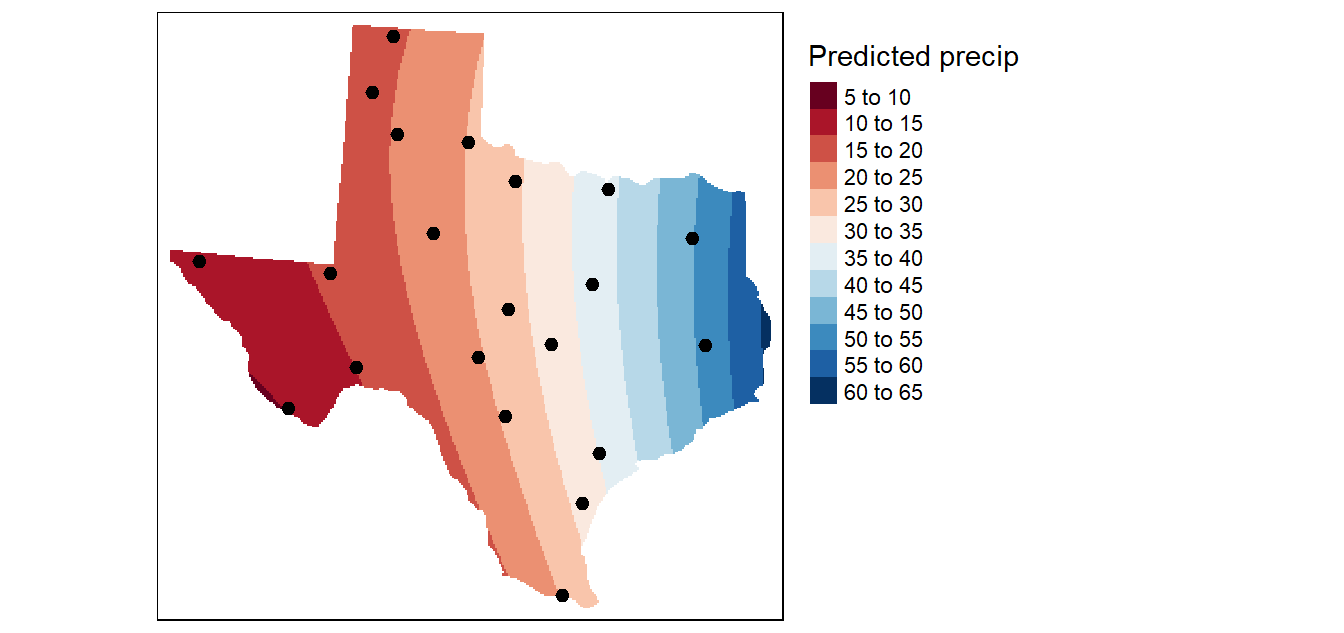
Figure 14.9: Result of a second order interpolation
This interpolation picks up a slight curvature in the east-west trend. But it’s not a significant improvement over the 1st order trend.
14.2.2 Ordinary Kriging
Several forms of kriging interpolators exist: ordinary, universal and simple just to name a few. This section will focus on ordinary kriging (OK) interpolation. This form of kriging usually involves four steps:
- Removing any spatial trend in the data (if present).
- Computing the experimental variogram, \(\gamma\), which is a measure of spatial autocorrelation.
- Defining an experimental variogram model that best characterizes the spatial autocorrelation in the data.
- Interpolating the surface using the experimental variogram.
- Adding the kriged interpolated surface to the trend interpolated surface to produce the final output.
These steps our outlined in the following subsections.
14.2.2.1 De-trending the data
One assumption that needs to be met in ordinary kriging is that the mean and the variation in the entity being studied is constant across the study area. In other words, there should be no global trend in the data (the term drift is sometimes used to describe the trend in other texts). This assumption is clearly not met with our Texas precipitation dataset where a prominent east-west gradient is observed. This requires that we remove the trend from the data before proceeding with the kriging operations.
Many pieces of software will accept a trend model (usually a first, second or third order polynomial). In the steps that follow, we will use the first order fit computed earlier to de-trend our point values (recall that the second order fit provided very little improvement over the first order fit).
Removing the trend leaves us with the residuals that will be used in kriging interpolation. Note that the modeled trend will be added to the kriged interpolated surface at the end of the workflow.
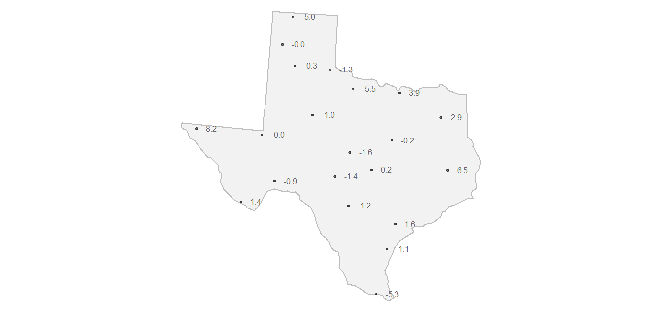
Figure 14.10: Map showing de-trended precipitation values (aka residuals). These detrended values are then passed to the ordinary kriging interpolation operations. You can think of these residuals as representing variability in the data not explained by the global trend. If variability is present in the residuals then it is best characterized as a distance based measure of variability (as opposed to a location based measure).
14.2.2.2 Experimental Variogram
In Kriging interpolation, we focus on the spatial relationship between location attribute values. More specifically, we are interested in how these attribute values (precipitation residuals in our working example) vary as the distance between location point pairs increases. We can compute the difference, \(\gamma\), in precipitation values by squaring their differences then dividing by 2.
For example, if we take two meteorological stations (one whose de-trended precipitation value is -1.2 and the other whose value is 1.6),

Figure 14.11: Locations of two sample sites used to demonstrate the calculation of gamma.
we can compute their difference (\(\gamma\)) as follows:
\[ \gamma = \frac{(Z_2 - Z_1)^2}{2} = \frac{(-1.2 - (1.6))^2}{2} = 3.92 \]
We can compute \(\gamma\) for all point pairs then plot these values as a function of the distances that separate these points:
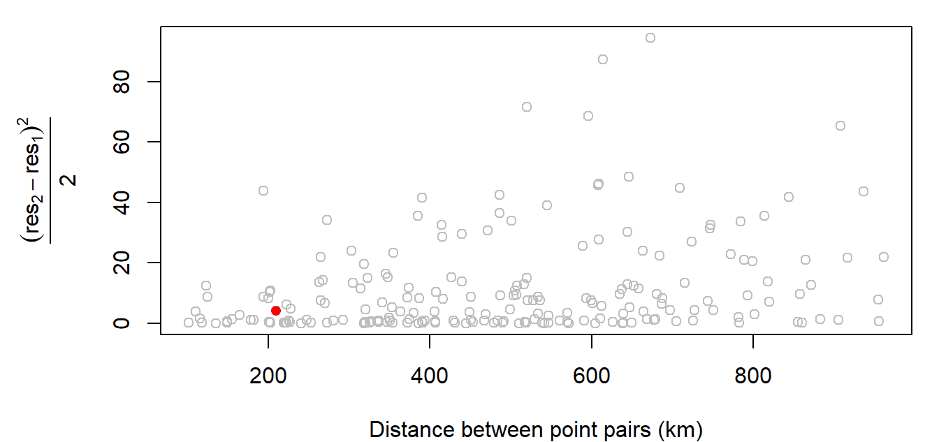
Figure 14.12: Experimental variogram plot of precipitation residual values.
The red point in the plot is the value computed in the above example. The distance separating those two points is about 209 km. This value is mapped in 14.12 as a red dot.
The above plot is called an experimental semivariogram cloud plot (also referred to as an experimental variogram cloud plot). The terms semivariogram and variogram are often used interchangeably in geostatistics (we’ll use the term variogram henceforth since this seems to be the term of choice in current literature). Also note that the word experimental is sometimes dropped when describing these plots, but its use in our terminology is an important reminder that the points we are working with are just samples of some continuous field whose spatial variation we are attempting to model.
14.2.2.3 Sample Experimental Variogram
Cloud points can be difficult to interpret due to the sheer number of point pairs (we have 465 point pairs from just 50 sample points, and this just for 1/3 of the maximum distance lag!). A common approach to resolving this issue is to “bin” the cloud points into intervals called lags and to summarize the points within each interval. In the following plot, we split the data into 15 bins then compute the average point value for each bin (displayed as red points in the plot). The red points that summarize the cloud are the sample experimental variogram estimates for each of the 15 distance bands and the plot is referred to as the sample experimental variogram plot.
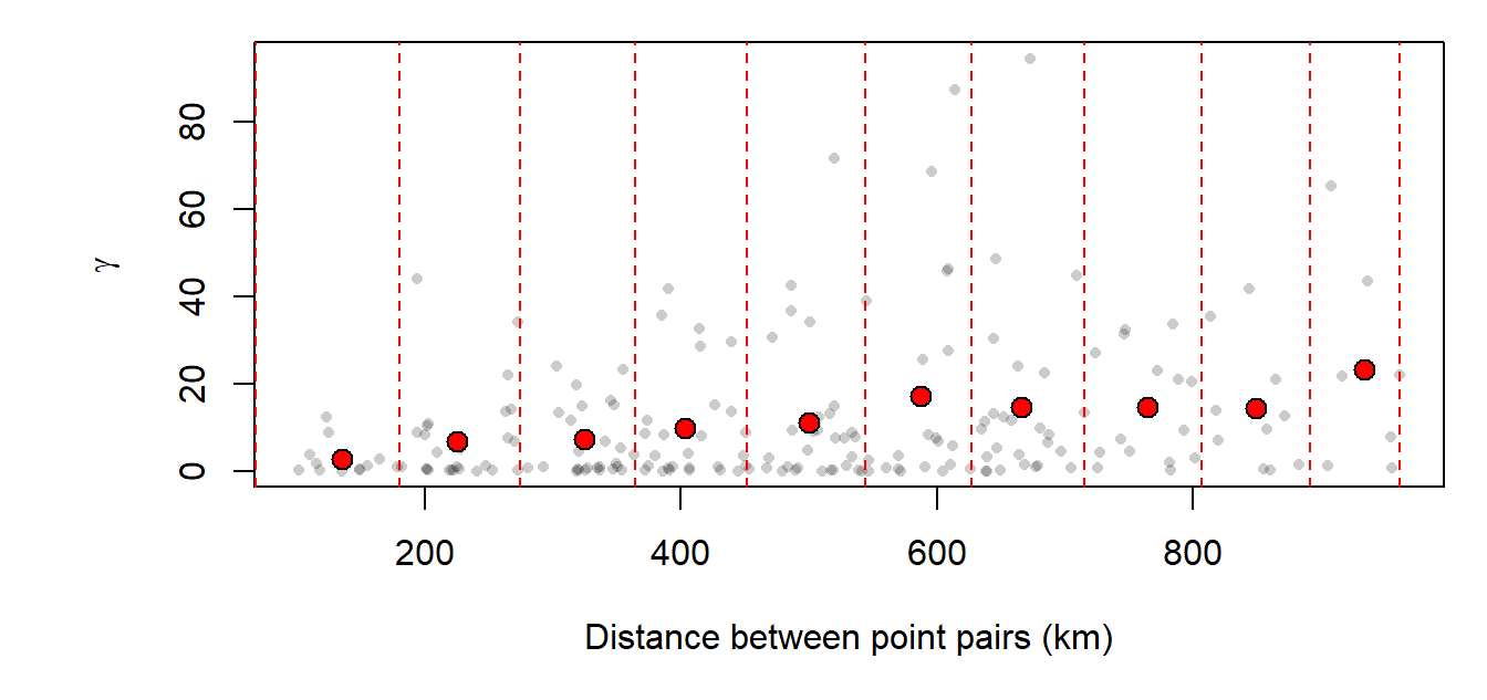
Figure 14.13: Sample experimental variogram plot of precipitation residual values.
14.2.2.4 Experimental Variogram Model
The next step is to fit a mathematical model to our sample experimental variogram. Different mathematical models can be used; their availability is software dependent. Examples of mathematical models are shown below:
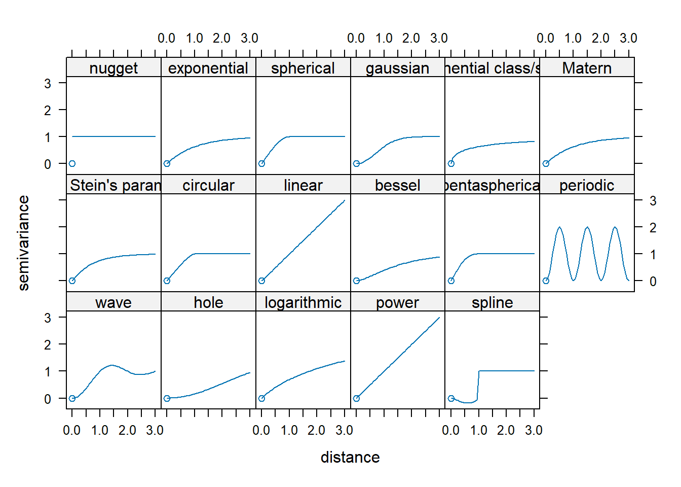
Figure 14.14: A subset of variogram models available in R’s gstat package.
The goal is to apply the model that best fits our sample experimental variogram. This requires picking the proper model, then tweaking the partial sill, range, and nugget parameters (where appropriate). The following figure illustrates a nonzero intercept where the nugget is the distance between the \(0\) variance on the \(y\) axis and the variogram’s model intercept with the \(y\) axis. The partial sill is the vertical distance between the nugget and the part of the curve that levels off. If the variogram approaches \(0\) on the \(y\)-axis, then the nugget is \(0\) and the partial sill is simply referred to as the sill. The distance along the \(x\) axis where the curve levels off is referred to as the range.
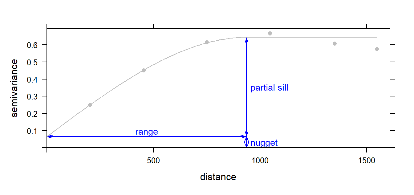
Figure 14.15: Graphical description of the range, sill and nugget parameters in a variogram model.
In our working example, we will try to fit the Spherical function to our sample experimental variogram. This is one of three popular models (the other two being linear and gaussian models.)
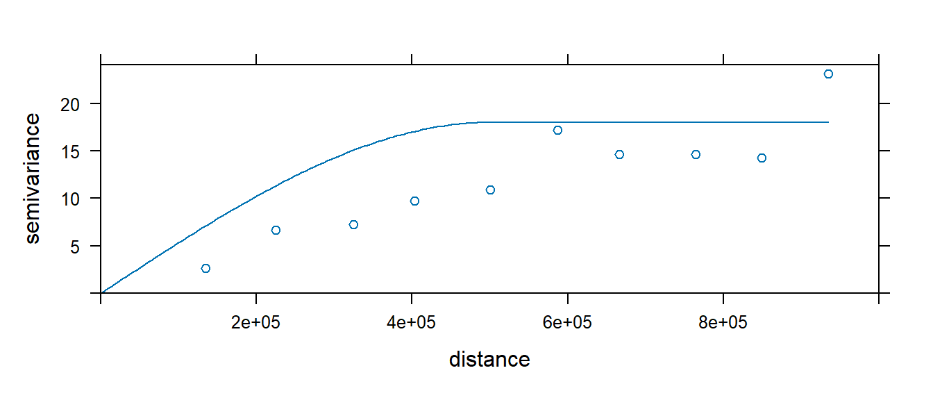
Figure 14.16: A spherical model fit to our residual variogram.
14.2.2.5 Kriging Interpolation
The variogram model is used by the kriging interpolator to provide localized weighting parameters. Recall that with the IDW, the interpolated value at an unsampled site is determined by summarizing weighted neighboring points where the weighting parameter (the power parameter) is defined by the user and is applied uniformly to the entire study extent. Kriging uses the variogram model to compute the weights of neighboring points based on the distribution of those values–in essence, kriging is letting the localized pattern produced by the sample points define the weights (in a systematic way). The exact mathematical implementation will not be covered here (it’s quite involved), but the resulting output is shown in the following figure:
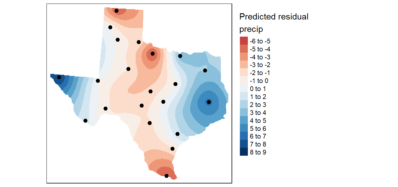
Figure 14.17: Krige interpolation of the residual (detrended) precipitation values.
Recall that the kriging interpolation was performed on the de-trended data. In essence, we predicted the precipitation values based on localized factors. We now need to combine this interpolated surface with that produced from the trend interpolated surface to produce the following output:
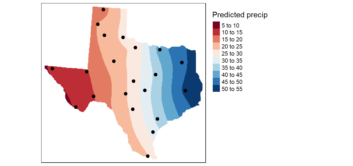
Figure 14.18: The final kriged surface.
A valuable by-product of the kriging operation is the variance map which gives us a measure of uncertainty in the interpolated values. The smaller the variance, the better (note that the variance values are in squared units).
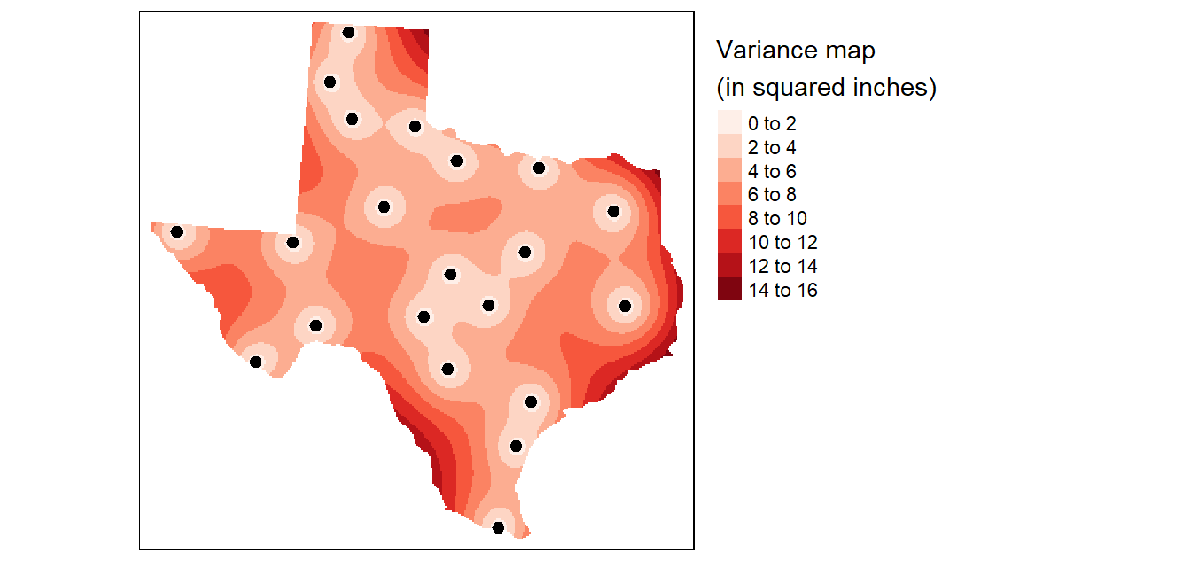
Figure 14.19: Variance map resulting from the Kriging analysis.