| dplyr | ggplot2 | tidyr |
|---|---|---|
| 1.2.0 | 4.0.2 | 1.3.2 |
35 Slicing Data: Exploring Discontinuities and Local Models
So far, we’ve assumed that the underlying process that relates the \(X\) and \(Y\) variables is homogeneous across the full range of \(X\) values. This assumption simplifies model fitting strategies. But sometimes, that assumption does not hold.
When this assumption fails, a single model may obscure important structure in the data. In such cases, slicing the data into segments-each governed by its own model-can reveal patterns that would otherwise remain hidden.
35.1 A synthetic example: Visualizing breaks in linearity
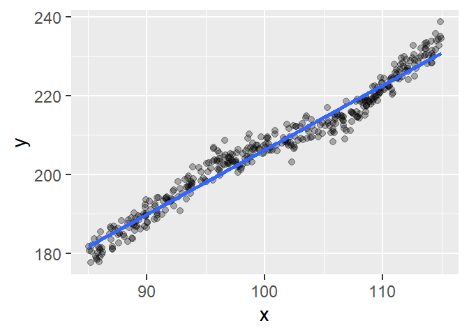
We’ll begin by fitting a simple linear model to a synthetic dataset.

The fitted line captures the overall trend reasonably well, but the relationship doesn’t appear to be strictly linear. To investigate further, we’ll examine the residuals using a residual-dependence plot.
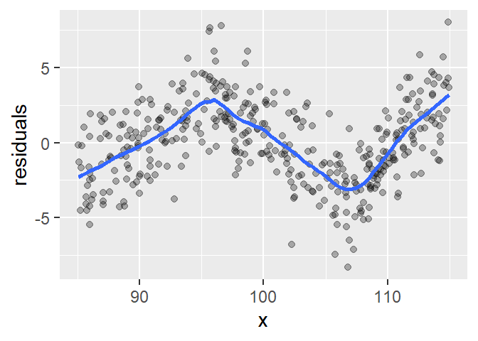
The residual plot reveals a dip between \(x \approx 95\) and \(x \approx 107\) followed by an upward trend. These kinks suggest that the data may be better modeled using three distinct linear segments, each with its own slope and intercept. The small loess span helps highlight these local deviations.
To explore this further, we divide the data into three groups based on the apparent breakpoints: \(x < 95\), \(95 \leq x < 106\) and \(x \geq 106\). We’ll label these groups 1, 2, and 3.
The faceted plots confirm our earlier suspicion: each segment appears to follow a distinct linear trend.
This example illustrates how a single global model may obscure important structure in the data. By examining residuals and fitting local models, we can uncover distinct regimes that reflect different underlying processes.
In the next section, we’ll see how this approach applies to real-world data where the breaks may not be as visually obvious.
35.2 Case study: Trends in daily temperature extremes
Disclaimer: the analysis presented here is only exploratory and does not mirror the complete analysis conducted by Vincent et al. (2005) nor the one conducted by Stone (2011).
35.2.1 Original analysis
The following data are pulled from the paper titled “Observed Trends in Indices of Daily Temperature Extremes in South America 1960-2000” (Vincent et al., 2005) and represent the percentage of nights with temperatures greater than or colder than the 90th and 10th percentiles respectively within each year. The percentiles were calculated for the 1961 to 2000 period.
library(tidyr)

Year <- 1960:2000
PerC <- c(11.69,9.33,14.35,10.73,14.15,11.16,13,12.13,14.25,10.01,11.94,14.35,
          10.83,9.38,11.5,10.44,12.66,7.55,9.77,9.81,8.9,8.51,7.02,6.83,9.67,
          7.84,7.11,8.56,10.59,7.93,8.85,8.8,8.75,8.18,7.16,9.91,10.15,6.58,
          6.44,9.43,8.03)
PerH <- c(8.62,10.1,6.67,11.13,5.71,9.48,7.63,8.12,7.2,9.64,8.42,5.71,11.72,
          11.32,7.2,7.17,7.46,13.17,9.28,8.75,12.38,10,13.83,17.59,10.14,
          9.84,11.23,14.39,9.44,8.26,12.15,12.45,13.14,13.67,15.22,11.79,11.16,
          20.37,17.56,11.13,11.49)
df2 <- data.frame(Year, PerC, PerH)

df2.l <- pivot_longer(df2, names_to = "Temp", values_to = "Percent", -Year)
Next, a straight line is fitted to the data.
ggplot(df2.l, aes(x = Year, y = Percent)) + geom_point() +
  stat_smooth(method = "lm", se = FALSE) + facet_wrap(~ Temp, nrow = 1)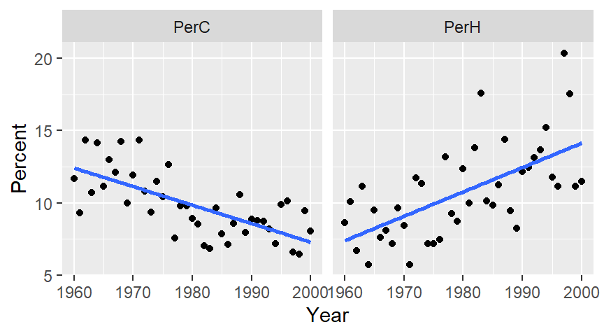
The plot on the left shows percent cold nights and the one on the right shows percent hot nights. At first glance, the trends appear to be significant and monotonic.
Next we’ll fit a loess to see if the trends are indeed monotonic. To minimize the undue influence of tail-end values in the plot, we’ll implement loess’ bisquare estimation method via the family=symmetric option. We’ll also use a small span to help identify any “kinks” in the patterns.
ggplot(df2.l, aes(x = Year, y = Percent)) + geom_point() +
  stat_smooth(method = "loess", se = FALSE, span = 0.5,
              method.args = list(degree = 1, family = "symmetric"))  +
  facet_wrap(~ Temp, nrow = 1)
The patterns seem to be segmented around the 1975-1980 period for both plots suggesting that the observed trends may not be monotonic. In fact, there appears to be a prominent kink in the percent cold data around the mid to late 1970`s. A similar, but not as prominent kink can also be observed in the percent hot data at around the same time period.
35.2.2 Changepoints and the pacific decadal oscillation
In a comment to Vincent et al.’s paper, R.J. Stone argues that the trend observed in the percent hot and cold dataset is not monotonic but is segmented instead. In other words, there is an abrupt change in patterns for both datasets that make it seem as though a monotonic trend exists when in fact the data may follow relatively flat patterns for two different segments of time. He notes that the abrupt change (which he refers to as a changepoint) occurs around the 1976 and 1977 period. He suggests that this time period coincides with a change in the Pacific Decadal Oscillation (PDO) pattern. PDO refers to an ocean/atmospheric weather pattern that spans multiple decades and that is believed to impact global climate.
The following chunk of code loads the PDO data, then summarizes the data by year before plotting the resulting dataset.
df3  <- read.table("http://mgimond.github.io/ES218/Data/PDO.dat",
                   header = TRUE, na.strings = "-9999")
pdo <- df3 %>%
  pivot_longer(names_to = "Month", values_to = "PDO", -YEAR) %>%
  group_by(YEAR) %>%
  summarise(PDO = median(PDO) )

ggplot(pdo, aes(x = YEAR, y = PDO)) + geom_line() +
  stat_smooth(se = FALSE, span = 0.25) +
  geom_vline(xintercept = c(1960, 1976, 2000), lty = 3)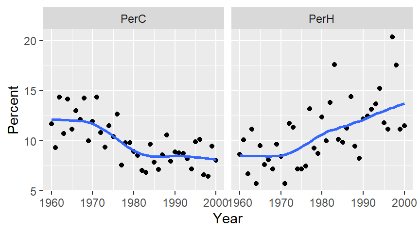
The contrast in PDO indexes between the 1960-1976 period and the 1976-2000 period is obvious with the pre-1977 index values appearing to remain relatively flat over a 15 year period and with the post-1977 index appearing to show a gradual increase towards a peak around the early 1990’s.
To see if distinct patterns emerge from the percent hot and cold data before and after 1976, we’ll split the data into two segments using a cutoff year of 1976-1977. Values associated with a period prior to 1977 will be assigned a seg value of Before and those associated with a post-1977 period will be assigned a seg value of After.
df2.l$seg <- ifelse(df2.l$Year < 1977, "Before", "After")Next, we’ll plot the data across four facets:
ggplot(df2.l, aes(x = Year, y = Percent)) + geom_point() +
  stat_smooth(method = "lm", se = FALSE) + facet_grid(seg ~ Temp)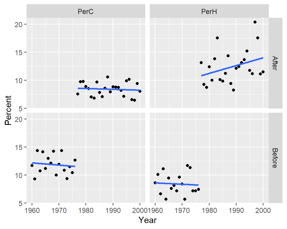
We can also choose to map seg to the color aesthetics which will split the points by color with the added benefit of fitting two separate models to each batch.
ggplot(df2.l, aes(x = Year, y = Percent, col = seg)) + geom_point() +
  stat_smooth(method = "lm", se=FALSE) + facet_wrap( ~ Temp, nrow = 1)
To check for “straightness” in the fits, we’ll fit a loess to the points.
ggplot(df2.l, aes(x = Year, y = Percent, col = seg)) + geom_point() +
  stat_smooth(method = "loess", se = FALSE, method.args = list(degree = 1)) +
  facet_wrap( ~ Temp, nrow = 1)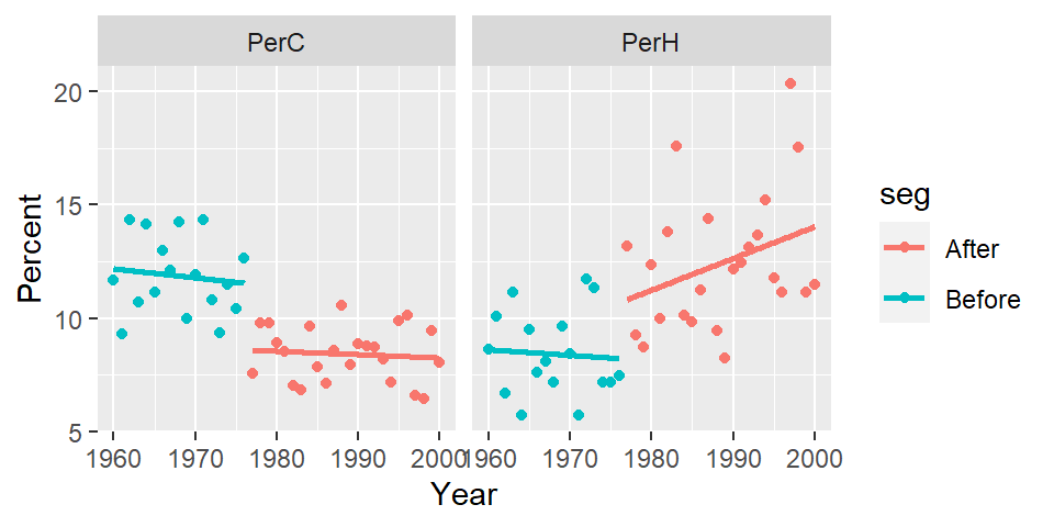
There is a clear “stair-step” pattern for the percent cold nights. However, there seems to be an upward trend in the percent of hot nights for the post-1977 period which could imply that in addition to the PDO effect, another process could be at play.
This little exercise highlights the ease in which an analysis can follow different (and seemingly sound) paths. It also serves as a reminder of the importance of domain knowledge when exploring data.
35.3 Summary
In earlier chapters, we assumed that a single model could describe the relationship between two variables across the entire range of data. This chapter challenged that assumption by introducing the concept of slicing-dividing the data into segments where different models may apply.
Using residual plots and loess fits, we saw how structural breaks, or changepoints, can be visually detected. These breaks often indicate that the data may be governed by different processes in different regions of the independent variable.
The synthetic example demonstrated how residual patterns can reveal hidden linear segments, while the temperature case study illustrated how domain knowledge can help interpret such patterns meaningfully.
Ultimately, slicing is a powerful exploratory tool that helps uncover non-monotonic trends, regime shifts, and localized behaviors that a single global model might obscure.
35.4 Reference
Original paper: Vincent, L. A., et al., 2005. Observed trends in indices of daily temperature extremes in South America 1960–2000. J. Climate, 18, 5011–5023.
Comment to the paper Stone, R. J., 2011. Comments on “Observed trends in indices of daily temperature extremes in South America 1960–2000.” J. Climate, 24, 2880–2883.
The reply to the comment Vincent, L. A., et al., 2011. Reply, J. Climate, 24, 2884-2887.