| tukeyedar |
|---|
| 0.5.0 |
22 Transforming data: Re-expression for Shape and Spread
In previous chapters, we explored how to visualize and model univariate data, and how to assess the fit and spread of residuals. A key assumption in many statistical procedures is that data are symmetrically distributed and have consistent spread across groups. However, real-world data often violate these assumptions—especially when distributions are skewed or contain outliers.
One effective strategy to address these issues is non-linear re-expression also known as transformation. In univariate analysis, re-expression is typically used to achieve one or more of the following objectives:
- Symmetrizing the distribution to mitigate skewness.
- Equalizing the spread to stabilize variability across groups.
- Normalizing the distribution to allow for a mathematical characterization of the spread.
In multivariate analysis, we can add the goals of:
- Linearizing relationships between variables to simplify interpretation and improve model performance.
- Normalizing residuals in regression models to satisfy assumptions of common statistical techniques.
Re-expressing variables involves changing the scale of measurement, typically from a linear scale to a non-linear one. It’s important to note that re-expressing batches of values does not create false patterns from noise: Re-expression changes perspective, not reality.
Among the various transformation techniques available, one of the most commonly used is the logarithmic transformation, which will be discussed next.
22.1 The log transformation
A popular form of transformation used is the logarithm. The log, \(y\), of a value \(x\) is the power to which the base must be raised to produce \(x\). This requires that the log function be defined by a base, \(b\), such as 10, 2 or exp(1) (the latter defining the natural log).
\[ y = log_b(x) \Leftrightarrow x=b^y \]
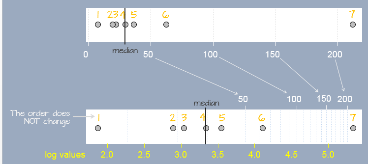
A log transformation preserves the order of the observations as measured on a linear scale but modifies the “distance” between them in a systematic way. In the following figure, seven observations measured on a linear scale (top scale) are re-expressed on a natural log scale (bottom scale). Notice how the separation between observations change. This results in a different set of values for the seven observations. The yellow text under the log scale shows natural log scale values.
In R, the base is defined by passing the parameter base= to the log() function as in log(x , base=10).
Re-expressing with the log is particularly useful when the change in one value as a function of another is multiplicative and not additive. An example of such a dataset is the compounding interest. Let’s assume that we start off with $1000 in an investment account that yields 10% interest each year. We can calculate the size of our investment for the next 50 years as follows:
rate <- 0.1                 # Rate is stored as a fraction
y    <- vector(length = 50) # Create an empty vector that can hold 50 values
y[1] <- 1000                # Start 1st year with $1000

# Next, compute the investment amount for years 2, 3, ..., 50.
# Each iteration of the loop computes the new amount for year i based
# on the previous year's amount (i-1).
for(i in 2:length(y)){
  y[i] <- y[i-1] + (y[i-1] * rate)  # Or y[i-1] * (1 + rate)
}
The vector y gives us the amount of our investment for each year over the course of 50 years.
 [1]   1000.000   1100.000   1210.000   1331.000   1464.100   1610.510   1771.561   1948.717
 [9]   2143.589   2357.948   2593.742   2853.117   3138.428   3452.271   3797.498   4177.248
[17]   4594.973   5054.470   5559.917   6115.909   6727.500   7400.250   8140.275   8954.302
[25]   9849.733  10834.706  11918.177  13109.994  14420.994  15863.093  17449.402  19194.342
[33]  21113.777  23225.154  25547.670  28102.437  30912.681  34003.949  37404.343  41144.778
[41]  45259.256  49785.181  54763.699  60240.069  66264.076  72890.484  80179.532  88197.485
[49]  97017.234 106718.957
We can plot the values as follows:
plot(y, pch = 20)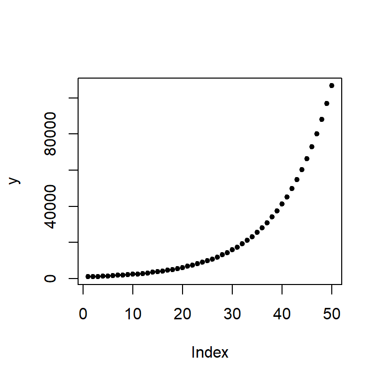
The change in difference between values from year to year is not additive, in other words, the difference between years 48 and 49 is different than that for years 3 and 4.
| Years | Difference |
|---|---|
y[49] - y[48] |
8819.75 |
y[4] - y[3] |
121 |
However, the ratios between the pairs of years are identical:
| Years | Ratio |
|---|---|
y[49] / y[48] |
1.1 |
y[4] / y[3] |
1.1 |
We say that the change in value is multiplicative across the years. In other words, the value amount 6 years out is \(value(6) = (yearly\_increase)^{6} \times 1000\) or 1.1^6 * 1000 = 1771.561 which matches value y[7].
When we expect a variable to change multiplicatively as a function of another variable, it is usually best to transform the variable using the logarithm. To see why, plot the log of y.
plot(log(y), pch=20)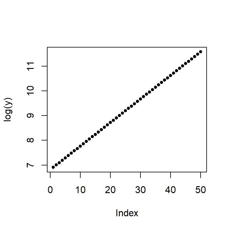
Note the change from a curved line to a perfectly straight line. The logarithm will produce a straight line if the rate of change for y is constant over the range of x. This is a nifty property since it makes it easier to see if and where the rate of change differs. For example, let’s look at the population growth rate of the US from 1850 to 2013.
dat <- read.csv("https://mgimond.github.io/ES218/Data/Population.csv", header=TRUE)
plot(US ~ Year, dat, type="l") 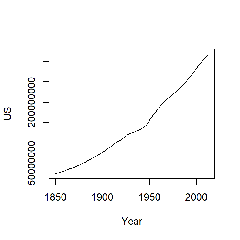
The population count for the US follows a slightly curved (convex) pattern. It’s difficult to see from this plot if the rate of growth is consistent across the years (though there is an obvious jump in population count around the 1950’s). Let’s log the population count.
plot(log(US) ~ Year, dat, type="l") 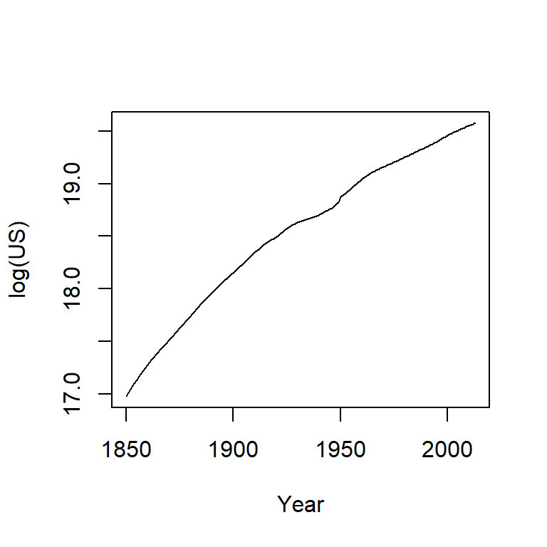
Here, the log plot shows that the rate of growth for the US has not been consistent over the years (had it been consistent, the line would have been straight). In fact, there seems to be a gradual decrease in growth rate over the 150 year period.
A logarithm is defined by a base. Some of the most common bases are 10, 2 and exp(1) with the latter being the natural log. The bases can be defined in the call to log() by adding a second parameter to that function. For example, to apply the log base 2 to a vector y, type log(y, 2). To apply the natural log to that same value, simply type log(y, exp(1))–this is R’s default log.
The choice of a log base will not impact the fundamental shape of the logged values in the plot, it only changes its scale. So unless interpretation of the logged value is of concern, any base will do. Generally, you want to avoid difficult to interpret logged values. For example, if you apply log base 10 to the investment dataset, you will end up with a small range of values–thus more decimal places to work with–whereas a base 2 logarithm will generate a wider range of values and thus fewer decimal places to work with.
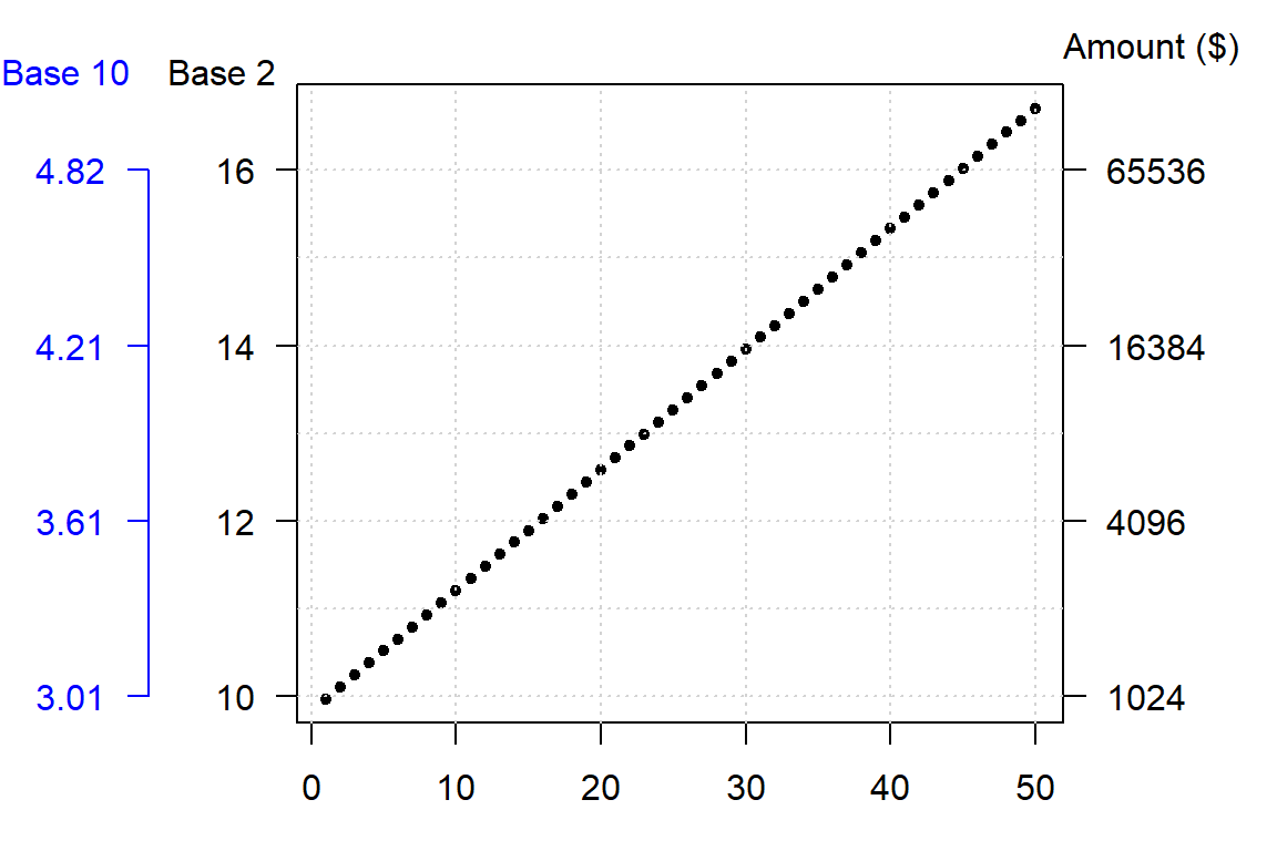
A rule of thumb is to use log base 10 when the range of values to be logged covers 3 or more powers of ten, \(\geq 10^3\) (for example, a range of 5 to 50,000); if the range of values covers 2 or fewer powers of ten, \(\leq 10^2\) (for example, a range of 5 to 500) then a natural log or a log base 2 is best.
The log is not the only transformation that can be applied to a dataset. A family of power transformations (of which the log is a special case) can be implemented using either the Tukey transformation or the Box-Cox transformation. We’ll explore the Tukey transformation next.
22.2 The Tukey transformation
The Tukey family of transformations offers a broad range of re-expression options (which includes the log). The values are re-expressed using the algorithm:
\[
T_{\text{Tukey}} =
\begin{cases}
x^p, & p \neq 0 \\
\log(x), & p = 0
\end{cases}
\] The objective is to find a value for \(p\) from a “ladder” of powers (e.g. -2, -1, -1/2, 0, 1/2, 1, 2) that does a good job in re-expressing the batch of values. Technically, \(p\) can take on any value. But in practice, we normally pick a value for \(p\) that may be “interpretable” in the context of our analysis. For example, a log transformation (p=0) may make sense if the process we are studying has a steady growth rate. A cube root transformation (p = 1/3) may make sense if the entity being measured is a volume (e.g. rain fall measurements). But sometimes, the choice of \(p\) may not be directly interpretable or may not be of concern to the analyst.
Finding a power transformation that achieves a desired shape can be an iterative process. In the following example, a skewed distribution is generated using the rgamma function. The goal will be to symmetrize the disitrbution.
# Create a skewed distribution of 50 random values
set.seed(9)
a <- rgamma(50, shape = 1)

# Let's look at the skewed distribution
boxplot(a, horizontal = TRUE)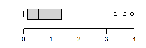
The batch is strongly skewed to the right. In an attempt to symmetrize the distribution, we’ll first try a square-root transformation (a power of 1/2)
boxplot(a^(1/2), horizontal = TRUE)
The skew is reduced, but the distribution still lacks symmetry. We’ll reduce the power to 0–a log transformation:
boxplot(log(a), horizontal = TRUE)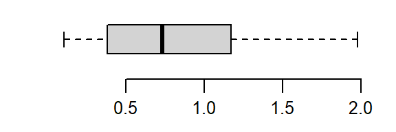
That’s a little too much over-correction; we don’t want to substitute a right skew for a left skew. A power between 0 and 1/2 (i.e. 1/4) is explored next.
boxplot(a^(1/4), horizontal = TRUE)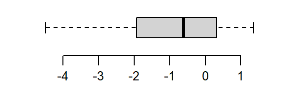
The power of 1/4 does a good job rendering a symmetrical distribution about a’s central value.
Note that power transformations are not a panacea to all distributional problems. If a power transformation cannot generate the desired outcome, then other analytical strategies that do not rely on a desired distributional shape needs to be sought.
22.3 The Box-Cox transformation
Another family of transformations is the Box-Cox transformation. The values are re-expressed using a modified version of the Tukey transformation:
\[
T_{Box-Cox} =
\begin{cases} \frac{x^p - 1}{p}, & p \neq 0 \\
log(x), & p = 0
\end{cases}
\] Both the Box-Cox and Tukey transformations method will generate similar distributions when the power p is 0 or greater, they will differ in distributions when the power is negative. For example, when re-expressing mtcars$mpg using an inverse power (p = -1), Tukey’s re-expression will change the data order but the Box-Cox transformation will not as shown in the following plots:.
The original data shows a negative relationship between mpg and disp; the Tukey re-expression takes the inverse of mpg which changes the nature of the relationship between the y and x variables where we now have a positive relationship between the re-expressed mpg variable and disp variable (note that by simply changing the sign of the re-expressed value, -x^(-1) maintains the nature of the original relationship); the Box-Cox transformation, on the other hand, maintains this negative relationship.
The choice of re-expression will depend on the analysis context. For example, if you want an easily interpretable transformation then opt for the Tukey re-expression. If you want to compare the shape of transformed variables, the Box-Cox approach will be better suited.
22.4 The eda_re function
The tukeyedar package offers a re-expression function that implements both the Tukey and Box-Cox transformations. To apply the Tukey transformation set tukey = TRUE (the default setting). For the Box-Cox transformation, set tukey = FALSE. The power parameter is defined by the p argument.
For a Tukey transformation:
library(tukeyedar)
mpg_re <- eda_re(mtcars$mpg, p=-0.25)
boxplot(mpg_re, horizontal = TRUE)
For a Box-Cox transformation:
mpg_re <- eda_re(mtcars$mpg, p=-0.25, tukey = FALSE)
boxplot(mpg_re, horizontal = TRUE)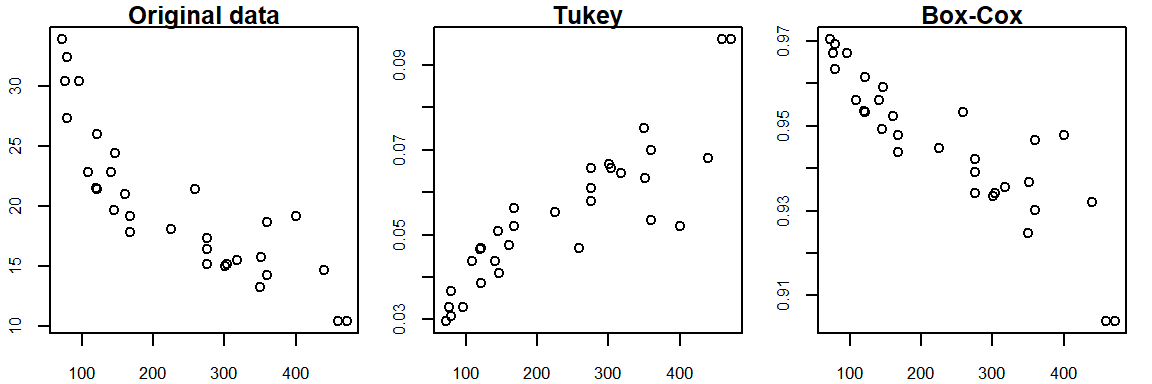
22.5 Built-in re-expressions for many tukeyedar functions
Many tukeyedar functions have a built-in argument p that will take as argument a power transformation that will be applied to the data. For example, the following Normal QQ plot function applies a quartic root transformation (p = 1/4) to a.
eda_theo(a, p = 1/4)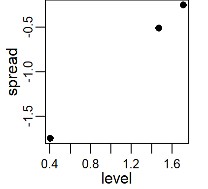
22.6 The eda_unipow function
The eda_unipow function will generate a matrix of distribution plots for a given vector of values using different power of transformations. By default, these powers are c(2, 1, 1/2, 1/3, 0, -1/3, -1/2, -1, -2)–this generates a 3-by-3 plot matrix.
eda_unipow(a)
What we are seeking is a symmetrical distribution. The power of 1/3 comes close. We can tweak the input power parameters to cove a smaller range of values.
eda_unipow(a, p = c(1/3, 1/4, 1/5, 1/6))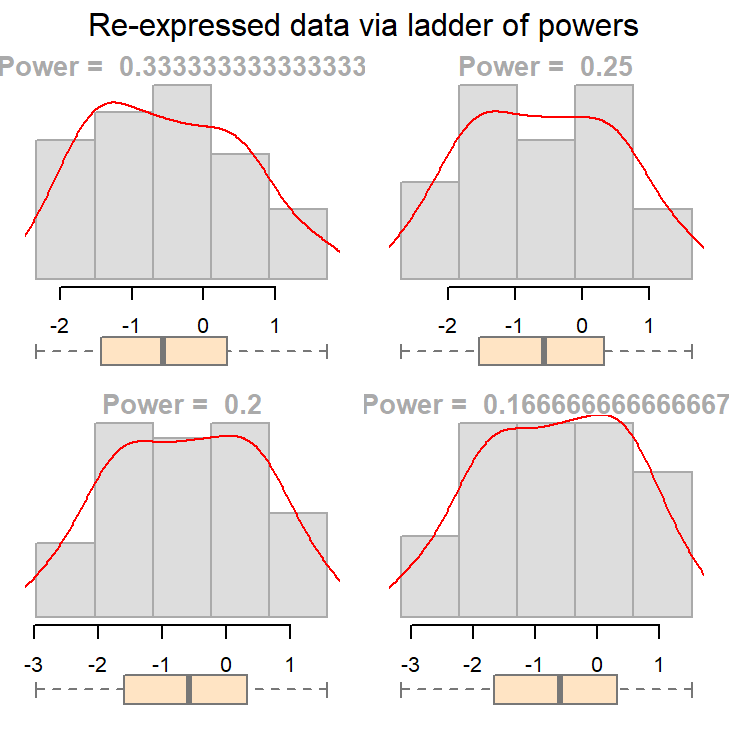
The above plot suggests that we could go with a power transformation of 0.25 or 0.2. The choice may come down to convenience and “interpretability”.
To illustrate the practical importance of re-expression, we’ll examine a real-world dataset involving groundwater contamination. This example shows how skewed data can distort statistical tests and how transformation can help restore interpretability.
22.7 An example: groundwater remediation analysis
The following data represent 1,2,3,4-tetrachlorobenzene (TCB) concentrations (in units of ppb) for two site locations: a reference site free of external contaminants and a contaminated site that went through remediation (dataset from Millard et al., p. 416-417).
# Create the two data objects (TCB concentrations for reference and contaminated sites)
Ref <-  c(0.22,0.23,0.26,0.27,0.28,0.28,0.29,0.33,0.34,0.35,0.38,0.39,
          0.39,0.42,0.42,0.43,0.45,0.46,0.48,0.5,0.5,0.51,0.52,0.54,
          0.56,0.56,0.57,0.57,0.6,0.62,0.63,0.67,0.69,0.72,0.74,0.76,
          0.79,0.81,0.82,0.84,0.89,1.11,1.13,1.14,1.14,1.2,1.33)
Cont <- c(0.09,0.09,0.09,0.12,0.12,0.14,0.16,0.17,0.17,0.17,0.18,0.19,
          0.2,0.2,0.21,0.21,0.22,0.22,0.22,0.23,0.24,0.25,0.25,0.25,
          0.25,0.26,0.28,0.28,0.29,0.31,0.33,0.33,0.33,0.34,0.37,0.38,
          0.39,0.4,0.43,0.43,0.47,0.48,0.48,0.49,0.51,0.51,0.54,0.6,
          0.61,0.62,0.75,0.82,0.85,0.92,0.94,1.05,1.1,1.1,1.19,1.22,
          1.33,1.39,1.39,1.52,1.53,1.73,2.35,2.46,2.59,2.61,3.06,3.29,
          5.56,6.61,18.4,51.97,168.64)

# We'll create a long-form version of the data for use with some of the functions
# in this exercise
df <- data.frame( Site = c(rep("Cont",length(Cont) ), rep("Ref",length(Ref) ) ),
                  TCB  = c(Cont, Ref ) )
Our goal is to assess whether the TCB concentrations at the contaminated site are significantly greater than those at the reference site. This is critical for evaluating the effectiveness of the remediation process and deciding if further action is necessary.
22.7.1 A typical statistical approach: the two sample t-test
A common statistical procedure for comparing two groups is the two-sample t-test. This test evaluates whether the means of two independent samples are significantly different.
The test can be framed in several ways. Here, we are defining the null hypothesis as \(\mu_{cont} \leq \mu_{ref}\) and the alternate hypothesis as \(\mu_{cont} > \mu_{ref}\) where \(\mu_{cont}\) is the mean concentration for the contaminated site and \(\mu_{ref}\) is the mean concentration for the reference site. The test can be implemented in R as follows:
t.test(Cont, Ref, alt="greater")
    Welch Two Sample t-test

data:  Cont and Ref
t = 1.4538, df = 76.05, p-value = 0.07506
alternative hypothesis: true difference in means is greater than 0
95 percent confidence interval:
 -0.4821023        Inf
sample estimates:
mean of x mean of y
3.9151948 0.5985106
The t-test produces a \(p\)-value of 0.075, indicating a 7.5% chance of observing a difference as or more extreme than what one would expect under the null hypothesis.
Many ancillary data analysts may stop here and proceed with the decision making process. This is not good practice.
The test relies on the standard deviation to estimate variability. However, extreme skewness and outliers inflate the standard deviation, potentially distorting the test results. By characterizing the spread of batches using the standard deviation, the t-test may misrepresent the distribution of the data if the data deviate significantly from normality.
For example, here’s a density-normal fit plot that will show how the t-test may be “interpreting” the distribution of concentrations for the contaminated site by using the batch’s standard deviation:
The concentration values are on the y-axis. The right half of the plot is the fitted Normal distribution computed from the sample’s standard deviation. The left half of the plot is the density distribution showing the actual shape of the distribution. The points in between both plot halves are the actual values. You’ll note the tight cluster of points near the value of 0 with just a few outliers extending out beyond a value of 150. The outliers are disproportionately inflating the standard deviation which, in turn, leads to the disproportionately large Normal distribution that is adopted in the t-test.
Since the test assumes that both samples are approximately Normally distributed, it would behoove us to check for deviation from normality using the normal QQ plot. Here, we compare the Cont values to a Normal distribution.
This is a textbook example of a batch of values that does not conform to a Normal distribution. At least four values (which represent ~5% of the data) seem to contribute to the strong skew and to a much distorted representation of location and spread. The mean and standard deviation are not robust to extreme values. In essence, all it takes is one single outlier to heavily distort the representation of location and spread in our data. The mean and standard deviation have a breakdown point of 1/n where n is the sample size.
22.7.2 Re-expressing concentrations
If we are to use the t-test, we need to make sure that the distributional requirements are met. Let’s compare both batches to a normal distribution via a Normal QQ plot using the eda_theo function:
library(tukeyedar)
eda_theo(Cont)
eda_theo(Ref)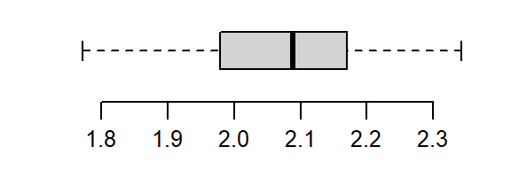
The non-Normal property of Cont has already been discussed in the last section. The reference site, Ref, shows mild skewness relative to a Normal distribution.
To address skewness, a common approach is to apply a transformation to the data. When applying transformations to univariate data that are to be compared across groups, it is essential to apply the same transformation to all batches.
The eda_theo function has an argument, p, that takes as input the power transformation to be applied to the data. The function also offers the choice between a Tukey (tukey=TRUE) or Box-Cox (tukey=FALSE) transformation method. The default is set to tukey=FALSE. We’ll first apply a log transformation (p = 0) as concentration measurements often benefit from such a transformation.
eda_theo(Cont, p = 0)
eda_theo(Ref, p = 0)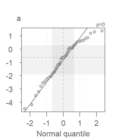
The log transformed data is an improvement, particularity for the Ref batch, but a skew in Cont is still observed suggesting a power parameter tweak.
With some trial and error, a power parameter of about -1/3 is found to offer a much better behaved distribution (note that the Box-Cox transformation is adopted in this example).
eda_theo(Cont, p = -1/3)
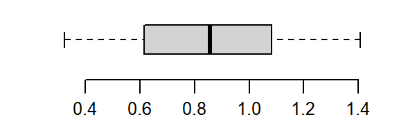
eda_theo(Ref, p = - 1/3)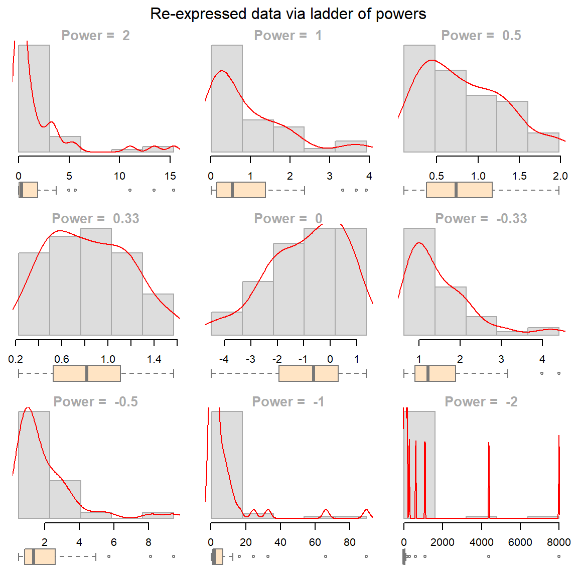
So, how important was the skewed distribution in influencing the t-test result? Now that we have normally distributed values, let’s rerun the t-test using the re-expressed values. Note that because the power is negative, we will adopt the Box-Cox transformation to preserve order by setting tukey=FALSE to the eda_re function.
t.test(eda_re(Cont,-1/3, tukey=FALSE), eda_re(Ref,-1/3,tukey=FALSE), alt="greater")
    Welch Two Sample t-test

data:  eda_re(Cont, -1/3, tukey = FALSE) and eda_re(Ref, -1/3, tukey = FALSE)
t = -0.98599, df = 111.54, p-value = 0.8369
alternative hypothesis: true difference in means is greater than 0
95 percent confidence interval:
 -0.468966       Inf
sample estimates:
 mean of x  mean of y
-0.9070769 -0.7322327
The result differs significantly from that with the raw data. This last run gives us a p-value of 0.84 whereas the first run gave us a p-value of 0.075. This suggests that there is an 85% chance that the reference site could have generated a mean concentration greater than that observed at the contaminated site!
22.7.3 Addendum: Is there more to glean from the data?
Re-expression is not only useful for statistical testing but also for improving interpretability in visual comparisons
Exploratory techniques can prove quite revealing. We can, for example, explore differences in site concentrations across all ranges of values using an empirical QQ plot. Given the skewed nature of our data, we will focus on the transformed values identified in the previous section. Additionally, a density plot is included to help interpret the QQ plot.
  eda_qq(Ref, Cont, p = -1/3, show.par = FALSE)
  eda_dens(Ref, Cont, p = -1/3, show.par = FALSE)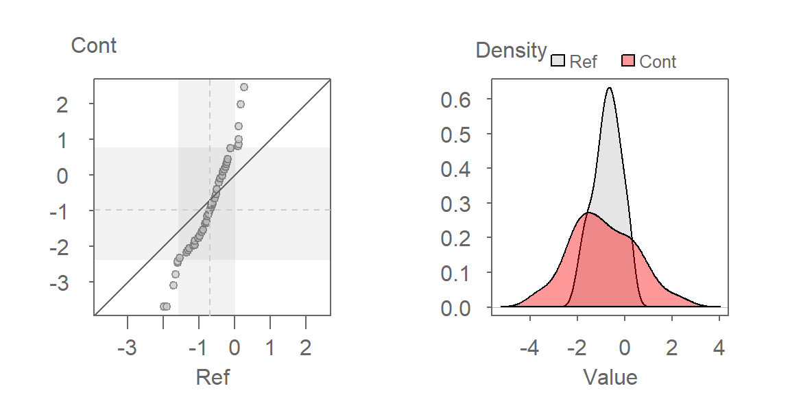
Here are some takeaways from the plots:
The QQ plot suggests that the shapes of the distributions are similar, which is expected given that the transformation rendered both datasets approximately Normal. However, their spreads differ, with the contaminated site showing greater variability in TCB concentrations.
The QQ plot reveals that the lower half of contaminated site concentrations are consistently lower than those at the reference site, while the upper half are higher. This suggests a non-uniform effect of remediation-some areas may have improved, while others still show elevated contamination.
A key insight from the QQ plot is the apparent multiplicative relationship between the datasets. Concentrations at the contaminated site appear to be approximately twice those at the reference site, when compared on the transformed scale. This observation is specific to the transformed data and reflects the nature of the re-expression. For instance, if the smallest concentration at the reference site is \(-2\), the smallest concentration at the contaminated site would be \(-2 \times 2 = -4\) (when measured on a \(-1/35\) power scale). On the original scale, the relationship translates to \(Cont = (2 \times Ref^{-1/3})^{1/-1/3}\).
This exercise underscores the value of EDA. By using visualization tools such as QQ plots, we gain a deeper understanding of the relationships between the two datasets. These insights extend far beyond the scope of a simple comparison of means, revealing patterns and variability that might otherwise be missed.
22.8 Summary
This chapter explored the use of re-expression (transformation) to address issues of skewness, unequal spread, and non-normality in univariate data. You learned about log transformations, Tukey’s ladder of powers, and Box–Cox transformations, and how to apply them to improve the interpretability and validity of statistical analyses. A real-world groundwater contamination example illustrated how transformation can dramatically affect both visual interpretation and statistical test results.
22.9 References
Millard S.P, Neerchal N.K., Environmental Statistics with S-Plus, 2001.