| dplyr | ggplot2 | lubridate |
|---|---|---|
| 1.2.0 | 4.0.2 | 1.9.5 |
36 A Deeper Exploration of Residuals: Revealing Hidden Structure
In previous chapters, we introduced the three R’s of Exploratory Data Analysis (EDA): Residuals, Re-expression, and Robustness. In this chapter, we focus on the first R: Residuals. But rather than using them solely as diagnostics, we explore how residuals can serve as tools for discovery. By iteratively modeling and analyzing residuals, we can peel back layers of structure in the data, revealing patterns that may be masked by dominant trends.
This layered approach exemplifies the EDA mindset: flexible, iterative, and guided by the data itself. To illustrate this, we’ll work through a real-world example involving atmospheric CO2 concentrations, uncovering long-term trends, seasonal cycles, and subtler fluctuations through successive rounds of residual analysis.
36.1 Uncovering Layers with Residuals: A CO2 Case Study
Let’s begin by plotting atmospheric CO2 concentrations (in parts per million) over time. The original dataset was obtained from NOAA’s Global Monitoring Laboratory, and it provides monthly CO2 measurements spanning several decades. .
library(lubridate)
library(dplyr)
library(ggplot2)

dat <- read.csv("http://mgimond.github.io/ES218/Data/co2_2024.csv")

dat2 <- dat %>%
      mutate( Date = ymd(paste(Year,"/", Month,"/15")),
              Year = decimal_date(Date),
              CO2 = Average)    %>%
      select(Year, Date, CO2)
Next, let’s look at the data:
ggplot(dat2, aes(x = Year , y = CO2)) + geom_point(size = 0.6)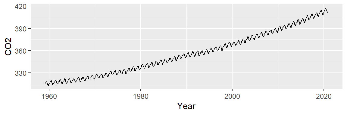
To better visualize potential patterns, we replot the data using lines instead of points.
ggplot(dat2, aes(x = Year , y = CO2)) + geom_line()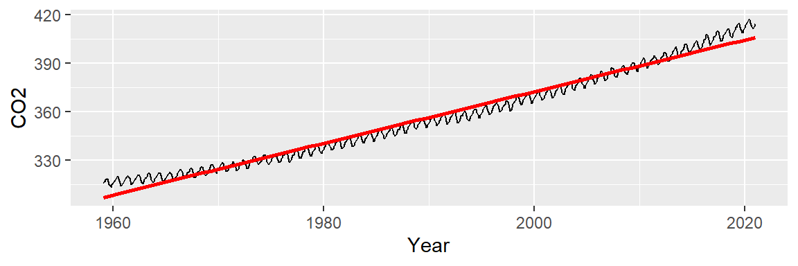
Two patterns emerge: a long-term upward trend and a seasonal oscillation. We’ll begin by modeling the overall trend to isolate and remove it, allowing us to focus on the cyclical component in the residuals.
36.2 Exploring the overall trend
We can attempt to model the overall trend by fitting a straight line to the data using a 1st order polynomial. The fitted line is displayed in red in the following plot. We will use ggplot2’s built-in smoothing function to plot the regression line.
ggplot(dat2, aes(x = Year, y = CO2)) + geom_line() +
stat_smooth(method = "lm", se = FALSE, col = "red") 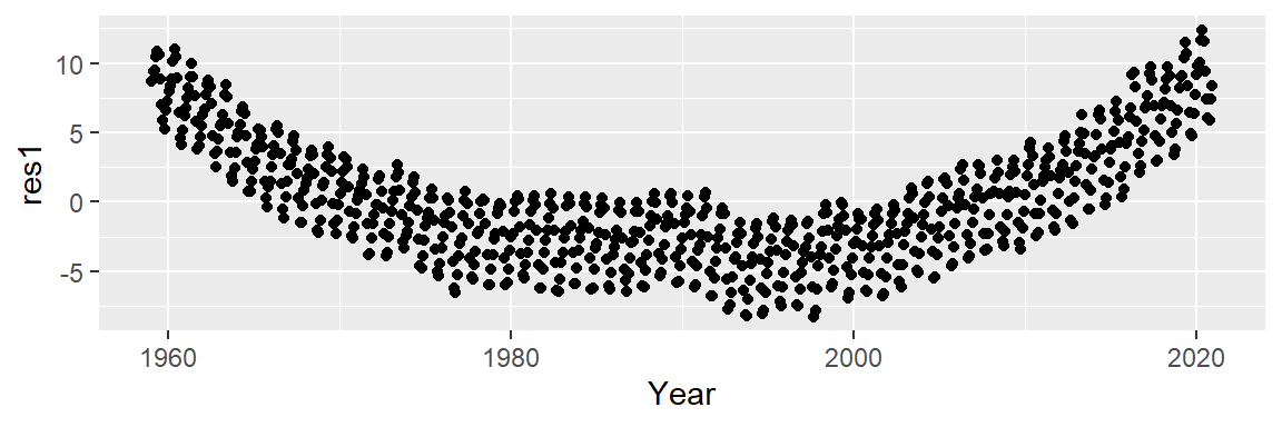
We then subtract the fitted trend from the original CO2 values to obtain the residuals–the portion of the data not explained by the model. But first, we will need to create a regression model object since it will provide us with the residuals needed to generate the residual plot.
# Generate a model object from the regression fit
M1 <- lm(CO2 ~ Year, dat2)
dat2$res1 <- M1$residuals

# Plot the residuals from the model object
ggplot(dat2, aes(x = Year, y = res1)) + geom_point()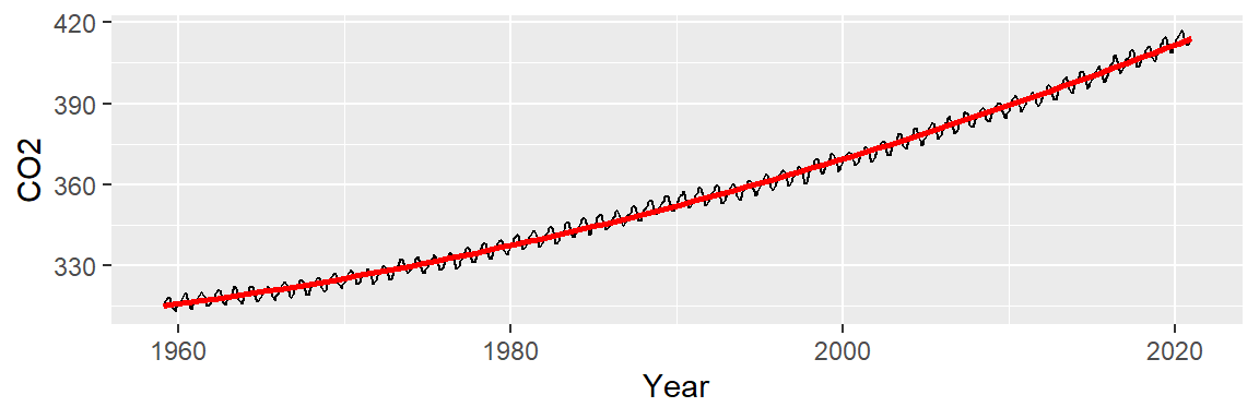
A convex pattern appears in the residuals. This suggests that we should augment the model to a 2nd order polynomial of the form:
\[ CO2_{trend} = a + b(Year) + c(Year^2) \]
The fitted line seems to do a better job in capturing the slight curvature in the data:
ggplot(dat2, aes(x = Year, y = CO2)) + geom_line() +
           stat_smooth(method = "lm", formula = y ~ x + I(x^2),
                       se = FALSE, col = "red")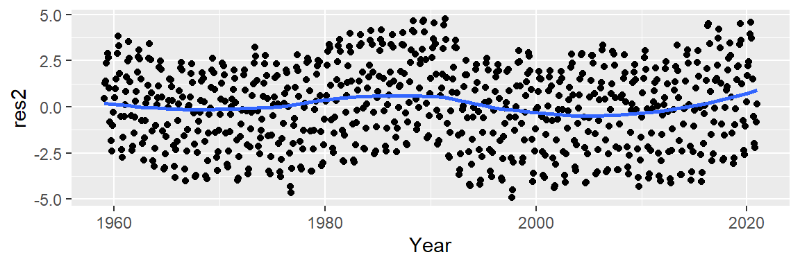
Next, we’ll explore the residuals. In helping discern any pattern in our residuals, we add a loess smooth to the plot.
M2 <- lm(CO2 ~ Year + I(Year^2), dat2)
dat2$res2 <- M2$residuals

ggplot(dat2 , aes(x = Year, y = res2)) + geom_point() +
           stat_smooth(method = "loess", se = FALSE)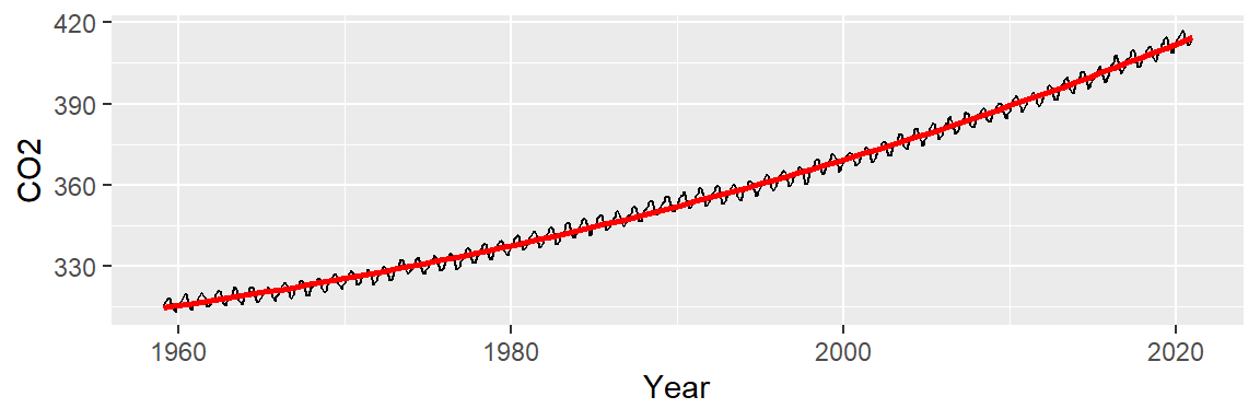
This model improves upon the linear fit, capturing a subtle curvature and a small “bump” around 1990. However, a “W”-shaped pattern remains in the residuals, which may obscure the seasonal oscillations we aim to analyze next. We can try a 3rd order polynomial and see if it can capture the 1980 to 1995 bump.
ggplot(dat2, aes(x = Year, y = CO2)) + geom_line() +
           stat_smooth(method = "lm", formula = y ~ x + I(x^2) + I(x^3),
                       se = FALSE, col = "red")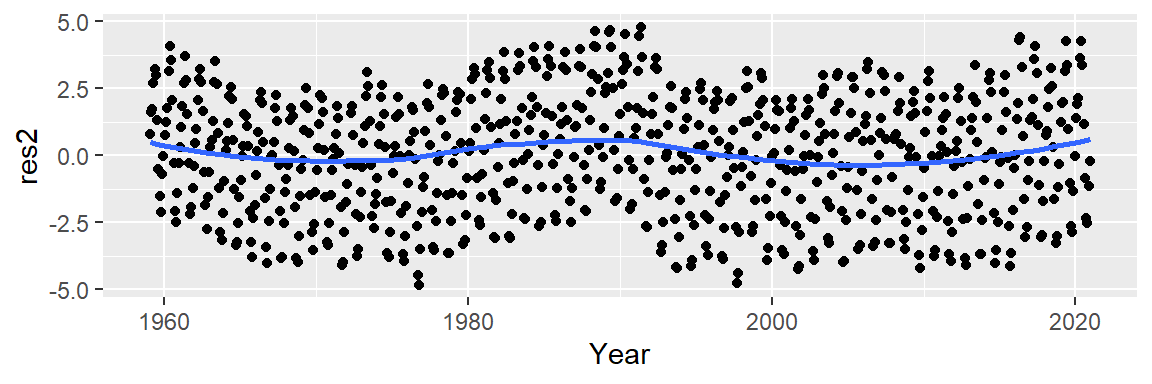
Now, let’s look at the residuals.
M2 <- lm(CO2 ~ Year + I(Year^2) + I(Year^3), dat2)
dat2$res2 <- M2$residuals

ggplot(dat2 , aes(x = Year, y = res2)) + geom_point() +
           stat_smooth(method = "loess", se = FALSE)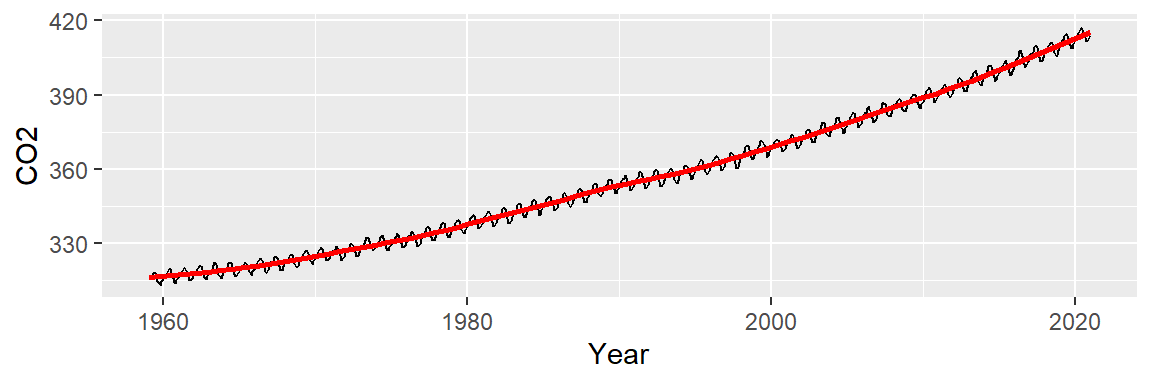
This does not appear to provide an improvement over the 2nd order polynomial fit.
Rather than continuing with higher-order polynomials, we now consider a non-parametric approach, which offers greater flexibility and fewer assumptions.
When our goal is to peel away one pattern to reveal any underlying structure, it’s important not to restrict ourselves to parametric fits, which impose rigid mathematical models on the data. Instead, non-parametric smoothing techniques offer a flexible alternative, as they make minimal assumptions and do not impose a predefined structure on the data.
In the following figure, we illustrate this approach using a loess fit, a non-parametric method well-suited for uncovering subtle patterns in the data.
ggplot(dat2, aes(x = Year, y = CO2)) + geom_line() +
             stat_smooth(method = "loess", span = 1/4, se = FALSE, col = "red")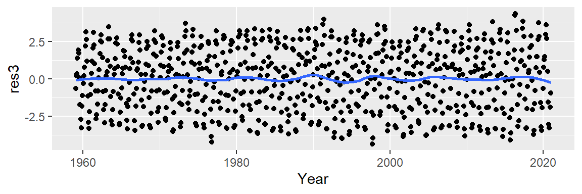
While the loess fit may resemble the polynomial models visually, its residuals indicate a more effective removal of decadal patterns.
lo <- loess(CO2 ~ Year, dat2, span=1/4)
dat2$res3 <- lo$residuals

ggplot(dat2,  aes(x = Year, y = res3)) + geom_point() +
           stat_smooth(method = "loess", se = FALSE)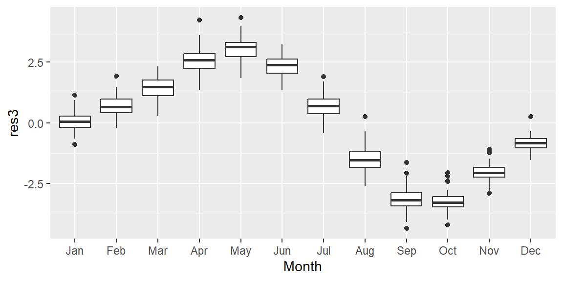
36.3 Isolating seasonality: uncovering cyclical patterns
We now turn our attention to the cyclical patterns in the residuals. Notice that the residuals’ y-axis values are an order of magnitude smaller than the original CO2 measurements. This suggests that the seasonal component contributes modestly to the overall variability (CO2 values have a range of [312.42, 426.91] ppm whereas the residuals have a range of [-4.31, 4.22] ppm).
While we might consider fitting a smooth curve to the residuals, this approach may not effectively capture the cyclical nature of the data. Instead, let’s see if the oscillation follows a 12 month cycle.
We group the residuals by month, removing the year component to focus on intra-annual variation. This allows us to examine how CO2 concentrations vary across months, independent of long-term trends. We summarize each month’s residuals using boxplots to visualize their distribution.
# Aggregate residuals by year
dat2$Month <- month(dat2$Date, label=TRUE)

ggplot(dat2, aes(x = Month, y = res3)) + geom_boxplot() 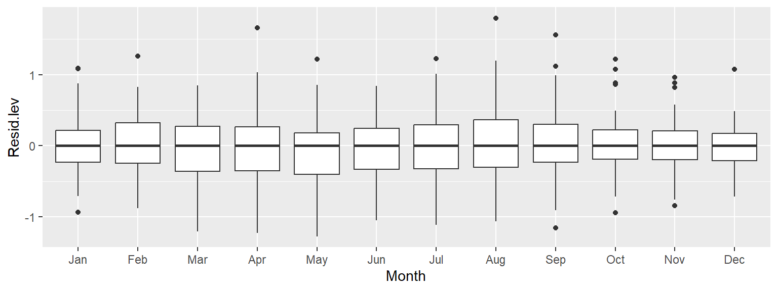
The resulting plot reveals a clear annual cycle, with CO2 concentrations peaking in spring and dipping in fall. This pattern is partly explained by the uneven distribution of land mass between the northern and southern hemispheres.
In the northern hemisphere, plants—and the process of photosynthesis—become dormant during the winter months, reducing the natural uptake of atmospheric CO2. While photosynthesis in the southern hemisphere reaches its peak between October and March, the smaller land mass of the southern hemisphere limits its overall impact.
Additional factors, such as increased CO2 emissions during the winter months, may also contribute to the seasonal fluctuations in atmospheric CO2 concentrations.
So far, we’ve uncovered three distinct patterns: a long-term upward trend, a localized “bump” around 1980-1995, and a seasonal cycle. Note that to effectively explore the cyclical pattern we had to de-trend (i.e. smooth) the data.
Next, we remove the seasonal component to see if additional structure remains in the data. To do this, we subtract the monthly median from each residual, producing a new set of residuals that are centered around zero for each month.
d3 <- dat2 %>%
  group_by(month(Date)) %>%
  mutate(Resid.lev = res3 - median(res3))

ggplot(d3, aes(x = Month, y = Resid.lev)) + geom_boxplot() 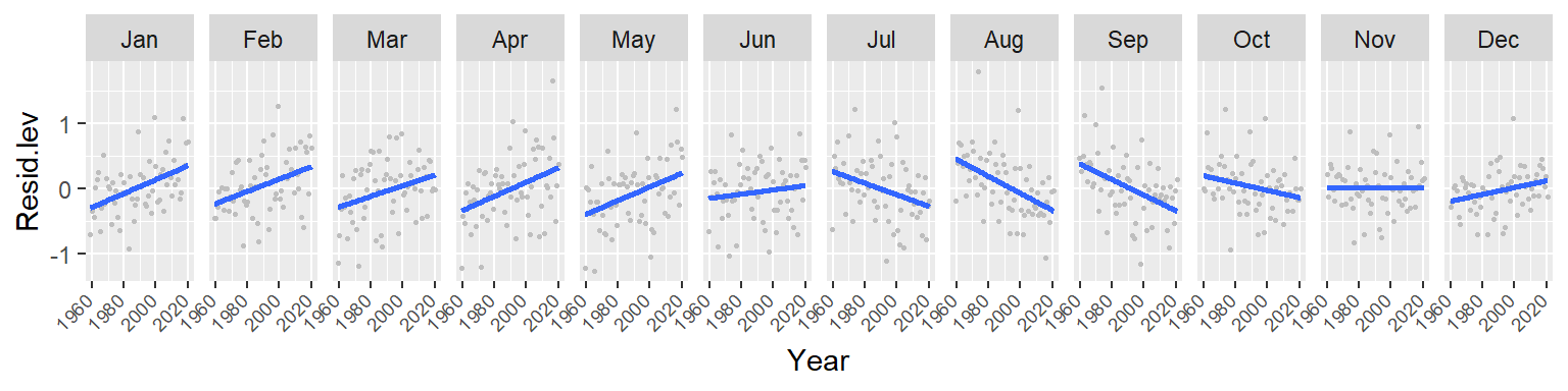
All the boxplots are lined up along their median values. We are now exploring the data after having accounted for both overall trend and seasonality. What can be gleaned from this dataset? We may want to explore the skewed nature of the residuals in March, or the narrower IQR of CO2 values for the fall months, for example.
We may also be interested in seeing if any trend in CO2 concentrations exists within each month. Let’s explore this by fitting a first order polynomial to the monthly data.
ggplot(d3, aes(x = Year, y = Resid.lev)) + geom_point(col = "grey", cex = .6)  +
     stat_smooth(se = FALSE, method = "lm") + facet_wrap(~ Month, nrow = 1) +
     theme(axis.text.x=element_text(angle=45, hjust = 1.5, vjust = 1.6,  size = 7))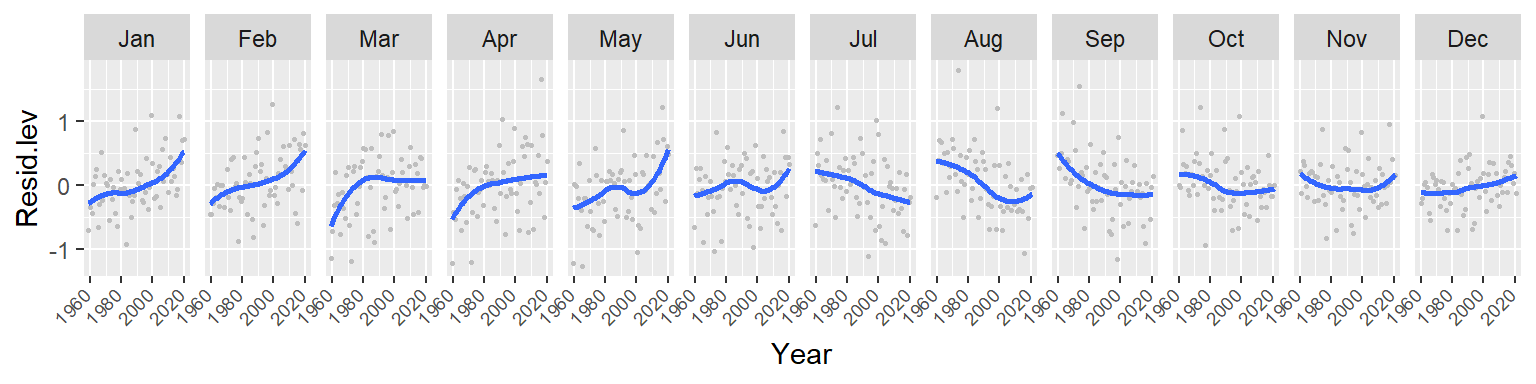
Note the overall increase in CO2 for the winter and spring months followed by a similar (but not as persistent) decrease in CO2 loss in the summer and fall months. This suggests either an increase in cyclical amplitude with the deviation from a central value being possibly greater for the winter/spring months. It could also suggest a gradual offset in the periodicity over the 60 year period. More specifically, a leftward shift in periodicity.
Let’s fit a loess to see if the trends within each month are monotonic. We’ll adopt a robust loess (family = "symmetric") to control for possible outliers in the data.
ggplot(d3, aes(x = Year, y = Resid.lev)) + geom_point(col = "grey", cex = .6)  +
     stat_smooth(method = "loess", se = FALSE,
                 method.args = list(family = "symmetric")) +
     facet_wrap(~ Month, nrow = 1) +
     theme(axis.text.x=element_text(angle=45, hjust = 1.5, vjust = 1.6,  size = 7))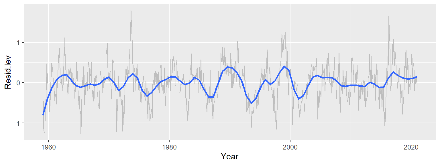
The trends are clearly not monotonic suggesting that the processes driving the cyclical concentrations of CO2 are not systematic. However, despite the curved nature of the fits, the overall trends observed with the straight lines still remain.
36.4 Beyond trend and seasonality: What remains
Having removed both the long-term trend and seasonal component, we now examine the remaining residuals over time. To account for potential noise in the data, we apply a robust loess smoother to highlight any remaining structure.
ggplot(d3, aes(x = Year, y = Resid.lev)) +  geom_line(col = "grey") +
     stat_smooth(method = "loess", se = FALSE, span = 0.1 ,
method.args = list(family = "symmetric", degree = 2)) 
Recall that we’ve already accounted for the overall trend–by far the dominant component, spanning over 110 ppm–and the seasonal cycle, which contributes about 7 ppm of variability. The remaining residuals represent approximately 2 ppm of variability–small, but potentially meaningful. Interestingly, these residuals still exhibit broad patterns that are not consistent with random noise and are not explained by seasonality. One possible explanation for these patterns is the Southern Oscillation Index (SOI), which measures atmospheric pressure differences across the Pacific basin. Positive SOI values are associated with wind-driven upwelling, which can release additional CO2 into the atmosphere.
It’s important to recognize that this is just one of many valid paths through the data. For instance, we might have begun by removing the seasonal component first, followed by modeling the long-term trend.
36.5 Summary
Residuals are not just diagnostic—they are powerful exploratory tools that help uncover hidden structure in data.
By iteratively modeling and removing dominant patterns (e.g., overall trend, seasonality), we can isolate subtler signals that may be of scientific interest.
In the CO2 dataset, we identified three layers of variability: a long-term upward trend, a seasonal cycle, and a residual component potentially linked to climate oscillations.
This layered approach exemplifies the EDA mindset: flexible, iterative, and guided by the data itself. It also highlights the importance of combining EDA techniques with domain knowledge to interpret complex patterns meaningfully.