| dplyr | ggplot2 | tukeyedar |
|---|---|---|
| 1.1.4 | 3.5.1 | 0.4.0 |
24 A working example: t-tests and re-expression
The following data represent 1,2,3,4-tetrachlorobenzene (TCB) concentrations (in units of ppb) for two site locations: a reference site free of external contaminants and a contaminated site that went through remediation (dataset from Millard et al., p. 416-417).
# Create the two data objects (TCB concentrations for reference and contaminated sites)
Ref <-  c(0.22,0.23,0.26,0.27,0.28,0.28,0.29,0.33,0.34,0.35,0.38,0.39,
          0.39,0.42,0.42,0.43,0.45,0.46,0.48,0.5,0.5,0.51,0.52,0.54,
          0.56,0.56,0.57,0.57,0.6,0.62,0.63,0.67,0.69,0.72,0.74,0.76,
          0.79,0.81,0.82,0.84,0.89,1.11,1.13,1.14,1.14,1.2,1.33)
Cont <- c(0.09,0.09,0.09,0.12,0.12,0.14,0.16,0.17,0.17,0.17,0.18,0.19,
          0.2,0.2,0.21,0.21,0.22,0.22,0.22,0.23,0.24,0.25,0.25,0.25,
          0.25,0.26,0.28,0.28,0.29,0.31,0.33,0.33,0.33,0.34,0.37,0.38,
          0.39,0.4,0.43,0.43,0.47,0.48,0.48,0.49,0.51,0.51,0.54,0.6,
          0.61,0.62,0.75,0.82,0.85,0.92,0.94,1.05,1.1,1.1,1.19,1.22,
          1.33,1.39,1.39,1.52,1.53,1.73,2.35,2.46,2.59,2.61,3.06,3.29,
          5.56,6.61,18.4,51.97,168.64)

# We'll create a long-form version of the data for use with some of the functions
# in this exercise
df <- data.frame( Site = c(rep("Cont",length(Cont) ), rep("Ref",length(Ref) ) ),
                  TCB  = c(Cont, Ref ) )
Our goal is to assess whether the TCB concentrations at the contaminated site are significantly greater than those at the reference site. This is critical for evaluating the effectiveness of the remediation process and deciding if further action is necessary.
24.1 A typical statistical approach: the two sample t-test
A common statistical procedure for comparing two groups is the two-sample t-test. This test evaluates whether the means of two independent samples are significantly different.
The test can be framed in several ways. Here, we are defining the null hypothesis as \(\mu_{cont} \le \mu_{ref}\) and the alternate hypothesis as \(\mu_{cont} \gt \mu_{ref}\) where \(\mu_{cont}\) is the mean concentration for the contaminated site and \(\mu_{ref}\) is the mean concentration for the reference site. The test can be implemented in R as follows:
t.test(Cont, Ref, alt="greater")
    Welch Two Sample t-test

data:  Cont and Ref
t = 1.4538, df = 76.05, p-value = 0.07506
alternative hypothesis: true difference in means is greater than 0
95 percent confidence interval:
 -0.4821023        Inf
sample estimates:
mean of x mean of y
3.9151948 0.5985106
The t-test produces a \(p\)-value of 0.075, indicating a 7.5% chance of observing a difference as or more extreme than what one would expect under the null hypothesis.
Many ancillary data analysts may stop here and proceed with the decision making process. This is not good practice.
The test relies on the standard deviation to estimate variability. However, extreme skewness and outliers inflate the standard deviation, potentially distorting the test results. By characterizing the spread of batches using the standard deviation, the t-test may misrepresent the distribution of the data if the data deviate significantly from normality.
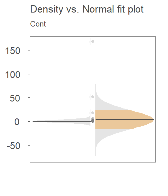
For example, here’s a density-normal fit plot that will show how the t-test may be “interpreting” the distribution of concentrations for the contaminated site by using the batch’s standard deviation:
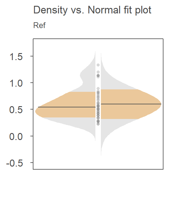
The concentration values are on the y-axis. The right half of the plot is the fitted Normal distribution computed from the sample’s standard deviation. The left half of the plot is the density distribution showing the actual shape of the distribution. The points in between both plot halves are the actual values. You’ll note the tight cluster of points near the value of 0 with just a few outliers extending out beyond a value of 150. The outliers are disproportionately inflating the standard deviation which, in turn, leads to the disproportionately large Normal distribution that is adopted in the t-test.
Since the test assumes that both samples are approximately Normally distributed, it would behoove us to check for deviation from normality using the normal QQ plot. Here, we compare the Cont values to a Normal distribution.
This is a textbook example of a batch of values that does not conform to a Normal distribution. At least four values (which represent ~5% of the data) seem to contribute to the strong skew and to a much distorted representation of location and spread. The mean and standard deviation are not robust to extreme values. In essence, all it takes is one single outlier to heavily distort the representation of location and spread in our data. The mean and standard deviation have a breakdown point of 1/n where n is the sample size.
24.2 Re-expression
If we are to use the t-test, we need to make sure that the distributional requirements are met. Let’s compare both batches to a normal distribution via a Normal QQ plot using the eda_theo function:
library(tukeyedar)
eda_theo(Cont)
eda_theo(Ref)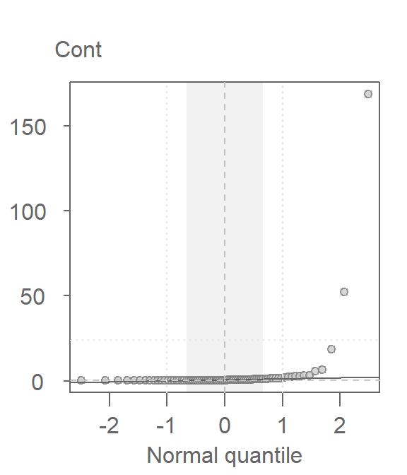
The non-Normal property of Cont has already been discussed in the last section. The reference site, Ref, shows mild skewness relative to a Normal distribution.
To address skewness, a common approach is to apply a transformation to the data. When applying transformations to univariate data that are to be compared across groups, it is essential to apply the same transformation to all batches.
The eda_theo function has an argument, p, that takes as input the power transformation to be applied to the data. The function also offers the choice between a Tukey (tukey=TRUE) or Box-Cox (tukey=FALSE) transformation method. The default is set to tukey=FALSE. We’ll first apply a log transformation (p = 0) as concentration measurements often benefit from such a transformation.
eda_theo(Cont, p = 0)
eda_theo(Ref, p = 0)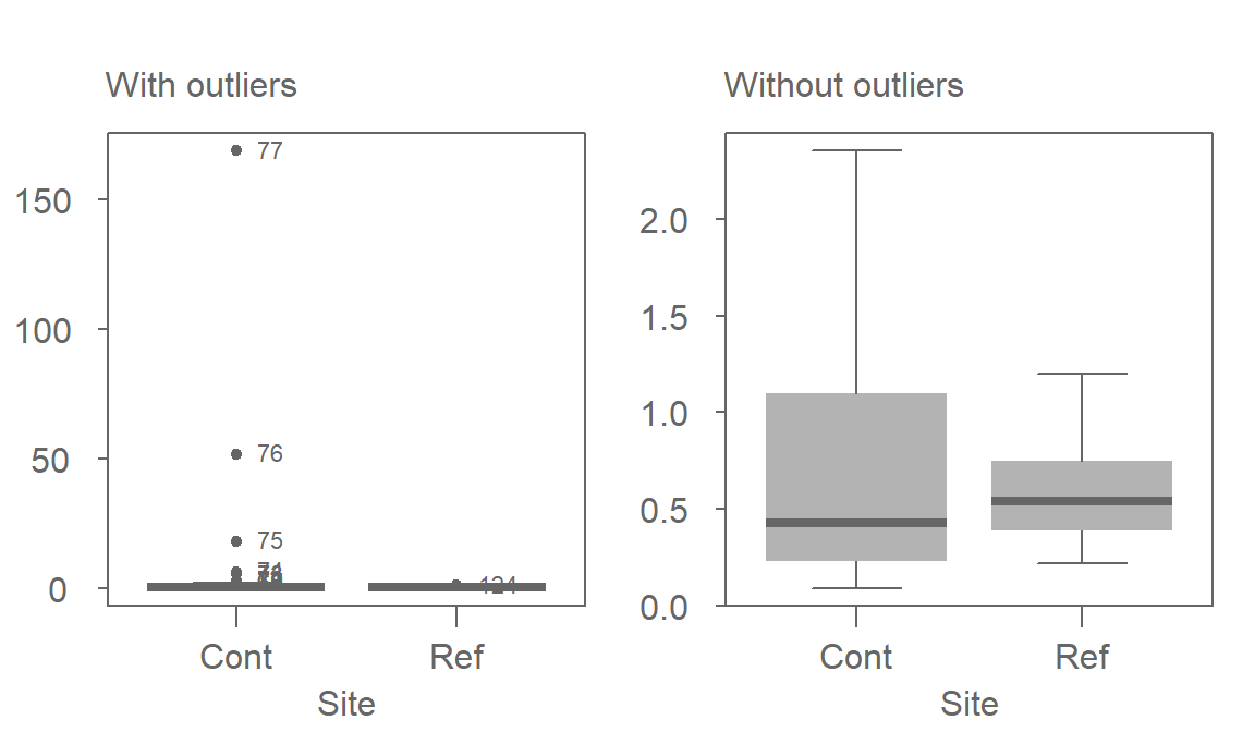
The log transformed data is an improvement, particularity for the Ref batch, but a skew in Cont is still observed. We’ll need to explore other powers next.
24.3 Fine-tuning the re-expression
An iterative process can be followed to fine-tune the choice of power. Or, we can explore the skewness across different “depths” (i.e. across different tail intervals) to see if the skewness is systematic across these depths. We’ll use letter value summary plots covered in chapter 23 to help guide us to a reasonable re-expression. We’ll make use of the custom eda_lsum function to generate the table and ggplot2 to generate the plots.
First, we’ll look at the raw contaminated site data:
library(ggplot2)

Cont.lsum <- eda_lsum(Cont, l=7)
ggplot(Cont.lsum) + aes(x=depth, y=mid, label=letter) +geom_point() +
                    scale_x_reverse() +geom_text(vjust=-.5, size=4)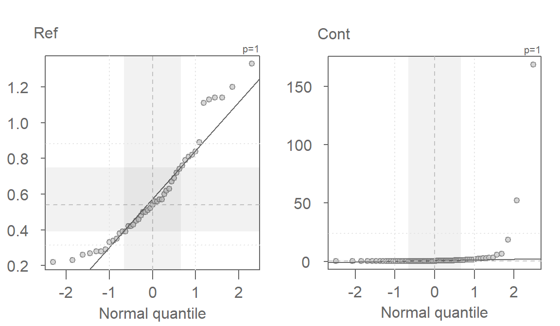
The data become strongly skewed for 1/32th of the data (depth letter C). Let’s now look at the reference site.
Ref.lsum <- eda_lsum(Ref, l=7)
ggplot(Ref.lsum) + aes(x=depth, y=mid, label=letter) +geom_point() +
                   scale_x_reverse() +geom_text(vjust=-.5, size=4)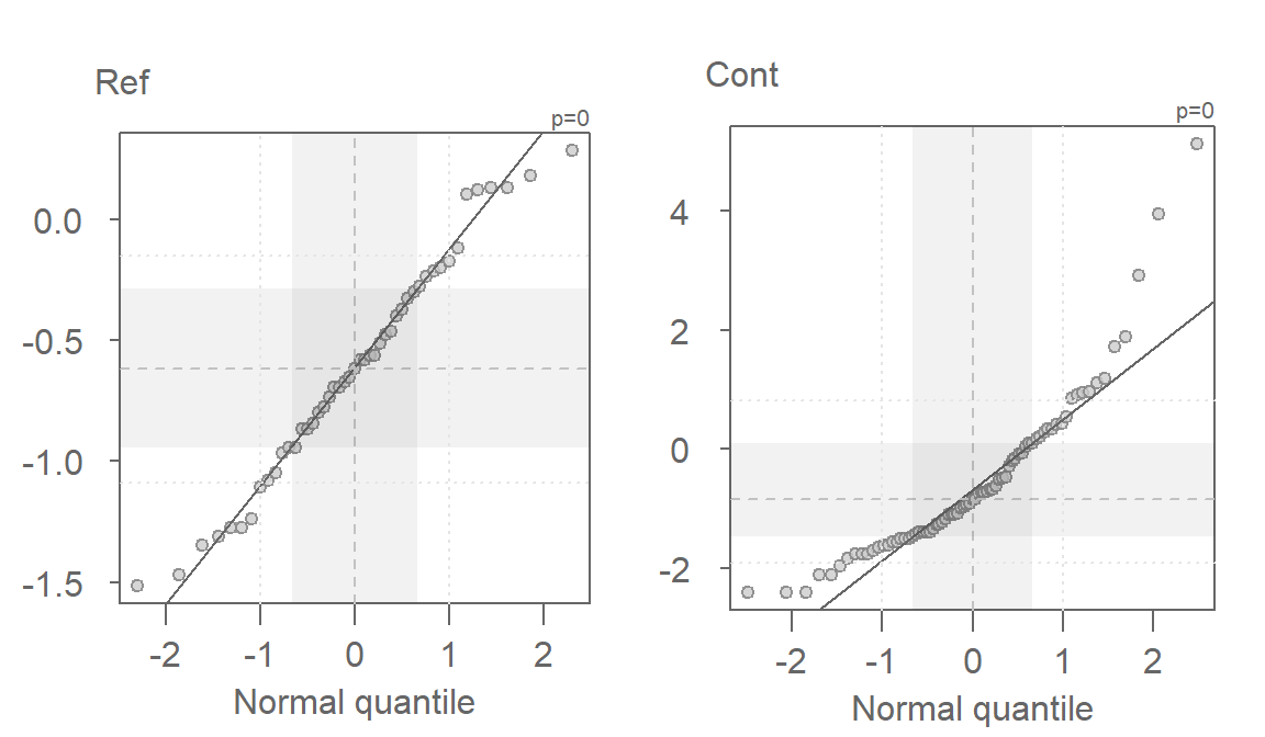
A skew is also prominent here but a bit more consistent across the depths with a slight drop between depths D and C (16th and 32nd extreme values).
Next, we will find a power function that re-expresses the values to satisfy the t-test distribution requirement. We’ll first look at the log transformation implemented in the last section. Note that we are using the custom eda_re function to transform the data. We’ll also make use of some advanced coding to reduce the code chunk size.
library(dplyr)

df  %>%
  group_by(Site) %>%
  do(eda_lsum( eda_re(.$TCB,0), l=7) ) %>%
  ggplot() + aes(x=depth, y=mid, label=letter) + geom_point() +
  scale_x_reverse() +geom_text(vjust=-.5, size=4) + facet_grid(.~Site)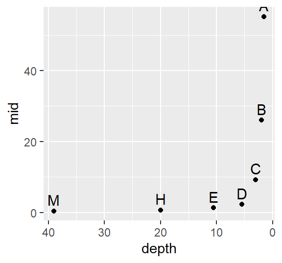
The log transformation seems to work well with the reference site, but it’s not aggressive enough for the contaminated site. Recall that to ensure symmetry across all levels of the batches, the letter values must follow a straight (horizontal) line. Let’s try a power of -0.5. Given that the negative power will reverse the order of the values if we adopt the Tukey transformation, we’ll use the default Box-Cox method.
df  %>%
  group_by(Site) %>%
  do(eda_lsum( eda_re(.$TCB,-0.5, tukey=FALSE), l=7) ) %>%
  ggplot() + aes(x=depth, y=mid, label=letter) + geom_point() +
  scale_x_reverse() +geom_text(vjust=-.5, size=4) + facet_grid(.~Site)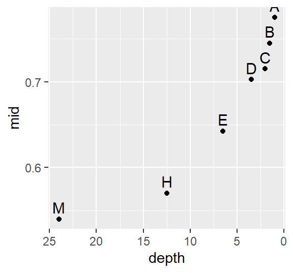
This seems to be too aggressive. We are facing a situation where attempting to normalize one batch distorts the other batch. Let’s try a compromise and use -.35.
df  %>%
  group_by(Site) %>%
  do(eda_lsum( eda_re(.$TCB,-0.35, tukey=FALSE), l=7) ) %>%
  ggplot() + aes(x=depth, y=mid, label=letter) + geom_point() +
  scale_x_reverse() +geom_text(vjust=-.5, size=4) + facet_grid(.~Site)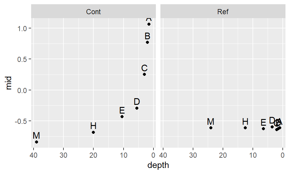
This seems to be a bit better. It’s obvious that we will not find a power transformation that will satisfy both batches, so we will need to make a judgement call and work with a power of -.35 for now.
Let’s compare the re-expressed batches with a normal distribution.
eda_theo(Cont, p = -0.35)
eda_theo(Ref, p = -0.35)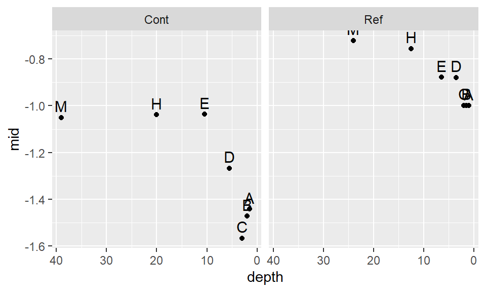
The skew seems to have been removed. A good thing. Let’s now compare the re-expressed batches using a density-normal fit plot for both batches of concentration values.
eda_normfit(df, TCB, Site, p = -0.35, tukey=FALSE, tsize = 1.1)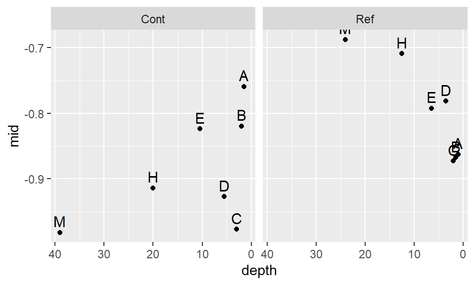
Recall that the right half of each plot is the Normal fit to the data and the left half is the density plot. There is far greater agreement between the normal fits and their accompanying density distributions for both sites.
So, how important was the skewed distribution in influencing the t-test result? Now that we have normally distributed values, let’s rerun the t-test using the re-expressed values. Note that because the power is negative, we will adopt the Box-Cox transformation to preserve order by setting tukey=FALSE to the eda_re function.
t.test(eda_re(Cont,-0.35, tukey=FALSE), eda_re(Ref,-0.35,tukey=FALSE), alt="greater")
    Welch Two Sample t-test

data:  eda_re(Cont, -0.35, tukey = FALSE) and eda_re(Ref, -0.35, tukey = FALSE)
t = -1.0495, df = 111.68, p-value = 0.8519
alternative hypothesis: true difference in means is greater than 0
95 percent confidence interval:
 -0.4845764        Inf
sample estimates:
 mean of x  mean of y
-0.9264188 -0.7386209
The result differs significantly from that with the raw data. This last run gives us a p-value of 0.85 whereas the first run gave us a p-value of 0.075. This suggests that there is an 85% chance that the reference site could have generated a mean concentration greater than that observed at the contaminated site!
24.4 Is there more to glean from the data?
Statistical tests are narrowly focused tools: they address specific questions under defined assumptions. For example, the t-test focuses on differences in mean values and relies on stringent assumptions about data distribution. While these tests are powerful, they do not provide a complete picture of the data. Exploratory techniques can often reveal patterns and insights beyond what statistical tests alone can show.
Exploratory techniques can prove quite revealing. We can, for example, explore differences in site concentrations across all ranges of values using an empirical QQ plot. Given the skewed nature of our data, we will focus on the transformed values identified in the previous section. Additionally, a density plot is included to help interpret the QQ plot.
  eda_qq(Ref, Cont, p = -0.35)
  eda_dens(Ref, Cont, p = -0.35)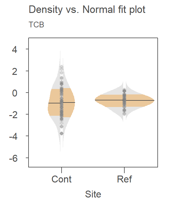
Here are some takeaways from the plots:
The QQ plot suggests that the shapes of the distributions are similar, which is expected given that the transformation rendered both datasets approximately Normal. However, their spreads differ, with the contaminated site showing greater variability in TCB concentrations.
The QQ plot highlights a striking pattern: the bottom half of the measured concentrations at the contaminated site are consistently lower than those at the reference site when ranked by order. Conversely, the top half of concentrations are greater at the contaminated site, suggesting that additional remediation may be needed to address elevated TCB levels in some locations.
A key insight from the QQ plot is the apparent multiplicative relationship between the datasets. Concentrations at the contaminated site appear to be approximately twice those at the reference site, when compared on the transformed scale. This observation is specific to the transformed data and reflects the nature of the re-expression. For instance, if the smallest concentration at the reference site is \(-2\), the smallest concentration at the contaminated site would be \(-2 \times 2 = -4\) (when measured on a \(-0.35\) power scale). On the original scale, the relationship translates to \(Cont = (2 \times Ref^{-0.35})^{1/-0.35}\).
This exercise underscores the value of exploratory data analysis (EDA). By using visualization tools such as QQ plots, we gain a deeper understanding of the relationships between the two datasets. These insights extend far beyond the scope of a simple comparison of means, revealing patterns and variability that might otherwise be missed.
24.5 References
Millard S.P, Neerchal N.K., Environmental Statistics with S-Plus, 2001.